Supporting Expansive Narratives: Iterative Redesign of the Terra Foundation for American Art Website
Authors: Marty Spellerberg, Principal Digital Strategist and Developer at Spellerberg Associates, and Jessica Warchall, former Director of Communications at Terra Foundation for American Art.
To learn more about the grants and collection loans database, see the companion post.
The Terra Foundation for American Art expands the narratives of American art through its grants, art collection, and initiatives. With offices in Chicago and Paris, the foundation collaborates with organizations to promote intercultural dialogues and encourage transformative practices, both locally and globally.
This case study documents a multi-year evolution of the foundation’s website, culminating in the reveal of a redesigned site and a new visual identity in the spring of 2025. Rather than being a single project with a defined start and finish, this was an ongoing collaboration that allowed us to adapt to organizational changes, test different approaches, reduce risks, and ultimately deliver a website that effectively serves both the foundation and its grantees.
Early Groundwork
Technical Foundation
In 2021, we made a crucial decision to clean up the existing WordPress implementation rather than rebuild it from scratch. The site contained valuable content related to past foundation-led projects, grant and fellowship programs, and grantees’ work. Since we could manage the existing content within the CMS, there was no need to transfer it elsewhere for editorial work.
This approach proved to be the most efficient path forward. We audited the site, deprecating unnecessary plugins and untangling the code to facilitate future enhancements. This groundwork laid a solid foundation for scalable development. Rather than waiting to launch everything at once and risking delays, we improved the user experience by rolling out elements incrementally as they became ready.
During this process, we implemented Google Analytics and Tag Manager configuration and refreshed the homepage through a series of sprints. The result was a streamlined experience that showcased available grants, provided news and updates about the foundation and its programs, and highlighted the foundation’s art collection.
A Foundation Report as Proof of Concept
In 2022, the foundation underwent a strategic repositioning, updating its mission, vision, and values. We updated the website to reflect these changes: restructuring the grants page, updating the about page, phasing out programs for individuals and fellowships, and establishing new structures for grants to organizations.
The previous WordPress theme offered only one page template, limiting content creators to basic layouts. The foundation wanted a system that could accommodate both simple, text-heavy pages and dynamic pages with varied content types—all without requiring developer assistance for routine updates.
The organization’s decision to create its first digital foundation report presented an opportunity to test a new approach. Rather than building a one-off solution, the team developed a custom WordPress block system that could serve as the basis for a future site redesign. New blocks included text, images, buttons, pull quotes, and highlight cards. This initiative established a reusable block library and content patterns that demonstrated how to quickly and efficiently create engaging, complex pages.
The test case proved successful, demonstrating a block-based structure that enabled the foundation to publish an entire report online using WordPress pages. As a result, the foundation can now produce robust reports—including dynamic elements—independently, without development support.

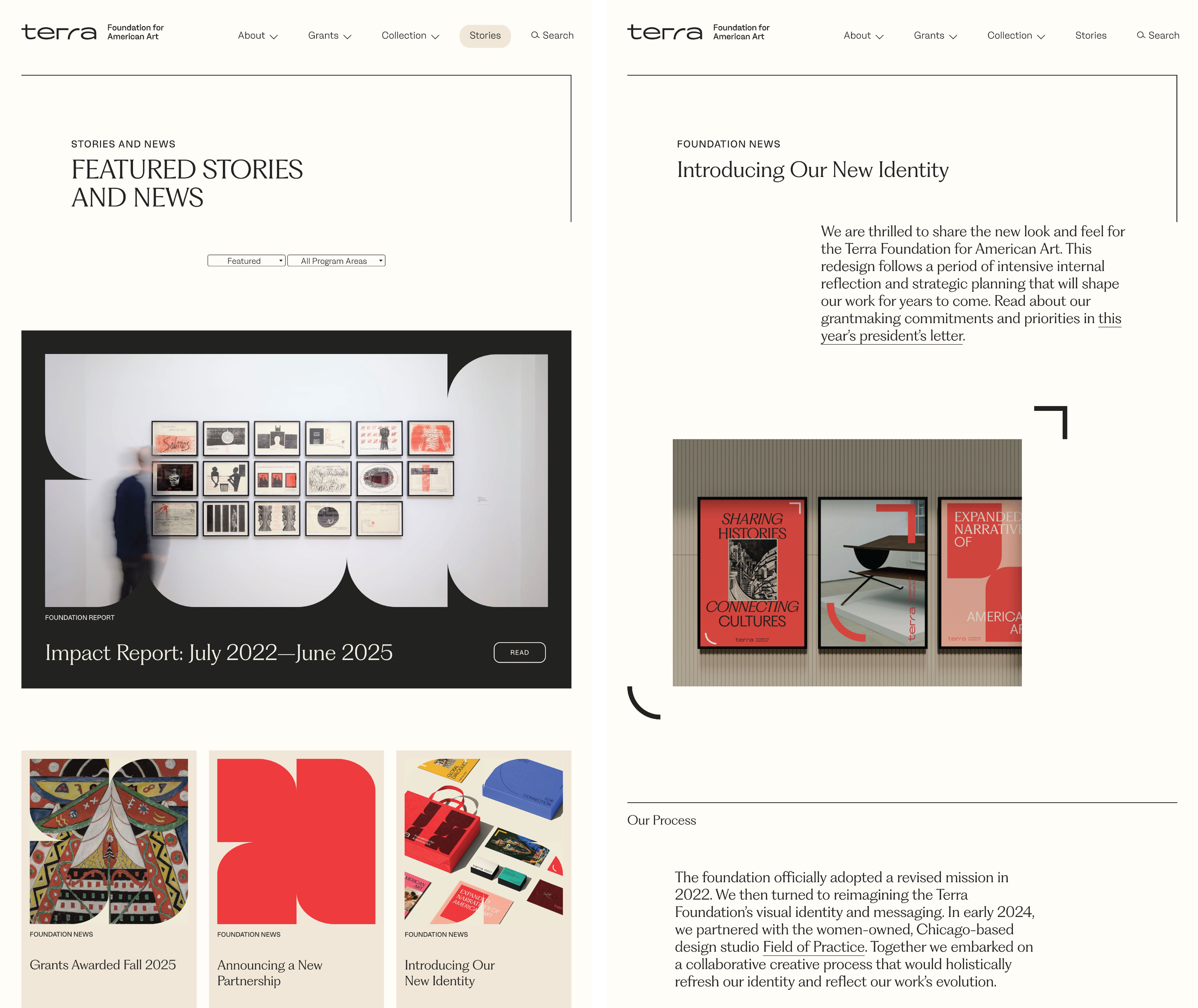
Stories Content Strategy
The content strategy for the “Stories” section centered on narrative storytelling that elevated grantee voices—a significant shift from how the organization had used its website before. Previously, the site served primarily as an information hub where grantees could access details needed to apply for grants and curators could find collection objects available for loan. We showcased Grants on a map, indicating open exhibition locations, and in a database with limited filtering and no narratives about projects or grantees.
The “Stories” section allowed grantees to see themselves reflected in the foundation’s work and understand its commitment to supporting similar projects. It demystified both the foundation and the grantmaking process, showing potential applicants their peers and the funded projects.
“Stories” also connected the foundation’s two main functions—grantmaking and the art collection. These had often been viewed as separate, but through storytelling alongside a new grants and collection loans database, we articulated a broader narrative about the relationship between these two areas.
We launched the “Stories” section before the website redesign. This timing allowed us to publish stories and integrate them into the main navigation early, establishing a foundation for design elements and styles that we would apply to posts during the redesign. We also established editorial workflows for generating content, enabling staff to continue producing and posting new stories throughout the redesign and preventing a significant content backlog.
User Research
We collaborated with the Pratt Center for Digital Experiences to conduct extensive user research, including heat-mapping the homepage and grant-opportunity pages. One key finding was the importance of deadlines.
To address this, we moved deadlines higher on the page and included them in multiple locations: the homepage, the grants landing page, and individual program pages. Deadlines are consistently displayed in a card block format, which helps content editors manage information as deadlines pass and enables users to identify important details easily. We also designed the card block to allow editors to set content start and end dates, ensuring that deadlines update automatically when they expire.
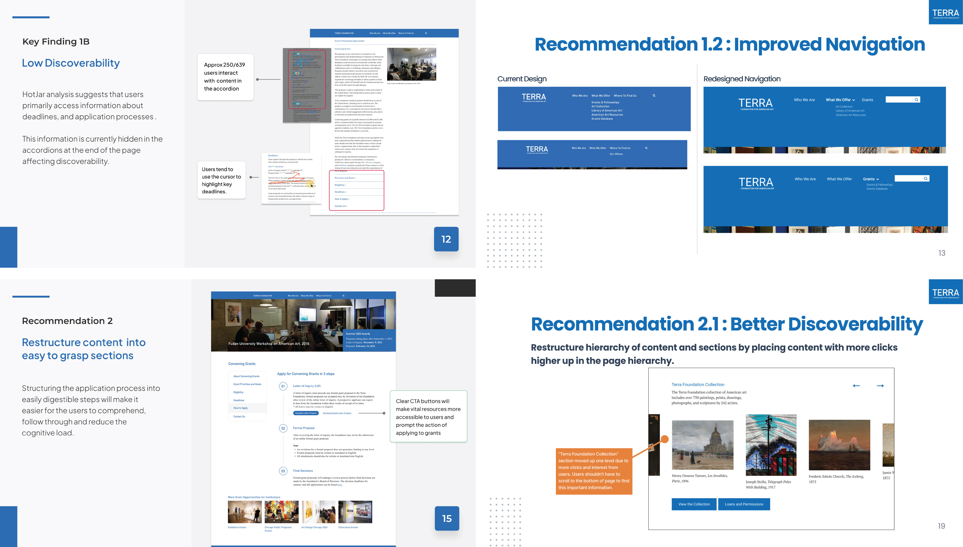
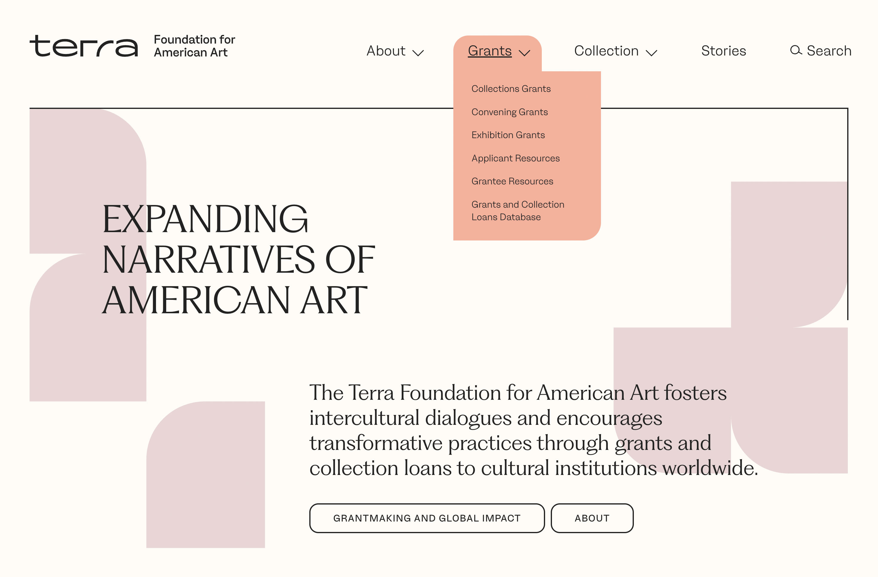
Navigation Update
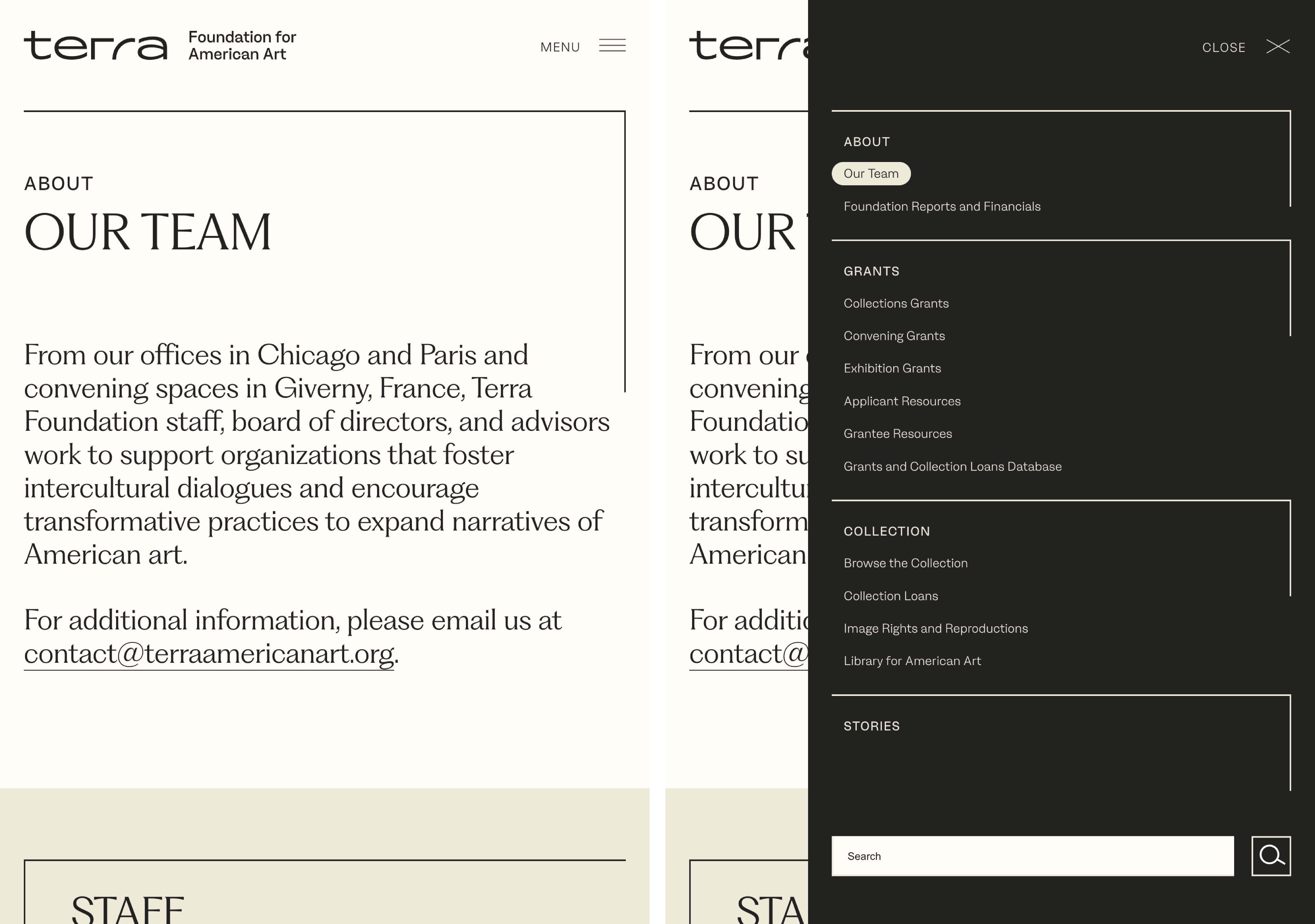
The previous navigation focused primarily on internal elements, featuring one-off projects and specific initiatives that received few visits because external audiences did not recognize them. To improve engagement, we simplified the navigation and shifted focus to external users. The navigation now clearly leads users to grant support options, showcases the art collection, offers search functionality, provides information about the foundation, and shares stories about grantees and projects.
Additionally, the old navigation structure was also hardcoded, making it difficult for content editors to update independently, particularly frustrating when programs began or ended. We transitioned to the WordPress menu system, giving editors full control and making updates easy.
Full Redesign
Design Firm Selection and Brand Development
We conducted a thorough RFP process to shortlist designers who truly reflected the foundation’s new organizational vision, ultimately selecting Field of Practice for the brand design.
The goal was to accurately reflect the foundation’s grantees and core values: Cultural Humility, Inclusion and Access, Partnership and Collaboration, and Experimentation and Adaptiveness. Notably, the typography was sourced from designers in both the United States and France, highlighting the foundation’s binational operations with offices in Chicago and Paris.
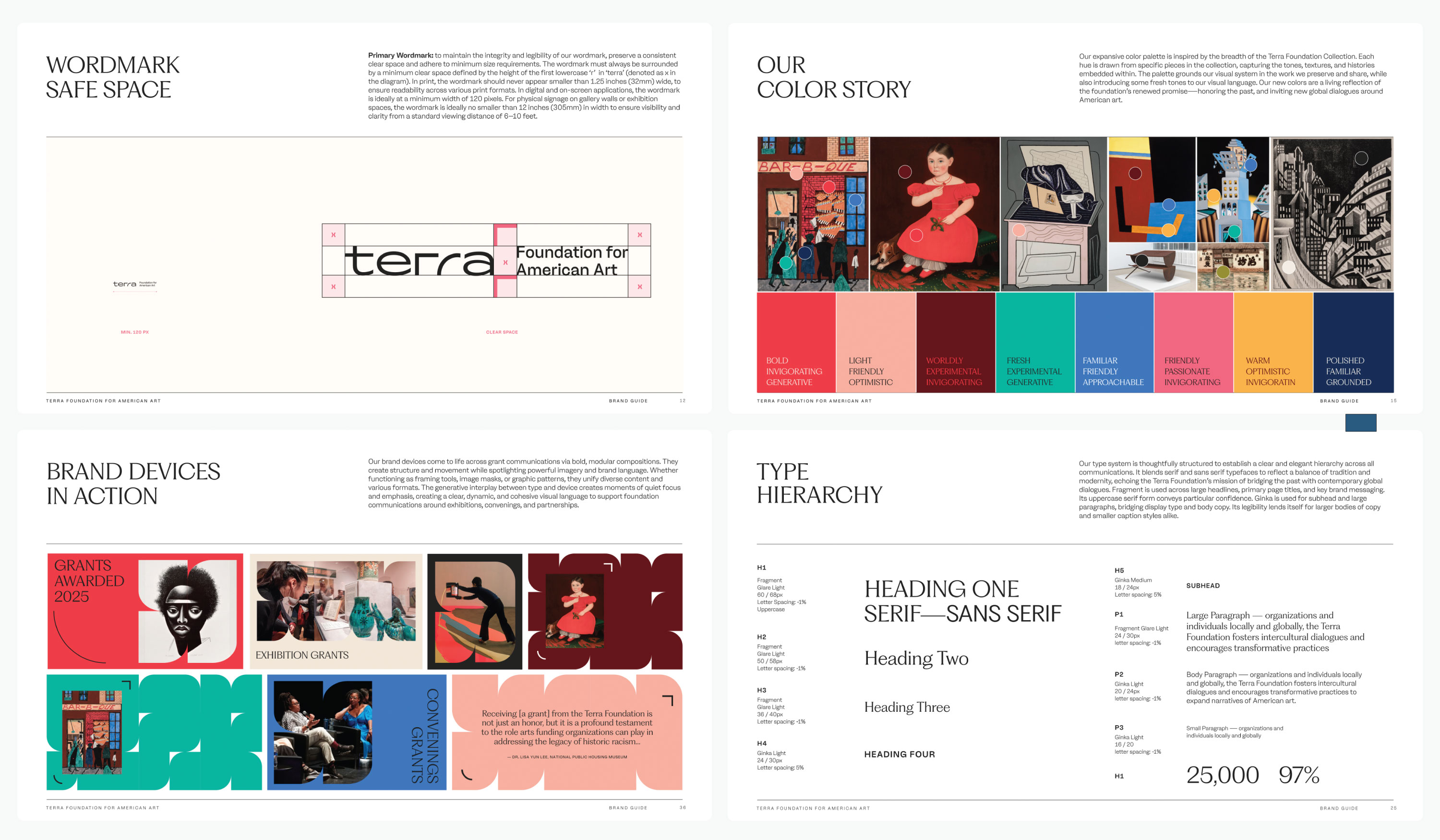
Color System
Incorporating color on the website was essential to reflect the diverse and multifaceted nature of American art and artists. Field of Practice selected a range of rich, bold colors from the foundation’s art collection as the basis for the palette, then modified and refined them to meet WCAG AA accessibility standards. This testing ensured that lighter and darker shades were available for various situations.
From this refined selection, we approved six color palettes for web pages. Each palette features a standard and an alternate option, allowing content editors to narrate a cohesive story on each page by grouping or separating content blocks as needed.
The most commonly used palettes have a light background and dark foreground with various hues for highlights. However, the light background is ivory rather than pure white, and the dark foreground is charcoal rather than pure black—even at the most restrained use of color, the overall effect remains soft. A neutral palette consisting solely of ivory and charcoal is used on all story pages to prevent distractions from the content and ensure cohesive navigation across storytelling content.
Component System
The site employs a component-based page templating approach, enabling developers to build a library of components that editors can mix and match to create both simple and complex pages. Editors generate pages by selecting components, choosing color palettes, and opting for variations within the theme. This approach allows them to maintain creative control while adhering to brand guidelines, reducing dependence on developers for daily editorial tasks. By using components to build pages, editors can tailor design to fit content needs rather than the other way around—offering significantly more flexibility than a limited set of pre-designed templates. While some components are hardcoded into specific templates, close collaboration between developers and content creators turns this into an advantage rather than a hindrance.
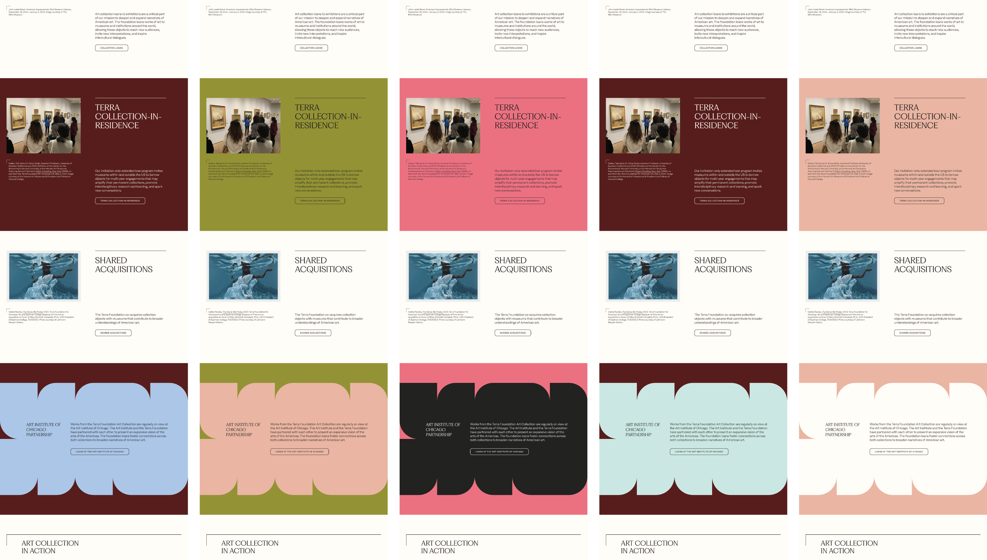
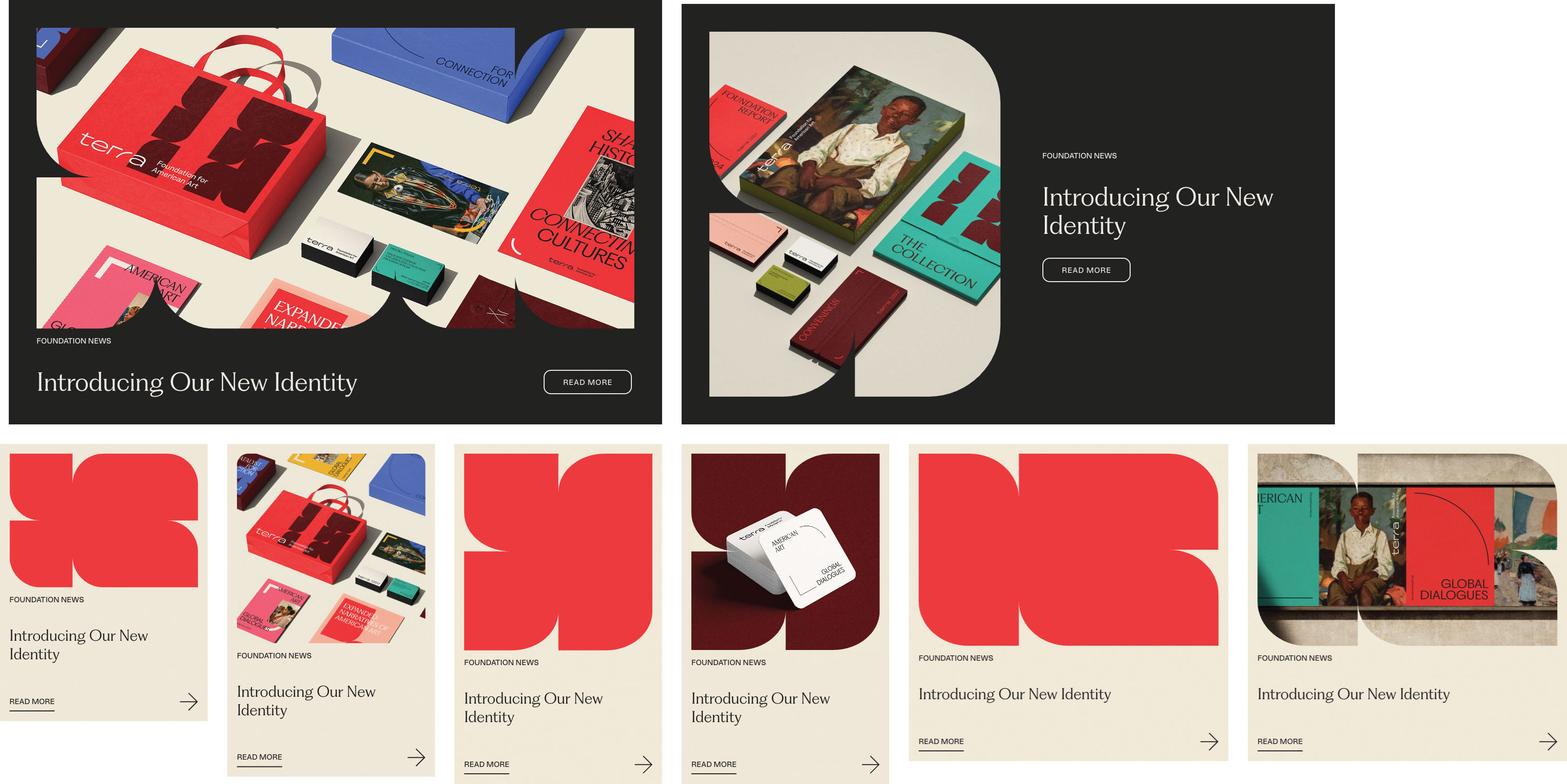
Cards are among the most crucial components in this system. They support the site’s narrative strategy and enable grantees to see supported projects represented throughout the website via stories and news, rather than confining them to a single page. Cards come in various configurations and can be created from scratch or by referencing other WordPress objects. Two major visual styles distinguish stories from non-stories, and cards can be displayed in one, two, or three columns depending on each page’s narrative requirements.
The card system also addresses a common challenge faced by art institutions: inconsistent imagery and availability. Vertical and horizontal images display differently, and when no image is available, fallback brand patterns incorporating the page’s palette colors are used instead. Multiple fallback patterns ensure visual variety and prevent adjacent cards without images from repeating the same design.
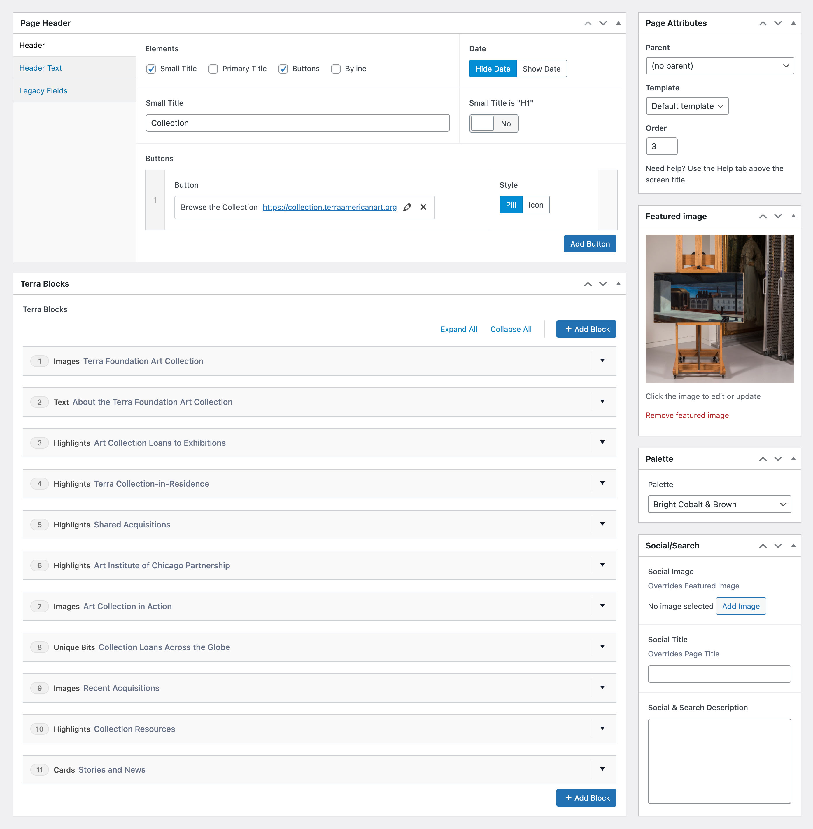
WordPress Editing Interface
We developed a flexible system that allows content editors to add images, headlines, buttons, and other elements while adhering to established guidelines and parameters. This design minimizes the chances of editors deviating from brand standards or creating inaccessible content.
To enhance usability, we made simple adjustments such as setting Advanced Custom Fields’ flexible content blocks to collapse by default. This tweak allows users to view all blocks at a glance and drag and drop them to reorder as needed.
While the system provides guardrails and guideposts, it remains flexible and adaptable—enabling editors to express creativity within the framework of brand guidelines while crafting narrative content.
Results and Reflection
The new site makes the foundation’s role clear: what it funds, what it doesn’t, and how to apply. Users can quickly find grantmaking opportunities and identify which programs fit their needs. Content hierarchy and design anticipate common questions, guiding visitors to answers—or to the right staff member when they need more help.
The art collection, long central to the foundation’s identity, is now woven throughout the site rather than treated as decoration or housed separately. Grants and collection loans share a unified database. Stories about grantee projects appear alongside stories about art initiatives. Collection objects surface intentionally on text-heavy pages as moments of pause.
For content editors, the system is both flexible and simple—an unusual combination. Structured color palettes and content blocks mean editors make a few initial choices, then the system handles the rest. The implementation required significant backend work, but the result is a tool that’s efficient to use daily.
Takeaways
Our iterative approach let us ship continuously—launching new navigation, a redesigned homepage, and a block system. It migrated pages without waiting for a single large release. Each rollout became an opportunity to test, learn, and refine before the next.
This method reduced organizational risk in two ways. First, because changes weren’t tightly interconnected, we could adapt in real time; bottlenecks in one area didn’t stall progress elsewhere. Second, by launching significant elements early, we eliminated dependencies that might have blocked later development.
By the time users encountered the fully redesigned site, much of it was already familiar. They had been using the new navigation for months and had seen updated content hierarchies through Stories. The final launch wasn’t a sudden shift—it was the last step in a gradual transition.
Project Collaborators
For Spellerberg Associates: Digital Strategy, WordPress Development, Front-End Development by Marty Spellerberg. Additional development by Heather Sansone and Trenisha Goslee.
For the Terra Foundation for American Art: Project leadership by Jessica Warchall. Additional contribution by Taylor L. Poulin.
Design by Field of Practice.
Posted October 2025