Navigation
Toronto International Film Festival ’07 Information Architecture
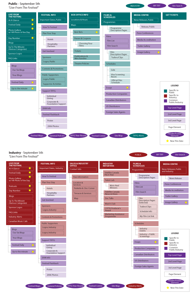
This is a page from the Information Architecture for the 2007 Toronto International Film Festival. It reflects a significant restructuring from previous years, cutting the number of main nav items in half. This page shows one of seven key dates leading up the the festival, with both “Public” and “Industry” views of the site.
The architecture was drawn-up by developer Marty Spellerberg with contributions from the entire online team and feedback from stakeholders across the organization.
Museum Website Top-Level Navigation Items
How many navigation items do museum websites have? How are they split? What are the most common terms? I looked at 35 museum websites and this is what I learned:
60% of sites split their persistent navigation into two groups (usually with different font sizes or visual treatment). In this case, the average number of buttons is 13, with 8 in one group and 5 in another.
For the 40% of sites presenting all their top-level items in one group the average number of buttons is 9.
The average number of buttons overall is 11.5.
The most common terms are as follows:
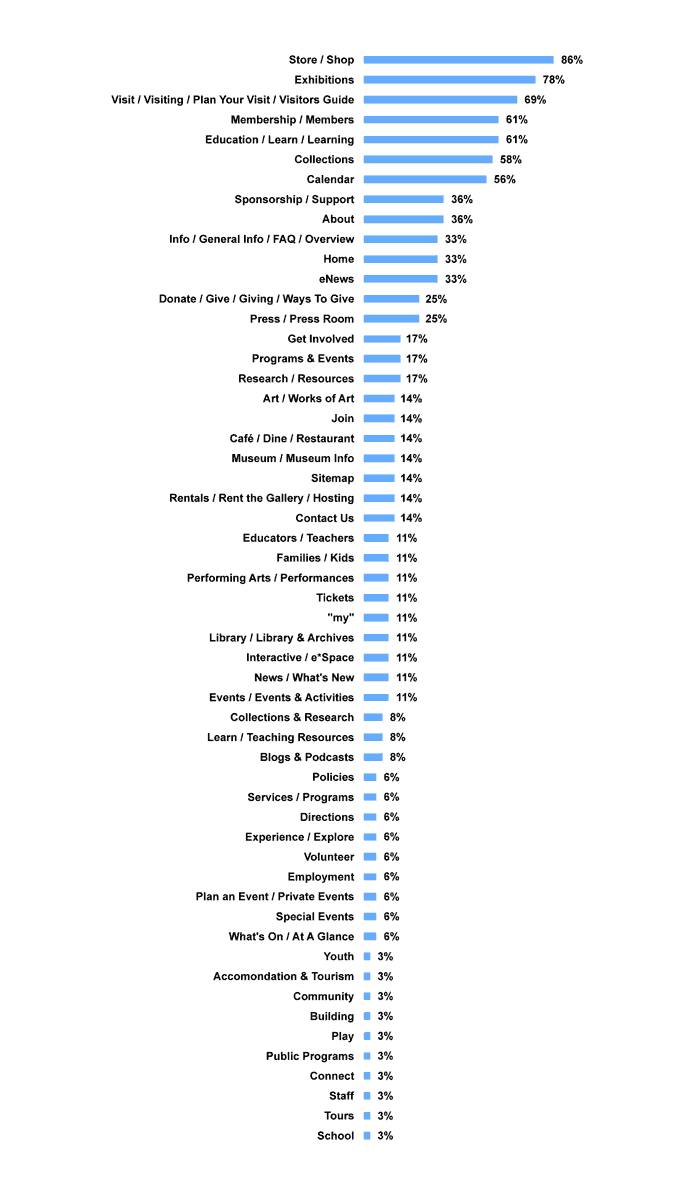
This research was conducted in March 2008 at the Art Gallery of Ontario. The 35 sites surveyed were: Glenbow, Skirball, Vancouver, Sfmoma, San Jose, LA MOCA, Phoenix, Colorado, Carter, Houston, New Orleans, Norton, High, Chrysler, Cincinnati, Indianapolis, Wexner, Baltimore, Chicago, Milwaukee, Albright-Knox, Montreal, Guggenheim, Brooklyn, Quebec, MoMA, Tate, Louvre, National Canada, ROM, Philidelphia, Detroit, Met, Chicago, National USA.
Museum Information Architecture: Where Are Weddings?
Weddings and other private events are a major source of revenue for museums; I’ve heard it said they “keep the lights on.” But where on a museum’s website will you find information on this service?
We grappled with this question in 2008 at the Art Gallery of Ontario as part of an information architecture review. From the museum’s perspective it’s an important business — does that mean it warrants a “tab” in the top level navigation? Some museums have it there. But on the other hand, it’s irrelevant to the vast majority of the site’s users, who are looking for current exhibits and the hours of operation. Also, how is it referred to? “Special Events” seems common in the event industry, but it conflicts with other museum initiatives such as fund raising galas. “Private” indicates exclusivity.
Here’s what I found in a survey of 50 museum websites:
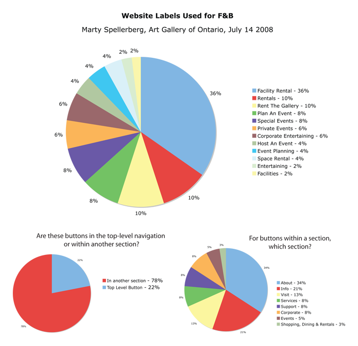
“Facility Rental” came out as the clear winner, with 36%. While 22% made it a top-level priority, the majority put it within another section. Which section? “About” with 34%, or “Info” with 21%.
At the AGO we used these findings to inform the decision to call our section “Venue Rental” (which sounds nicer while still avoiding conflict) and link it under “About.”
The sites surveyed were: Skirball, Vancouver, Sfmoma, San Jose, LA MOCA, Phoenix, Colorado, New Orleans, Norton, High, Chrysler, Cincinnati, Indianapolis, Wexner, Baltimore, Chicago, Milwaukee, Albright-Knox, Guggenheim, Brooklyn, MoMA, Tate, Louvre, Canada, ROM, Philadelphia, Detroit, Met, Chicago, Bata, Kansas City, New Museum, Walker, Calgary, Kamloops, Nanaimo, Two Rivers, Victoria, Fredericton, Hamilton, McMichael, Nova Scotia, Mendel, MacKenzie, Anchorage, Birmingham, Boise, LA County, de Young, New Brit.
Redesigned website navigation for the Santa Cruz MAH
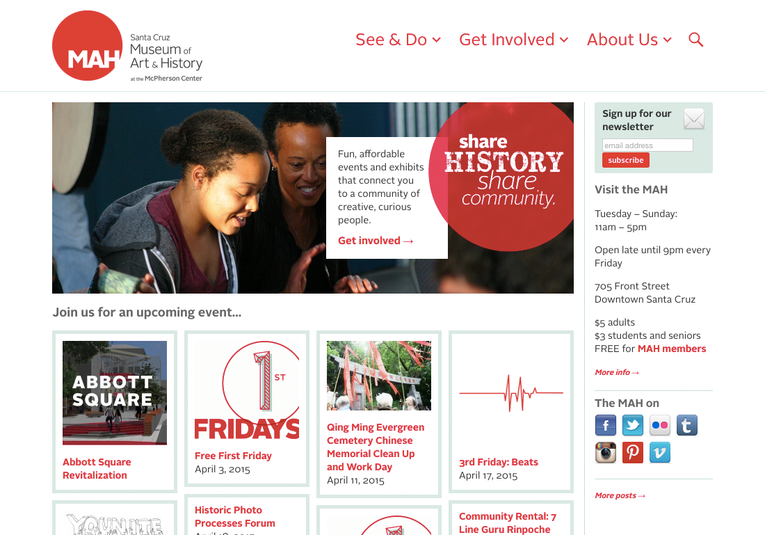
I recently redesigned the top-navigation of the Santa Cruz Museum of Art and History’s website. Working closely with Museum staff, I simplified the nav and introduced a modern, mobile-responsive interface pattern.
The MAH is about engagement. The Museum is fulfilling its mission when it’s “bringing people together around art and history.” The seed of this navigation change began with a conversation about opportunities to better accomplish that mission using the website.
The design at that time included seven top-level links — Calendar, Exhibitions, Learn, Get Involved, Rent the MAH, Blog and About. We realized that this fairly typical collection of links didn’t signal to visitors how central getting involved was to the MAH experience.
Now, by reducing that down to three — See & Do, Get Involved and About — we’re more clearly communicating to visitors the Museum’s character and priorities.
Also, the web has changed since the site’s last redesign. Mobile apps and responsive web design have introduced a slew of new interaction patterns. While the site has not yet been converted to responsive (a project that’s currently in-progress), we used a mobile-inspired interaction pattern for the second-level links.
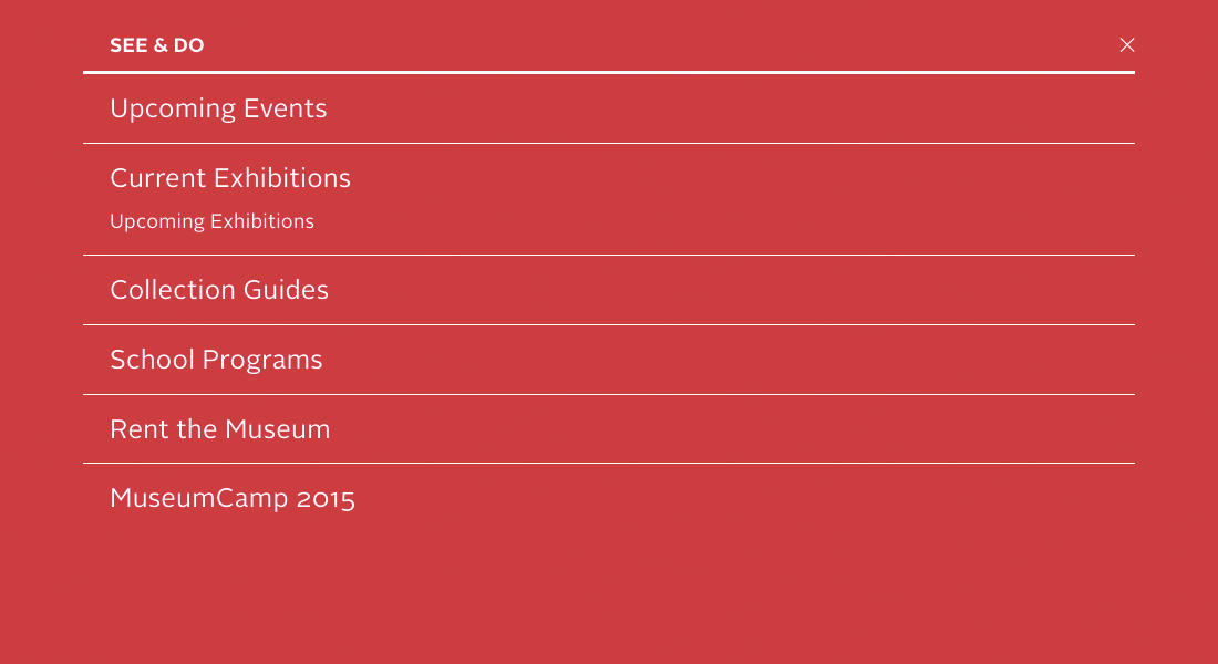
Whereas the old design used a drop-down style commonly cribbed from desktop menus, for this design clicking/tapping each of the top-level items triggers a full-screen shade.
And rather than listing the second-level links horizontally, we’ve stacked them vertically. This reduces line-length-imposed character limitations, allowing the Museum the flexibility to include as many items as they need in each shade, each with as many words as is needed for effective communication.
Project team
- Marty Spellerberg, Designer/Developer for Spellerberg Associates
- Elise Granata, Marketing & Engagement Coordinator for the Santa Cruz MAH