In-Gallery Kiosks
In-Gallery Kiosk for Artist Midi Onodera
The Archive and Everyday Life Conference, held May 6–8, 2010 at McMaster University, examined how fields of archive intersect with everyday life. The conference program includes panel discussions, screenings, and visual art.
Midi Onodera’s year-long 2009 video project A Movie A Week was on view in the accompanying group exhibition held at Hamilton Artists Inc. from May 1–15. Her collection of 52 mini-movies “focus the lens on daily, un-monumental occurrences fit for the small screen.”
A long-time collaborator of Midi’s, I developed her site and online-presentation of A Movie A Week. For this exhibition, Ruby Pajares and I created a stand-alone version of the project (image above) that could be run off a lap-top.

Interactive In-Gallery Video Kiosk for Artist Midi Onodera
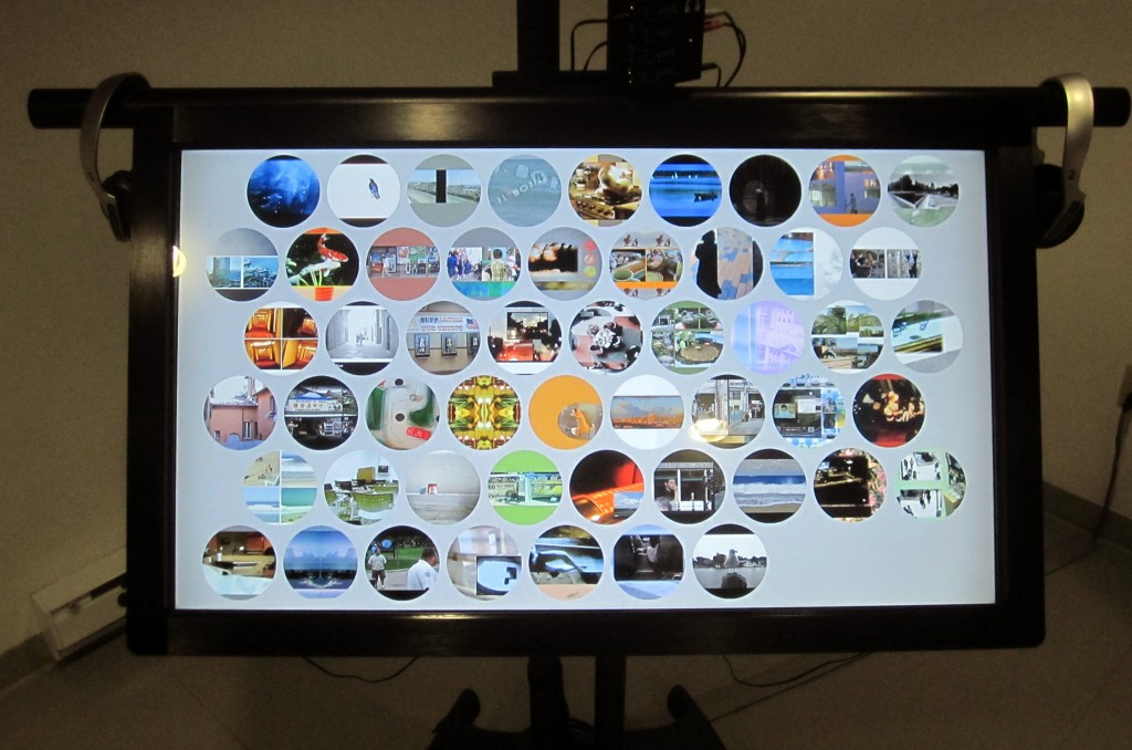
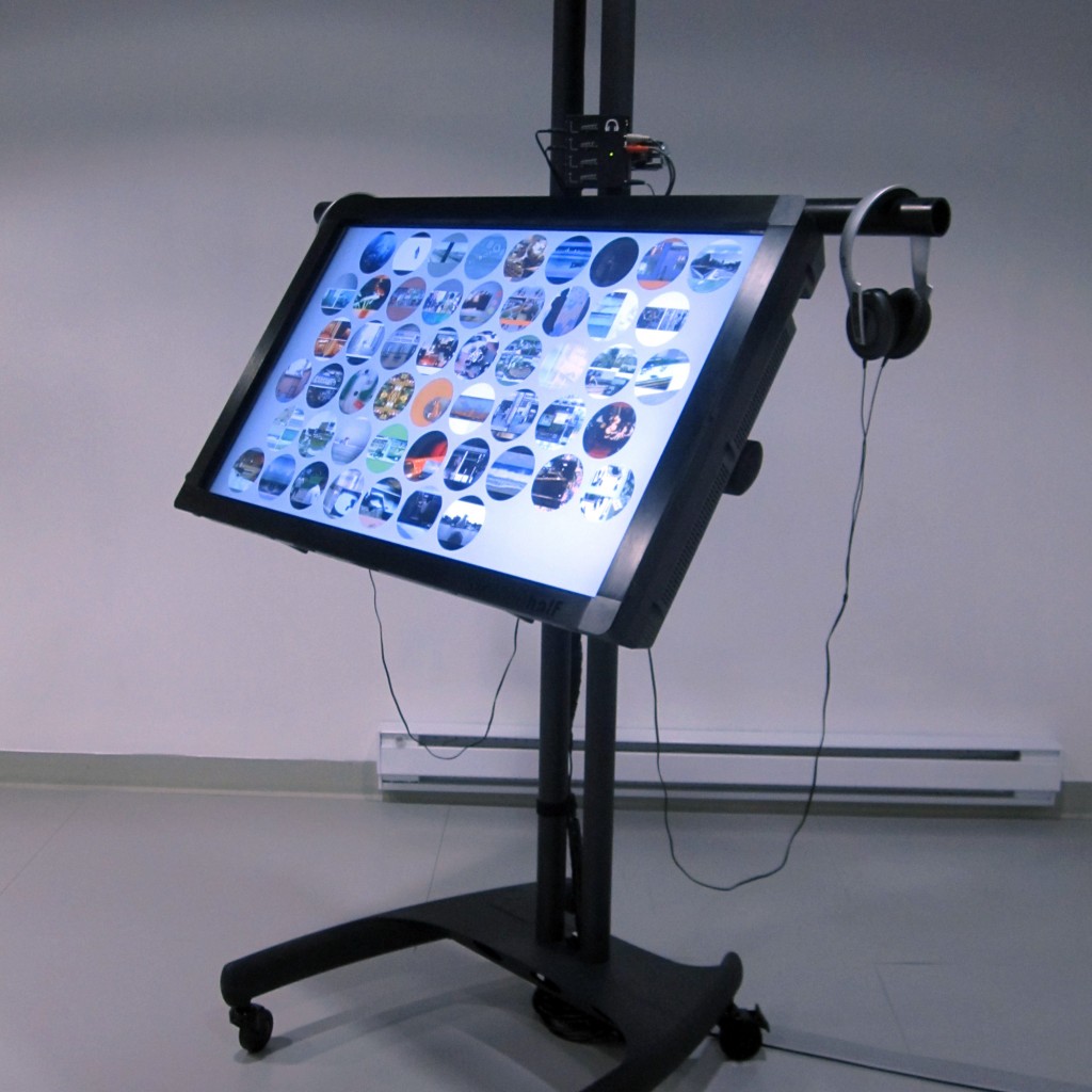
Interactive Touchscreen Interface using jQuery and HTML5 Video
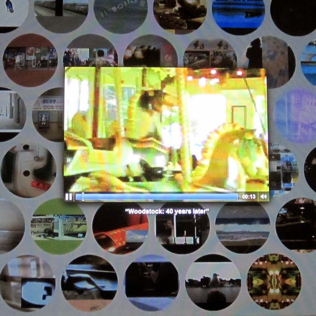
In 2009 artist Midi Onodera created a series of 52 short clips designed for podcasting. I have been fortunate to be involved in this project, providing technical support and new media development. When exhibition opportunities arise, such as Onodera’s recent show at Concordia University in Montreal, we grapple with ways to present these new-media-specific works in the gallery setting. Knowing Concordia had some sweet gear, Onodera chose show this series on a large touch-screen monitor. I designed and implemented the interface using web-standard technologies including jQuery and HTML5 Video.
I have posted the code on Github. It uses a jQuery vertical center function I previously created, as well as some other interface effects. One of my favourite of its features is the randomization: The thumbnails are shuffled as the page is loaded and then each moves to the end of the page upon being selected. At its core are the functions to load and play the clips.
Swapping Sources in an HTML 5 Video
The interface provides access to 53 video clips, but rather than giving each its own instance, I set up an single video element, omitting a source.
<video class="video" id="video" controls="" autoplay="" width="640" height="426"></video> |
And then, when a video is selected, its source is added in and the element begins to play.
$('.video').attr('src','movies/' + movieNum + '.m4v');
document.getElementById('video').play(); |
But the strangest thing happened when the next video is loaded and played: The audio from the first clip would play along with the new! I tried all sorts of things, including completely unloading the video element and creating a new one for each cycle, but still the audio could be heard. What a strange bug!
In the end I found it could be solved by, upon closing the clip, pausing the playback and then removing the video source:
document.getElementById('video').pause();
$('.video').removeAttr('src'); |
All of this can be seen in-context over at Github.
Origins: A User-Generated Museum Exhibit created using iPads, Google Maps and WordPress

Origins: The Birth and Rise of Chinese American Communities in Los Angeles is a permanent, cutting edge exhibition celebrating the growth and development, since the 1890s, of Chinese American enclaves from Downtown Los Angeles to the San Gabriel Valley.
Origins was designed for the Chinese American Museum, Los Angeles by THINK Jacobson & Roth. I was fortunate to be brought on as a member of the THINK team, providing start-to-finish design and development on the exhibit’s media component, Origins online. An interactive website available in the exhibit’s Monterey Park area, Origins online allows visitors to find and share great places, stories and resources of the San Gabriel Valley and other LA neighborhoods. The in-gallery presentation includes a table with two iPads for accessing the website, and a third for recording video of visitors’ own stories.
Agile Design Process, No Wireframes.

One of the earliest decisions we made on the project was to forego traditional wireframes.
The project team, consisting of CAM’s Steve Wong and Michael Truong, and THINK’s Lori Jacobson and Carla Roth, had a strong broad-strokes image of what they wanted. At our first meeting they described a map of the San Gabriel Valley, with markers indicating points of interest submitted by the public. And so, to our second meeting, I brought a working prototype demonstrating that functionality.
We continued in that vein for much of the project. At each meeting we reviewed the current state of the application and came to a consensus on development priorities for the next week. Feeling our way forward, we’d field lots of ideas and implement those with the highest priority. This process reminds me of the saying, “crossing the river by stepping on stones.”
Rather than discussing abstractions and hypotheticals, this approach allowed us to base our decisions on real experiences with a working interface. And rather than spending our limited time producing paper documents such as wireframes and mockups, all our effort went toward expressing ideas in code that could be poked, prodded, tested and, ultimately, launched.
“When Marty proposed working without wireframes, I immediately responded positively to this idea. With a tight budget and a hands-on client, working with iterative prototypes was the way to go. Rather than lingering in pre-production, this allowed us to quickly make team decisions and try things out in a very real way.”
— Carla Roth
At about the two-thirds mark we took a step back and presented our work, and the decisions it embodied, to Executive Director Michael Duchemin, who gave it his blessing. As the physical exhibition took shape we took a break, and by the time we reconvened the launch date had begun to loom large. So we locked development on new functionality and turned our focus to fit and finish.
I proposed that, since the site would be presented in-gallery using iPads, we adopt the iOS design vernacular. Applying gradients, highlights, textures and pop-overs would involve adding substantial complexity to the code, however, and increase the cost-of-change. For this reason we decided it was finally appropriate to create a mock-up and secure a more traditional client sign-off. From there we turned to browser testing and bug barbecue, then finished with the physical installation and documentation.

Google Maps + WordPress + iPads
Curator Steve Wong described his own extensive use of Google Maps in charting the region’s activity and history, and imagined enabling something similar for the community. I had previous experience with the Google Maps Javascript API so was able to hit the ground running. We chose WordPress for the CMS because of its ease-of-use for both development and content management. Additionally, I knew that the Gravity Forms plugin would allow us to fulfill the user-submission aspect of the project. And we chose Media Temple to host based on the suitability of their offering and my own familiarity with their setup. (Their location in Los Angeles was a bonus!)
The implementation’s core technical concept is described in my WordPress + Google Maps tutorial. Also, this project was the original motivator for the Address Geocoder WordPress plugin, which is now available from the WordPress plugin directory. The other aspect of the technical challenge was creating a JavaScript-heavy site that would look its best on 3rd generation iPads running the Kiosk Pro browser, while also performing on the desktop.
I’m happy to answer questions regarding the technical aspects of this project, including the Google Maps API, WordPress or, more generally, our agile approach and deploying web-based museum exhibits using iPads. Questions about the overall exhibit should be directed to THINK Jacobson & Roth.
The Chinese American Museum is a great space with a ton of history and a staff truly committed to serving their community and preserving its heritage. If you’re in LA, go see the exhibit!
Goshka Macuga microsites for the Museum of Contemporary Art Chicago
This post is a collaboration between Sarah Wambold and Marty Spellerberg. Sarah Wambold is a Denver-based project manager and documentary producer. Marty Spellerberg is an Austin-based interactive media designer/developer.
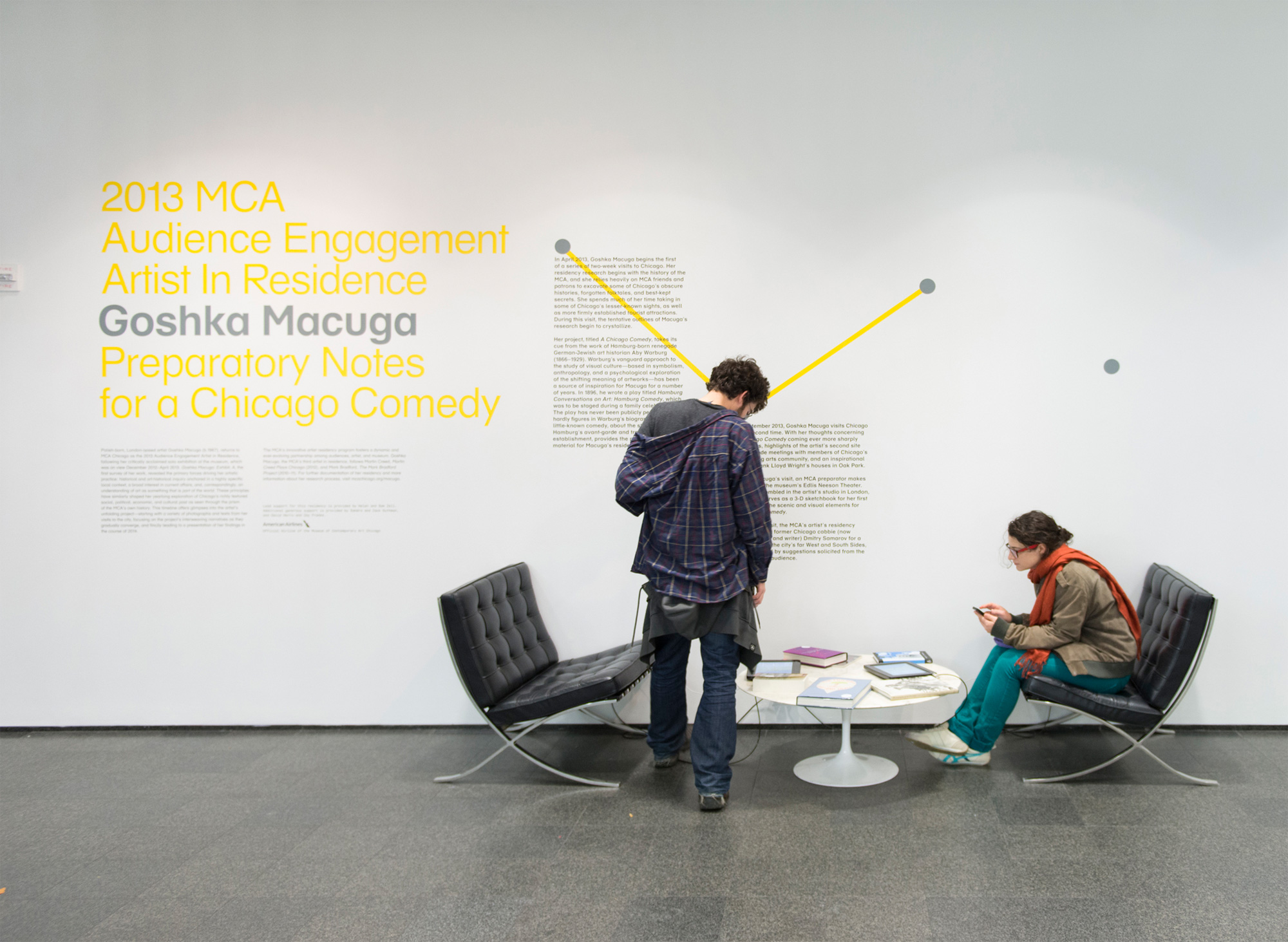
Goshka Macuga is the MCA Chicago’s 2013 Artist In Residence.
“Macuga’s work interweaves two strands that have helped define contemporary art in the last decade: artists’ increasing tendency toward historical and archival research and their growing interest in strategies of display and the dialogue between artistic and curatorial practice.”
— Dieter Roelstraete
Inspired by Hamburg Conversations on Art: Hamburg Comedy, a 1896 work German Jewish art historian Aby Warburg, Macuga’s residency project is to create a Chicago Comedy. But because the resulting work, likely to be a play, will not exist until the end of the term, the artist’s process is being documented and presented to the public as Preparatory Notes for a Chicago Comedy. Our team became involved as interactive media designers/developers.
With no artist on site—she’s in London—and no objects being produced in the early phases, how would museum visitors know there was, in fact, a residency taking place? We needed a physical manifestation or marker that would let the public know what was happening as it was happening.
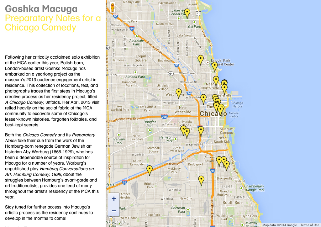
In-Gallery iPad Kiosk
The artist was opposed to creating a object or an installation “as a placeholder,” so digital, with its ability to present a depth of information in a physically economical and engaging way, emerged as the best candidate. iPads as part of a title wall installation became the solution for a physical, onsite manifestation of the residency.
Early in the year, Macuga was joined by MCA Curator Dieter Roelstraete for a romp around the city, seeking to “excavate Chicago’s lesser-known histories, forgotten folktales, and best-kept secrets.” The material they generated became the basis for our presentation.
Since the artist’s notes were organized around places she visited around the city, we chose an interactive map interface. This provided an instantly relevant format: Onsite visitors are, by definition, present in Chicago and likely to relate to a map of the city. This also served to emphasize the project’s connection and relevance to the local community, a goal of the Museum’s residency program generally.
The technical solution was based on the technique demonstrated in Marty’s Integrating WordPress and Google Maps tutorial, which he previously used to create an in-gallery kiosk for the Chinese American Museum, Los Angeles.
Museum Website
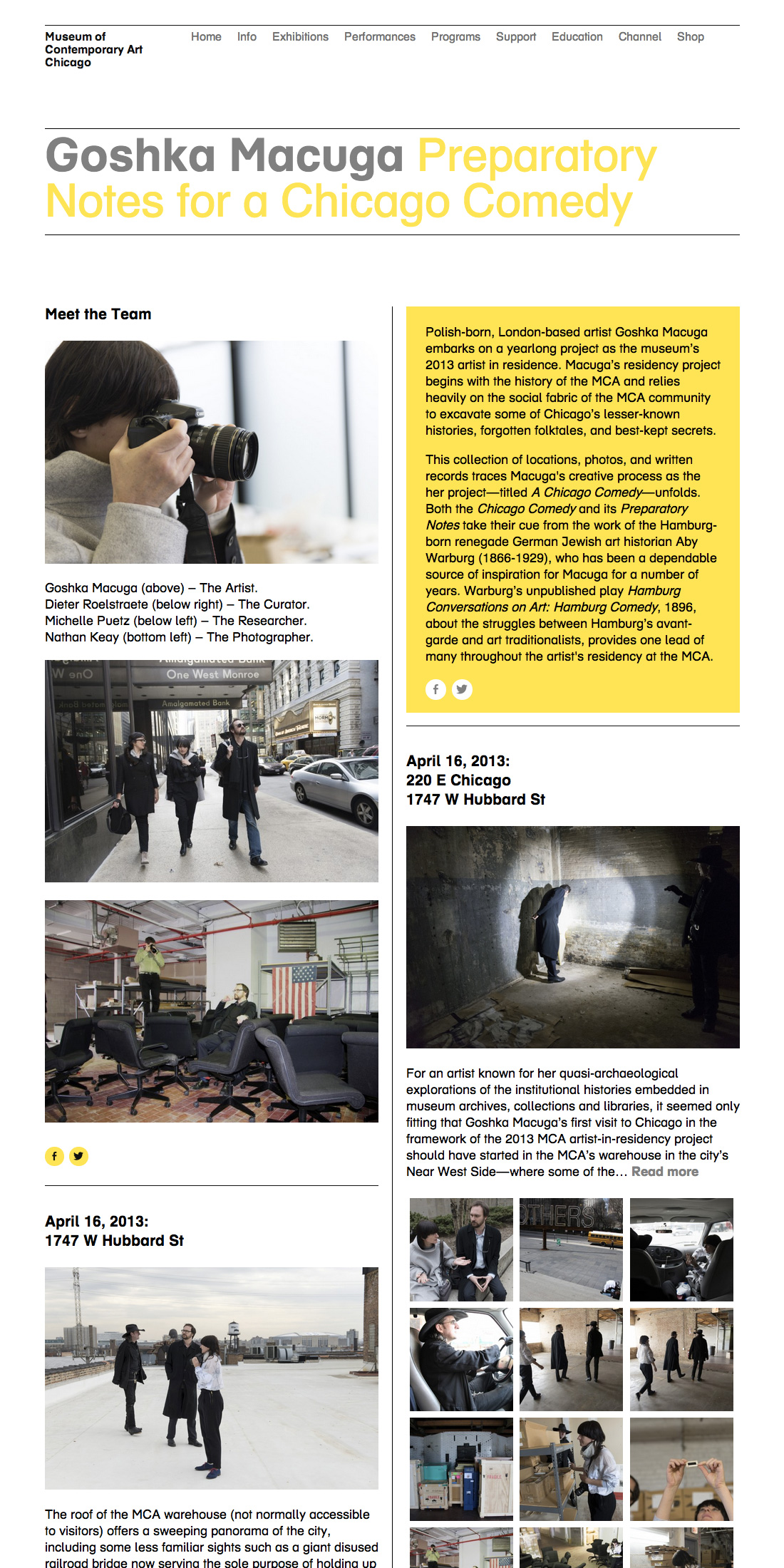
We also wanted to put something online that could live-on once the residency itself is completed. We realized, over several discussions with the curator, that Macuga’s work would find its form in phases: Lateral research of canvassing Chicago; vertical research of deep dives at the Warburg Institute; production, likely to happen abroad; and a to-be-determined final presentation. The digital strategy would need to respond to each of these.
We recognized that the map interface would be inadequate for telling the rest of the story of the residency; as Macuga moved from research-based activities, some happening abroad, and into production, using a map to navigate the content would no longer make sense.
The Museum had a history of stand-alone project blogs, and we made the choice to continue that format in this case. The first thing we did was to consolidate the most recent blogs under a unified banner and feed, which improved the prospects for long-term maintenance, as well as providing added context for future researchers. But we also wanted to provide a unique feel specific to the here-and-now, so we designed a two-column landing page using the Packery layout library.
The project was driven by a core creative concept that came into view over a period of time, as the artist’s process revealed the characteristics of the artwork she is creating. By adopting an agile design and development methodology, our team was able to respond to the changing needs for the project mid-course. The result was a compelling, revealing and engaging presentation for Museum visitors both onsite and online.
Project Collaborators
Digital Team
Producer and Project Manager: Sarah Wambold
Designer and Developer: Marty Spellerberg
Content Coordinator: Marian Oman
Residency Team
Project Manager: Erika Hanner
Curator: Dieter Roelstraete
Content Creators: Michelle Puetz, Dieter Roelstraete, and Goshka Macuga
Touchscreen interactive for the Chinese American Museum Los Angeles

I recently had the opportunity to again collaborate with the Chinese American Museum on an interactive touchscreen in-gallery kiosk. The piece is part of the exhibition Tales of the Distant Past: The Story of Hong Kong and the Chinese Diaspora and illustrates the Chinese diaspora around the world.
Design and development of the project began with a Museum-supplied spreadsheet of the Chinese population for each of the world’s countries, sourced from the Wall Street Journal. Realizing that many of the countries would be presented at sizes that would be much too small to work as touchscreen hit-targets, I combined them into 50 interactive pieces. Each of these pieces can be tapped to open up a detail screen presenting the Chinese population in each country.
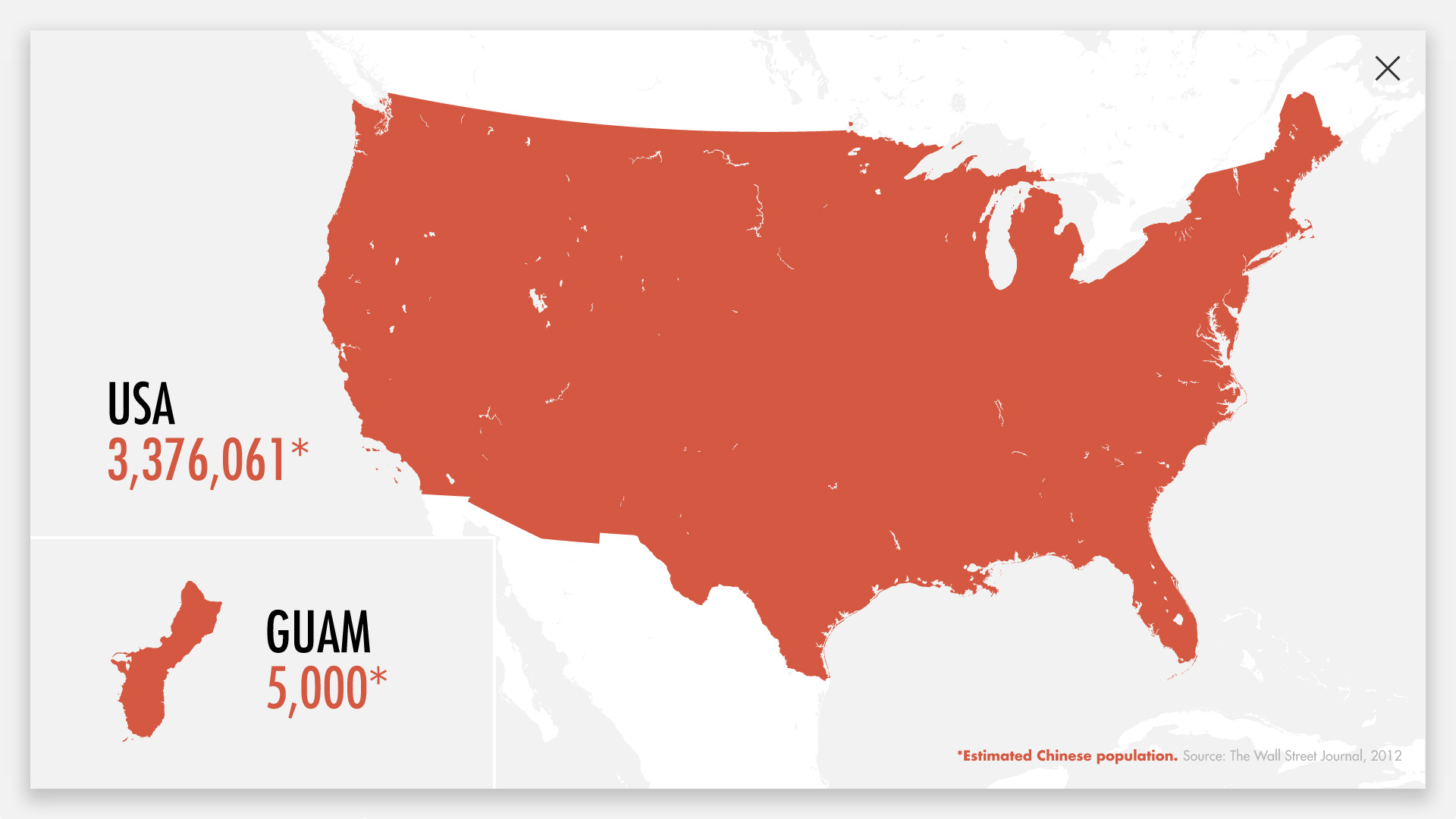
The interactive was built using HTML/CSS/JavaScript, with SVGs for the maps. It’s presented via a web browser in kiosk mode, running locally on a computer housed inside the wall.
This is the second map-based touchscreen in-gallery kiosk I’ve created for the Chinese American Museum Los Angeles. The first was Origins: Monterey Park, A Chinese American Suburb, focused on the community around LA.
The Chinese American Museum Los Angeles, housed in the oldest and last surviving structure of LA’s original Chinatown, is dedicated to the Chinese American experience and history in Southern California.