Responsive
California Missions microsite for The Huntington Library
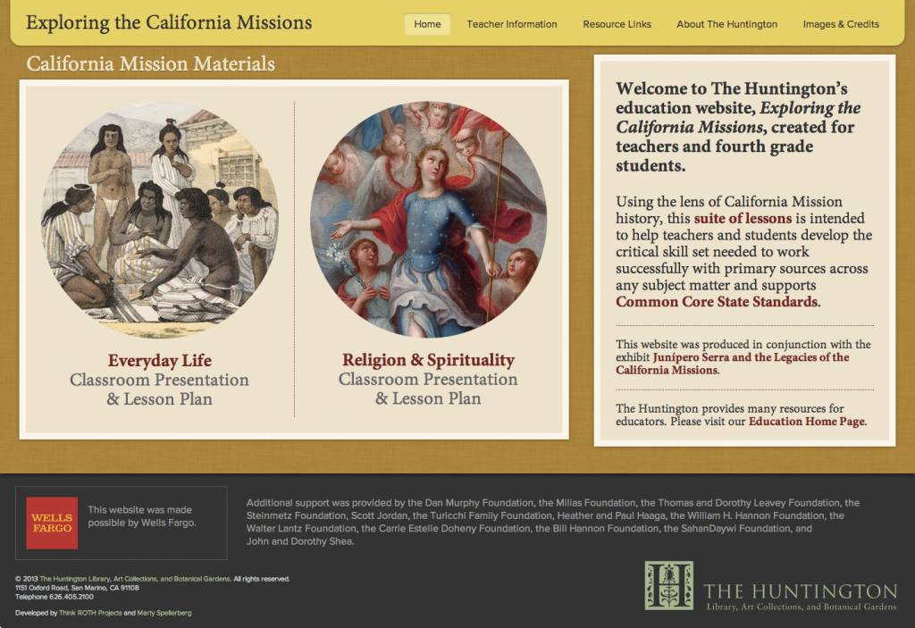
I’m happy to report the launch of Exploring the California Missions, a website I designed and developed for The Huntington Library, Art Collections, and Botanical Gardens.
Using the lens of California Mission history, Exploring the California Missions presents a suite of lessons intended to help teachers and fourth grade students develop the critical skills needed to work with primary sources. The website was produced in conjunction with the exhibit Junípero Serra and the Legacies of the California Missions.
Located in San Marino, California, The Huntington is a collections-based research and educational institution serving scholars and the general public.
The website is built on WordPress, with the classroom presentations presented using SlideShare. This project was created in association with Think ROTH Projects and in collaboration with a cross-departmental team from The Huntington.
Goshka Macuga microsites for the Museum of Contemporary Art Chicago
This post is a collaboration between Sarah Wambold and Marty Spellerberg. Sarah Wambold is a Denver-based project manager and documentary producer. Marty Spellerberg is an Austin-based interactive media designer/developer.
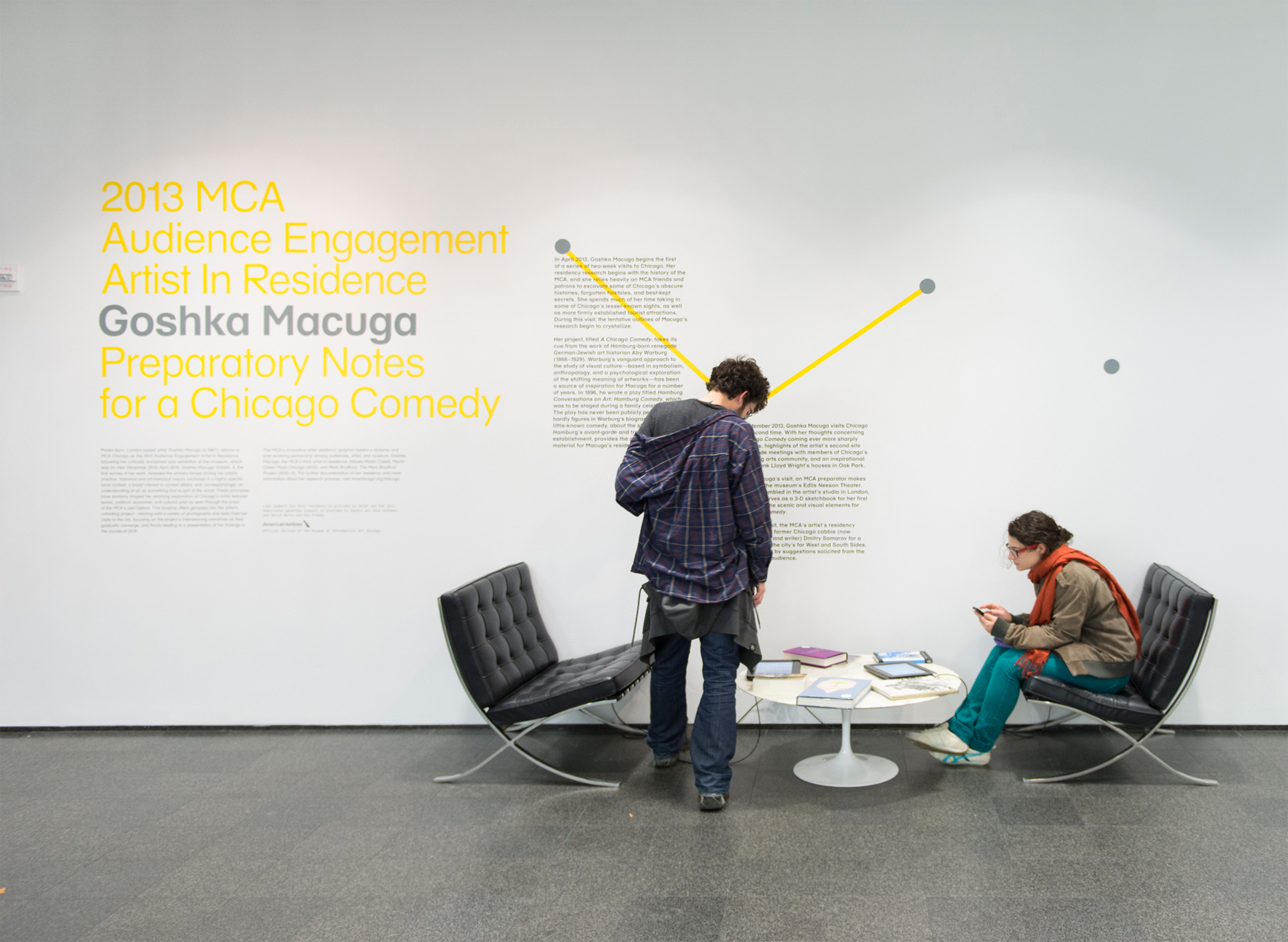
Goshka Macuga is the MCA Chicago’s 2013 Artist In Residence.
“Macuga’s work interweaves two strands that have helped define contemporary art in the last decade: artists’ increasing tendency toward historical and archival research and their growing interest in strategies of display and the dialogue between artistic and curatorial practice.”
— Dieter Roelstraete
Inspired by Hamburg Conversations on Art: Hamburg Comedy, a 1896 work German Jewish art historian Aby Warburg, Macuga’s residency project is to create a Chicago Comedy. But because the resulting work, likely to be a play, will not exist until the end of the term, the artist’s process is being documented and presented to the public as Preparatory Notes for a Chicago Comedy. Our team became involved as interactive media designers/developers.
With no artist on site—she’s in London—and no objects being produced in the early phases, how would museum visitors know there was, in fact, a residency taking place? We needed a physical manifestation or marker that would let the public know what was happening as it was happening.
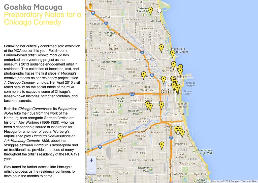
In-Gallery iPad Kiosk
The artist was opposed to creating a object or an installation “as a placeholder,” so digital, with its ability to present a depth of information in a physically economical and engaging way, emerged as the best candidate. iPads as part of a title wall installation became the solution for a physical, onsite manifestation of the residency.
Early in the year, Macuga was joined by MCA Curator Dieter Roelstraete for a romp around the city, seeking to “excavate Chicago’s lesser-known histories, forgotten folktales, and best-kept secrets.” The material they generated became the basis for our presentation.
Since the artist’s notes were organized around places she visited around the city, we chose an interactive map interface. This provided an instantly relevant format: Onsite visitors are, by definition, present in Chicago and likely to relate to a map of the city. This also served to emphasize the project’s connection and relevance to the local community, a goal of the Museum’s residency program generally.
The technical solution was based on the technique demonstrated in Marty’s Integrating WordPress and Google Maps tutorial, which he previously used to create an in-gallery kiosk for the Chinese American Museum, Los Angeles.
Museum Website
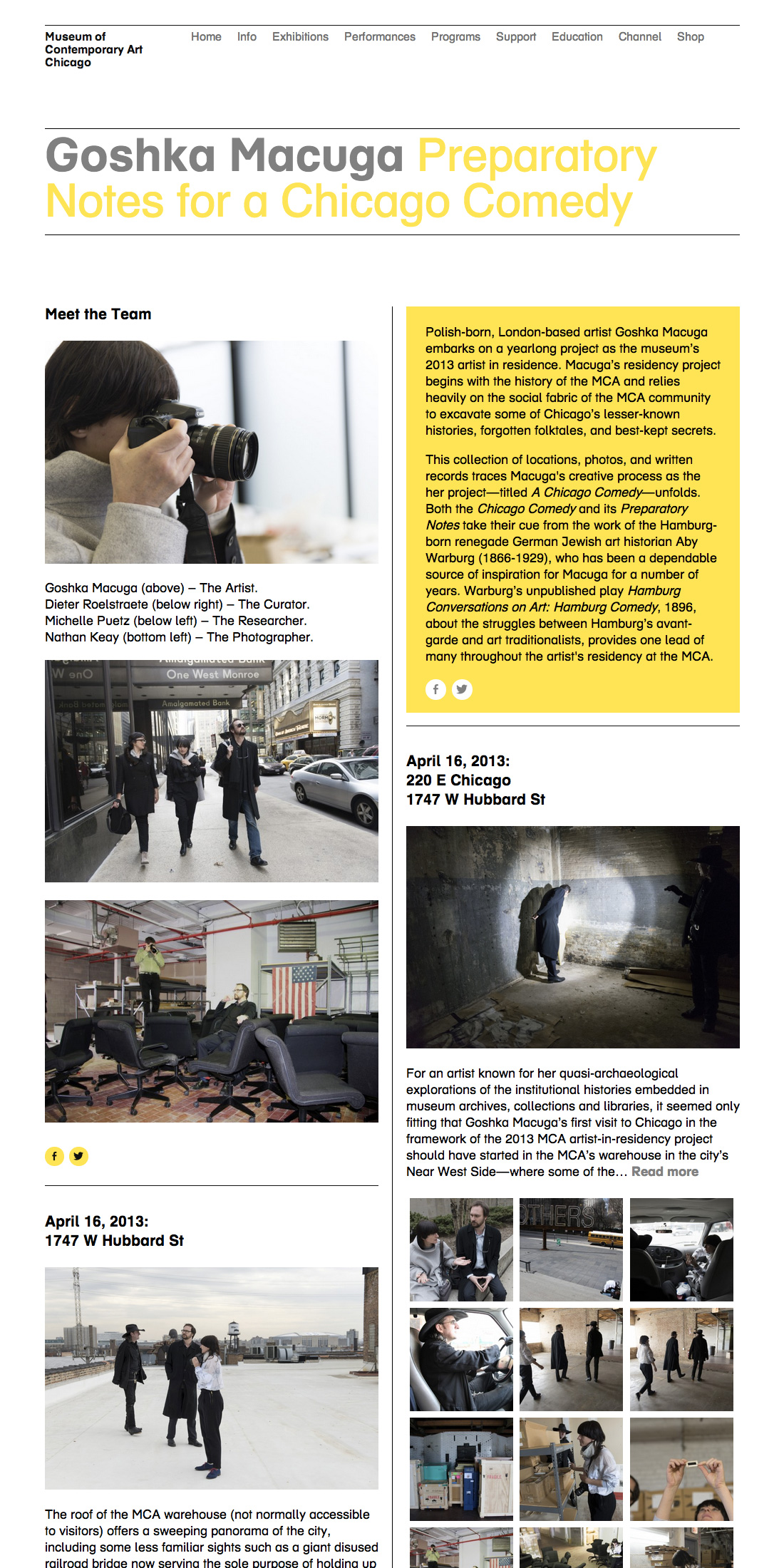
We also wanted to put something online that could live-on once the residency itself is completed. We realized, over several discussions with the curator, that Macuga’s work would find its form in phases: Lateral research of canvassing Chicago; vertical research of deep dives at the Warburg Institute; production, likely to happen abroad; and a to-be-determined final presentation. The digital strategy would need to respond to each of these.
We recognized that the map interface would be inadequate for telling the rest of the story of the residency; as Macuga moved from research-based activities, some happening abroad, and into production, using a map to navigate the content would no longer make sense.
The Museum had a history of stand-alone project blogs, and we made the choice to continue that format in this case. The first thing we did was to consolidate the most recent blogs under a unified banner and feed, which improved the prospects for long-term maintenance, as well as providing added context for future researchers. But we also wanted to provide a unique feel specific to the here-and-now, so we designed a two-column landing page using the Packery layout library.
The project was driven by a core creative concept that came into view over a period of time, as the artist’s process revealed the characteristics of the artwork she is creating. By adopting an agile design and development methodology, our team was able to respond to the changing needs for the project mid-course. The result was a compelling, revealing and engaging presentation for Museum visitors both onsite and online.
Project Collaborators
Digital Team
Producer and Project Manager: Sarah Wambold
Designer and Developer: Marty Spellerberg
Content Coordinator: Marian Oman
Residency Team
Project Manager: Erika Hanner
Curator: Dieter Roelstraete
Content Creators: Michelle Puetz, Dieter Roelstraete, and Goshka Macuga
Migrating the Museum of Contemporary Art Chicago Exhibitions Website to WordPress

Working with the Museum of Contemporary Art Chicago, we recently completed a redesign of the Exhibitions area of the Museum’s website. The project was a collaboration between Spellerberg Associates and staff at the MCA.
On the front-end, we implemented a mobile-responsive design reflecting a contemporary interpretation of the Museum’s established visual identity. We also addressed elements of the navigation convention that had proved inconsistent and unclear to users. On the back-end, we moved from legacy CodeIgniter-powered infrastructure to WordPress.
Working with a live website and content set, it was important that the project be completed with continuity of service and minimal disruption to content editors. With this in mind, we adopted an iterative approach, with the migration taking place in two stages. First we moved the individual exhibition pages, one by one; second we moved the category archive pages.
Migrating the Exhibition Records
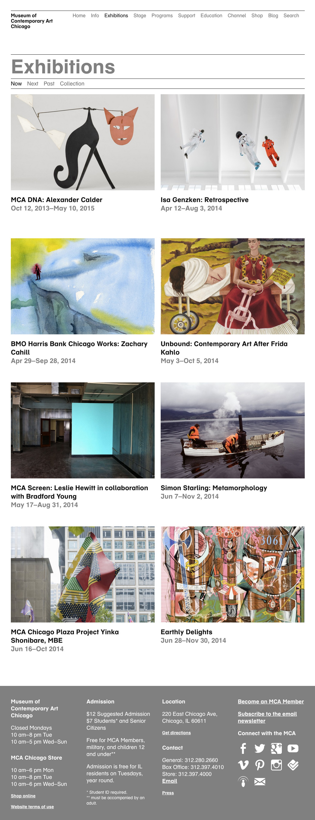
Exhibitions were created in WP as a custom post type. Knowing we had hundreds of records, we configured this type to be non-hierarchical, like Posts (hierarchical types, like Pages, run into performance problems with large sets). To match our data, three custom-field metaboxes were added the Edit screen: Start Date, End Date and Read Dates; other data was input into WP’s standard fields. Records were migrated manually, providing the opportunity to clean the content (remove dead links, etc) and update the accompanying images.
A “redirect” field was added to the legacy CodeIgniter CMS and was populated with the URL of the corresponding WordPress permalink. Using this data, the CodeIgniter templates redirected visitors from the legacy pages to the new, WordPress versions. In this way the migration was rolled-out incrementally, as records were completed.
Migrating the Exhibition Category Pages
Exhibition records were organized into a custom taxonomy called “Exhibition Categories,” which was used to generate the Past Exhibitions pages. During the first stage of the work, these taxonomy archives were redirected to the URLs of their CodeIgniter counterparts. Once the migration of the individual records was complete, the Exhibition Category templates were fully implemented and the redirect removed.
All exhibition records were filed in the appropriate “Past Exhibitions” category, even if the show had not yet completed. The taxonomy archive templates then used the Exhibition’s “End Date” custom field to filter out current and upcoming shows, displaying only those that had closed.
The last element was the Current and Upcoming Exhibitions pages. These were created as WordPress Pages containing custom loops which look up and display exhibitions with the appropriate Start and End Date custom fields. Here’s an example of the WordPress code:
The CodeIgniter versions of these pages were then redirected to their WP counterparts, completing the migration.
Project Team
Marty Spellerberg, Principal, Spellerberg Associates
Sarah Wambold, Former Director of Digital Media, Museum of Contemporary Art Chicago
Marian Oman, Content Coordinator, Spellerberg Associates
Shauna Skalitzky, Assistant Editor, Museum of Contemporary Art Chicago
Designing a Visitor-Centric, Mobile-First Homepage for the Santa Cruz Museum of Art & History

We’re excited to have launched a new homepage for the Santa Cruz Museum of Art And History! It’s the fruit of a year of development, analytics and design.
Led by Executive Director Nina Simon, the Santa Cruz Museum of Art & History is a participatory museum. Its mission is to ignite shared experiences and unexpected connections and, when we’re successful, our work helps build a stronger, more connected community. We start with the people and work back to the museum; everything from our programming to communications is premised on an understanding of our communities’ needs. So in redesigning our homepage we asked, “how can we use knowledge of our visitor’s motivations to deliver a focused, user-focused mobile web experience?”
Research
In Mobile First, Luke Wroblewski wrote, “websites and applications should be designed and built for mobile first … the end result is an experience focused on the key tasks users want to accomplish.” To identify these key tasks, we began by focusing on the motivations of our visitors.
In his book Identity and the Museum Visitor Experience, John Falk outlined a predictive model of visitor experience designed to help museum professionals better meet their visitors’ needs. Through research with dozens of museums and thousands of visitors, Falk established his predictive model of visitor experience. While this work is now widely shared expertise in the field, most of the suggestions apply to facility and exhibition design. We took it to the web.
Falk’s framework identifies museum visitor motivations as:
- Experience Seeker
- Explorer
- Socializer
- Recharger
- Hobbyist / Professional
We applied this research to our homepage redesign project, adjusting the visitor archetypes to fit our local audience. We created fleshed-out personas that included descriptions of how each intrinsic motivation tracks to museum programming and engagement opportunities; and what kinds of messaging and imagery they may positively respond to.
Design
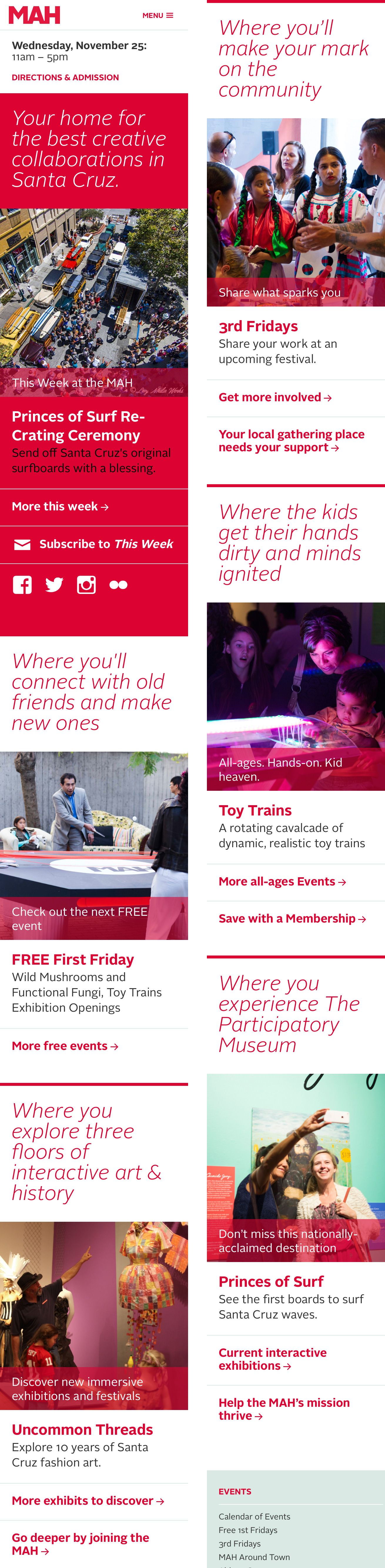
We mapped each motivation to an area on the new homepage. Each block contains a set of elements — a tagline, an image, an activity and a couple of links — that are populated with content tailored specifically to the motivation. This means that our choice of what events and activities to feature are driven by appeals to specific segments of our audience. But we also wanted to ensure support for the Museum’s broader marketing priorities, so included a “This Week at the MAH” block at the very top.
The previous website design was more scattered, event-heavy, and encouraged “click on what you know” rather than exploration. We hope that this new design will push fresh content specifically curated for each identity, encouraging a broader understanding of how visitors can engage with the MAH.
We’ll be closely watching the analytics to see how visitors are now using the site’s homepage.
Team
This project was a collaboration between Marty Spellerberg, principal at Spellerberg Projects; and Elise Granata, marketing and engagement coordinator at the MAH. Thank you also to Joe Costello for usability contributions; and to Ahree Lee for persona consultation.