Santa Cruz MAH
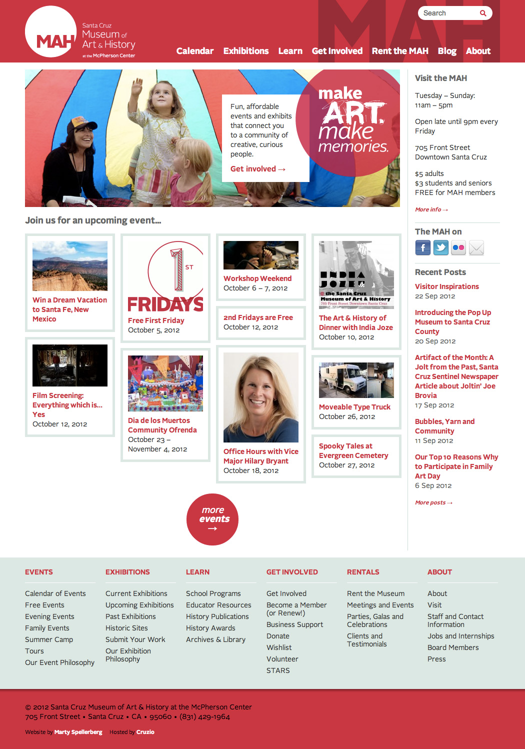
Website redesign for the Santa Cruz Museum of Art & History
Like many of my museum colleagues, I’m a big fan of Nina Simon’s blog, Museum 2.0. When the Santa Cruz Museum of Art & History, of which she is the director, needed a new website, I jumped at the opportunity. Simon praised my work, saying,
“Marty is everything I could have wanted from a designer — he overdelivered on my vague directives and pushed me to think more rigorously about what we were trying to do.”
The project was a full website redesign and redevelopment. We migrated from a legacy CMS to WordPress, added new content and functionality, and redesigned to match the MAH’s new visual identity.
Membership microsite for the Santa Cruz Museum of Art & History
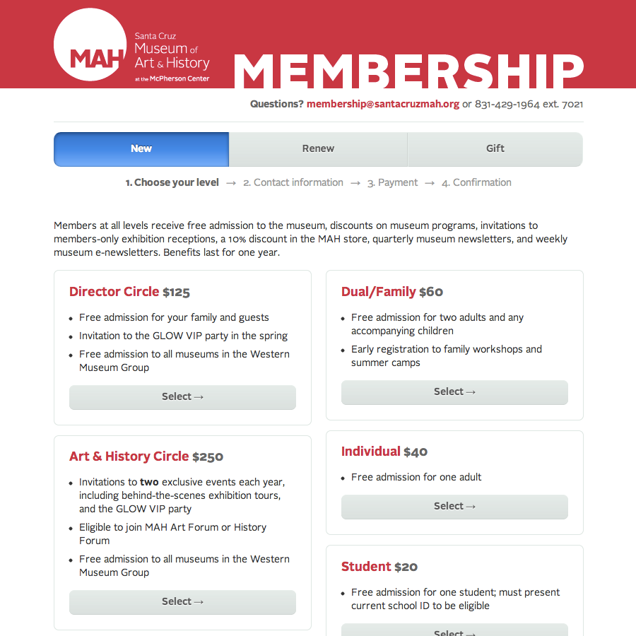
I’ve been working with the Santa Cruz Museum of Art & History to develop a series of low-tech, low-cost strategies and systems to track, celebrate, and act on personal interactions with visitors.
“Like many small museums, the MAH cannot afford expensive ticketing or membership software systems,” says Executive Director Nina Simon. “We have very high ability to form relationships with visitors, but low ability to capitalize on those interactions.”
One of the initiatives we’ve undertaken to address this discrepancy was the creation a new online membership storefront that integrates with the Museum’s website, other membership materials, and philosophy. I designed and developed the site in close collaboration with Museum staff, beginning with a visit to the MAH.
“We were fortunate to have Marty in our office as we outlined how the site would look and function, and he literally cut and collaged together our existing printed membership materials to build an online system that looked and felt the same as our existing paper system. He’s created a less daunting transition for our members, who are accustomed to those materials.”
— Karen Bush, Membership Director
Located in downtown Santa Cruz, California, The Santa Cruz Museum of Art & History is a community-centered origination whose vision is to become a thriving, central gathering place where local residents and visitors have the opportunity to experience art, history, ideas, and culture.
The website is built on WordPress, using the Gravity Forms plugin.
Website for the Santa Cruz MAH’s Pop Up Museum
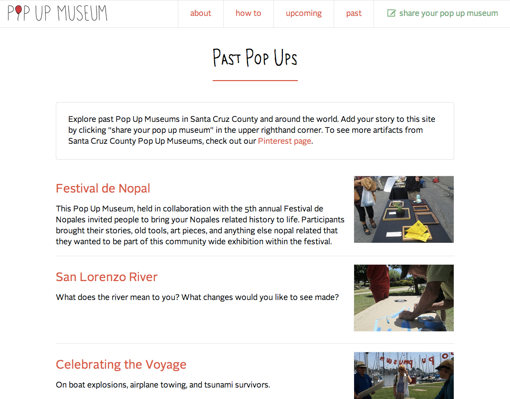
A Pop Up Museum is a of temporary exhibit created by the people who show up to participate. It works by choosing a theme and venue and then inviting people to bring an object on-topic to share. The Santa Cruz Museum of Art & History hosts Pop Up Museums throughout Santa Cruz County in partnership with community organizations, businesses, and schools.
Website designed and developed by Marty Spellerberg. Lettering, logo and illustrations by Iris Gottlieb.
Conference microsite and archive for the Santa Cruz MAH’s Museum Camp
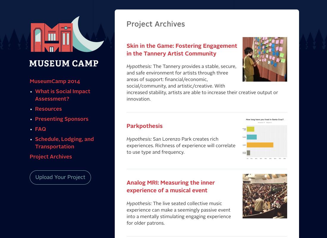
Museum Camp is an annual conference produced by the Santa Cruz Museum of Art & History. The format is similar to a hack-a-thon: Participants have 72 hours to work on a project consistent with a theme. This year’s theme was “Social Impact Assessment” and involved conducting research projects based on different locations around Santa Cruz.
Since Museum Camp is something that will recur each year, we decided to build a home for the camp separate from the main Museum website. As well as moving over the camp literature, we developed a portion of the site which allows participants to post documentation their projects to share with their peers and future researchers.
The Museum Camp logo was designed by Andrew McBride.
Redesigned website navigation for the Santa Cruz MAH
I recently redesigned the top-navigation of the Santa Cruz Museum of Art and History’s website. Working closely with Museum staff, I simplified the nav and introduced a modern, mobile-responsive interface pattern.
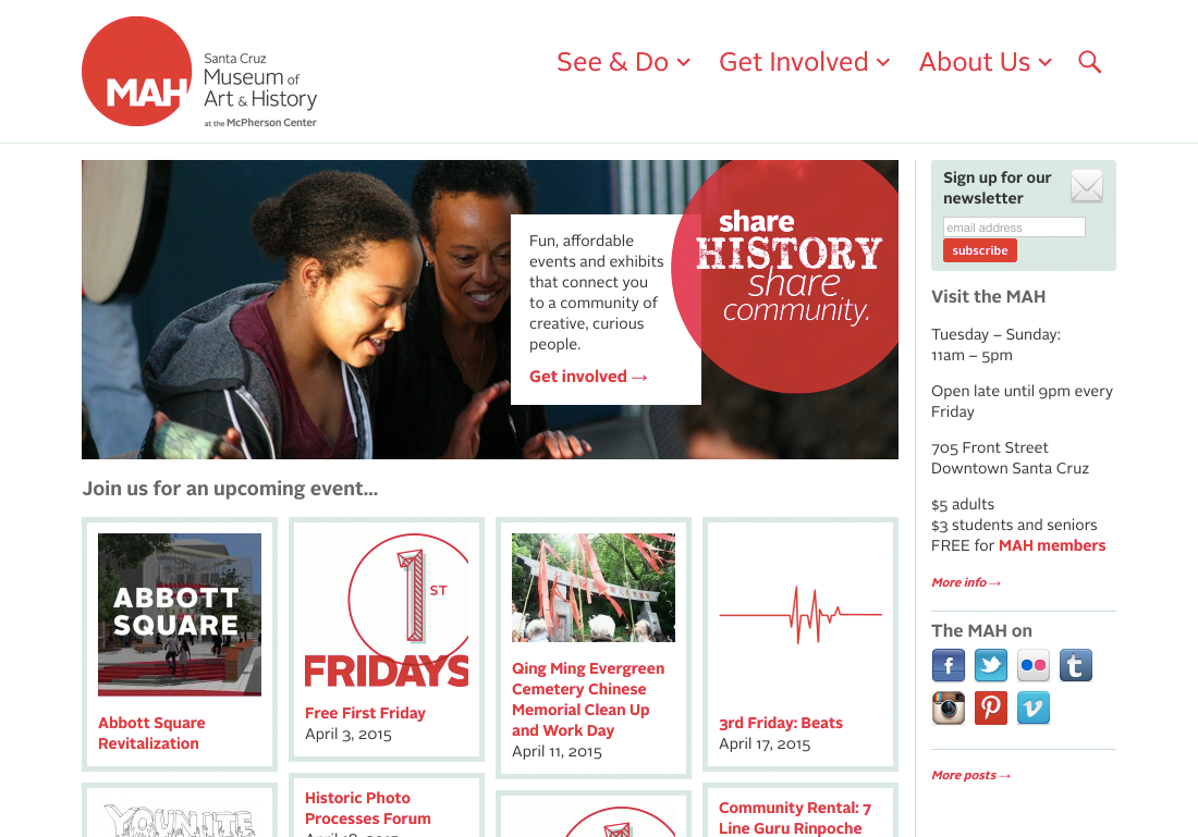
The MAH is about engagement. The Museum is fulfilling its mission when it’s “bringing people together around art and history.” The seed of this navigation change began with a conversation about opportunities to better accomplish that mission using the website.
The design at that time included seven top-level links — Calendar, Exhibitions, Learn, Get Involved, Rent the MAH, Blog and About. We realized that this fairly typical collection of links didn’t signal to visitors how central getting involved was to the MAH experience.
Now, by reducing that down to three — See & Do, Get Involved and About — we’re more clearly communicating to visitors the Museum’s character and priorities.
Also, the web has changed since the site’s last redesign. Mobile apps and responsive web design have introduced a slew of new interaction patterns. While the site has not yet been converted to responsive (a project that’s currently in-progress), we used a mobile-inspired interaction pattern for the second-level links.
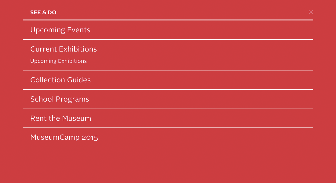
Whereas the old design used a drop-down style commonly cribbed from desktop menus, for this design clicking/tapping each of the top-level items triggers a full-screen shade.
And rather than listing the second-level links horizontally, we’ve stacked them vertically. This reduces line-length-imposed character limitations, allowing the Museum the flexibility to include as many items as they need in each shade, each with as many words as is needed for effective communication.
Project team
- Marty Spellerberg, Designer/Developer for Spellerberg Associates
- Elise Granata, Marketing & Engagement Coordinator for the Santa Cruz MAH
MuseumCamp 2015

MuesumCamp this year was amazing! Kudos to Nina Simon, Beck Trench and the team of organizers for crafting such a well-thought-out experience enabling 100+ of us to work through ideas of space and community.
I experienced Camp as a giant, time-and-space-constrained act of collaborative creation, the result of which will be a deck of “space making” exercise cards. But the deck is just a byproduct; the real accomplishment was the format of the event itself. It was an awe-inspiring feat of facilitation, scattering talks and workshops in between bursts of team collaboration, bonding opportunities and alone time.
The theme was “space”, in all the ways that can be interpreted. Emphasis was on making space for others, and claiming space for oneself and one’s community. The attendees came from such diverse backgrounds that I was able to have both conversations premised on commonalities (“I know, right?”) and difference (“I’ve never thought about that before”).
For me, there were two moments that really stood out. One was learning of the experience of a group of Filipino youth in SF, striving for life, liberty and punk rock in the face of societal alienation, peer violence and gentrification. It opened my mind to communities that might exist in my own neighborhood. The other was an impromptu opportunity to rehearse the seminal Fluxus happening Kicking a Guitar Around the Block, which drew a spontaneous audience murmuring, “oh they’re making art!”
After camp, I stayed on in Santa Cruz for a few days with MAH staff and nights with the community at the top of Mystery Spot Rd. Being among those beautiful people was an energizing experience, and I love them deeply.
Designing a Visitor-Centric, Mobile-First Homepage for the Santa Cruz Museum of Art & History

We’re excited to have launched a new homepage for the Santa Cruz Museum of Art And History! It’s the fruit of a year of development, analytics and design.
Led by Executive Director Nina Simon, the Santa Cruz Museum of Art & History is a participatory museum. Its mission is to ignite shared experiences and unexpected connections and, when we’re successful, our work helps build a stronger, more connected community. We start with the people and work back to the museum; everything from our programming to communications is premised on an understanding of our communities’ needs. So in redesigning our homepage we asked, “how can we use knowledge of our visitor’s motivations to deliver a focused, user-focused mobile web experience?”
Research
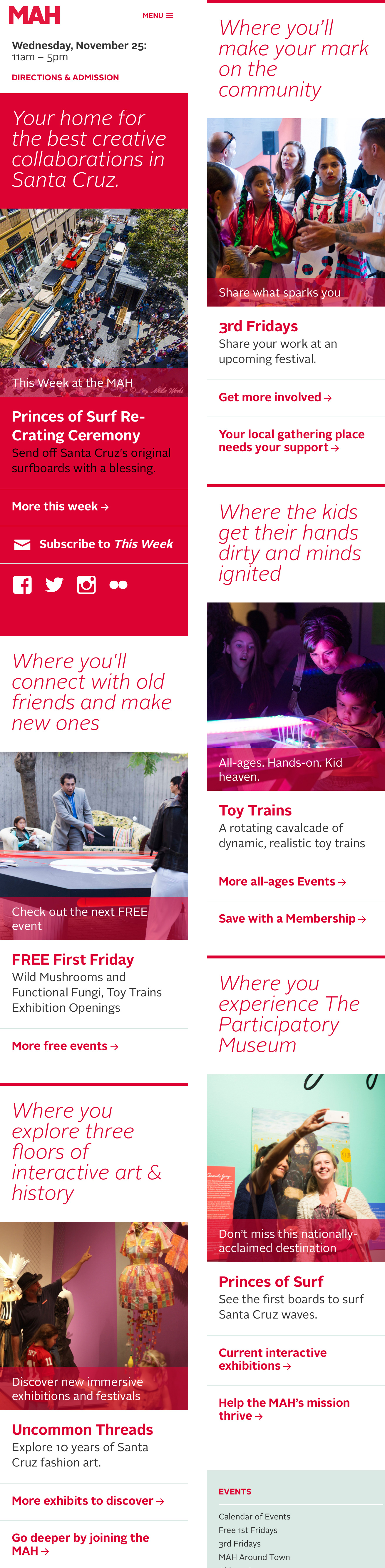
In Mobile First, Luke Wroblewski wrote, “websites and applications should be designed and built for mobile first … the end result is an experience focused on the key tasks users want to accomplish.” To identify these key tasks, we began by focusing on the motivations of our visitors.
In his book Identity and the Museum Visitor Experience, John Falk outlined a predictive model of visitor experience designed to help museum professionals better meet their visitors’ needs. Through research with dozens of museums and thousands of visitors, Falk established his predictive model of visitor experience. While this work is now widely shared expertise in the field, most of the suggestions apply to facility and exhibition design. We took it to the web.
Falk’s framework identifies museum visitor motivations as:
- Experience Seeker
- Explorer
- Socializer
- Recharger
- Hobbyist / Professional
We applied this research to our homepage redesign project, adjusting the visitor archetypes to fit our local audience. We created fleshed-out personas that included descriptions of how each intrinsic motivation tracks to museum programming and engagement opportunities; and what kinds of messaging and imagery they may positively respond to.
Design
We mapped each motivation to an area on the new homepage. Each block contains a set of elements — a tagline, an image, an activity and a couple of links — that are populated with content tailored specifically to the motivation. This means that our choice of what events and activities to feature are driven by appeals to specific segments of our audience. But we also wanted to ensure support for the Museum’s broader marketing priorities, so included a “This Week at the MAH” block at the very top.
The previous website design was more scattered, event-heavy, and encouraged “click on what you know” rather than exploration. We hope that this new design will push fresh content specifically curated for each identity, encouraging a broader understanding of how visitors can engage with the MAH.
We’ll be closely watching the analytics to see how visitors are now using the site’s homepage.
Team
This project was a collaboration between Marty Spellerberg, principal at Spellerberg Projects; and Elise Granata, marketing and engagement coordinator at the MAH. Thank you also to Joe Costello for usability contributions; and to Ahree Lee for persona consultation.
Membership microsite refresh for the Santa Cruz Museum of Art and History
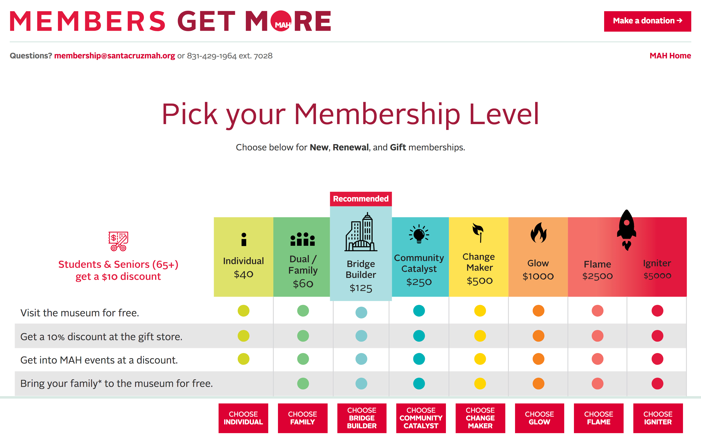
As part of our ongoing work with The Santa Cruz MAH, we recently refreshed the microsite used for membership renewals. The site is build on WordPress and Gravity Forms, with various plugins providing functionality including those from For Gravity, gravity+ and Gravity Wiz.