Websites
Page 5 of 5
WordPress development for Clockshop

Clockshop is an arts organization in Los Angeles, working “at the intersection of politics, urban space, and cultural production to explore the forces that shape our lived environment.” They do a lot of site-specific programming involving locations and communities in the city.
I recently had the opportunity to collaborate with them on their website. They were happy with the visual style of their site, originally designed by Nicole Rodarte, but had found their programming archive had outgrown the handful of static HTML pages they were serving. So we moved the site over to WordPress and iterated on their information architecture. The new platform presents site visitors with a better understanding of Clockshop’s work, and provides the room they need for what promises to be an exciting year of programming growth.
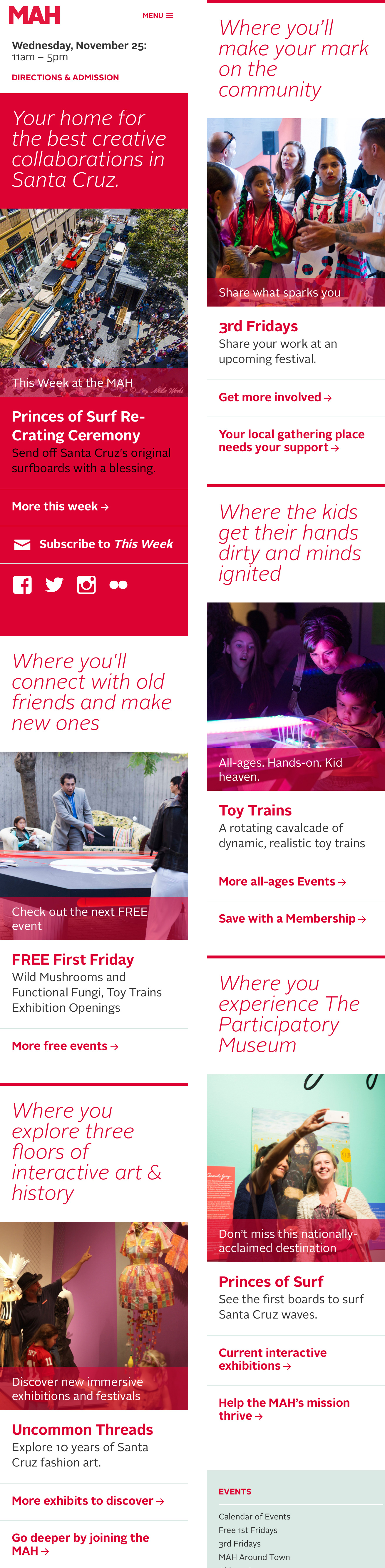
Designing a Visitor-Centric, Mobile-First Homepage for the Santa Cruz Museum of Art & History

We’re excited to have launched a new homepage for the Santa Cruz Museum of Art And History! It’s the fruit of a year of development, analytics and design.
Led by Executive Director Nina Simon, the Santa Cruz Museum of Art & History is a participatory museum. Its mission is to ignite shared experiences and unexpected connections and, when we’re successful, our work helps build a stronger, more connected community. We start with the people and work back to the museum; everything from our programming to communications is premised on an understanding of our communities’ needs. So in redesigning our homepage we asked, “how can we use knowledge of our visitor’s motivations to deliver a focused, user-focused mobile web experience?”
Research
In Mobile First, Luke Wroblewski wrote, “websites and applications should be designed and built for mobile first … the end result is an experience focused on the key tasks users want to accomplish.” To identify these key tasks, we began by focusing on the motivations of our visitors.
In his book Identity and the Museum Visitor Experience, John Falk outlined a predictive model of visitor experience designed to help museum professionals better meet their visitors’ needs. Through research with dozens of museums and thousands of visitors, Falk established his predictive model of visitor experience. While this work is now widely shared expertise in the field, most of the suggestions apply to facility and exhibition design. We took it to the web.
Falk’s framework identifies museum visitor motivations as:
- Experience Seeker
- Explorer
- Socializer
- Recharger
- Hobbyist / Professional
We applied this research to our homepage redesign project, adjusting the visitor archetypes to fit our local audience. We created fleshed-out personas that included descriptions of how each intrinsic motivation tracks to museum programming and engagement opportunities; and what kinds of messaging and imagery they may positively respond to.
Design
We mapped each motivation to an area on the new homepage. Each block contains a set of elements — a tagline, an image, an activity and a couple of links — that are populated with content tailored specifically to the motivation. This means that our choice of what events and activities to feature are driven by appeals to specific segments of our audience. But we also wanted to ensure support for the Museum’s broader marketing priorities, so included a “This Week at the MAH” block at the very top.
The previous website design was more scattered, event-heavy, and encouraged “click on what you know” rather than exploration. We hope that this new design will push fresh content specifically curated for each identity, encouraging a broader understanding of how visitors can engage with the MAH.
We’ll be closely watching the analytics to see how visitors are now using the site’s homepage.
Team
This project was a collaboration between Marty Spellerberg, principal at Spellerberg Projects; and Elise Granata, marketing and engagement coordinator at the MAH. Thank you also to Joe Costello for usability contributions; and to Ahree Lee for persona consultation.
Introducing the National Museum Website Visitor Motivation Survey
I’m leading, with collaborator Sarah Wambold, a nationwide study into the motivation of visitors to museum websites. As of this writing we have 22 participating institutions, including representatives in Canada and Australia.

Background
Google Analytics is a powerful tool in understanding traffic to a website, but site statistics alone do not always tell the full story. A combination of techniques is necessary to gain insight into why visitors come to a museum’s website, which are more likely to return, and how different types of visitors consume the content they find there. One such technique is a Visitor Motivation Survey (VMS), such as the one presented at MW 2012 by the Indianapolis Museum of Art. Using their method, online visitors are presented with a one-question survey that asks them to specify why they’ve come to the website that day. Custom variables are used to track responses in Google Analytics. This allows site traffic to be segmented by responses, thereby allowing site activity to be tracked by motivational category. Sarah and I conducted a survey of this kind for the MCA Chicago in 2014.
In his book Identity and the Museum Visitor Experience, researcher John Falk outlined a predictive model of visitor experience designed to help museum professionals better meet their visitors’ needs. Drawing upon a career studying museum visitors, he identified five key types of visitors who attend museums and the internal motivations that drive repeat visitation: Experience Seeker; Explorer; Socializer; Recharger; Hobbyist / Professional. (I’ve previously made use of Falk’s framework in the redesign of the Santa Cruz MAH’s homepage.)
A Wide Survey
Our project is simultaneously surveying a myriad of museum websites, pairing an IMA-style Google Analytics-powered backend with segments adapted from Falk’s motivation framework. Since the IMA’s 2012 presentation, studies following IMA’s methodology have been reproduced at various institutions. In addition to the use of Falk, our project is distinct in that it looks at the data in aggregate and provides representatives from participating museums the opportunity to discuss their findings, highlighting patterns that emerge across the various institutions. In seeking to identify trends across the sector, we hope to identify best practices for each motivation and enable participants gain an understanding the similarities and differences in their audiences. Participating institutions include:
- Art21
- Art Gallery of Ontario
- Aspen Art Museum
- Chicago Architecture Foundation
- Chinese American Museum Los Angeles
- Clockshop
- Clyfford Still Museum
- Contemporary Art Museum St. Louis
- de Young Museum (soon to be launched)
- Hammer Museum (soon to be launched)
- Houston Center for Contemporary Craft (soon to be launched)
- Institute of Contemporary Art/Boston
- Illinois Holocaust Museum
- The Menil Collection
- Santa Cruz Museum of Art and History
- Museum of Contemporary Art Denver
- Nasher Museum of Art at Duke University
- Nasher Sculpture Center
- Portland Art Museum
- Powerhouse Museum
- Warhol Museum
- Yerba Buena Center for the Arts
Cross-Platform Roll-out
I developed the survey’s implementation, consisting of HTML, CSS and JS files that together create a user interface for the VMS. Along with supporting documents, I packaged the sample code as a WordPress plugin, which was posted to a GitHub repo for easy access by developers at the various institutions. This was soon joined by a Drupal 7 adaptation, put together by Chris Brown of the Yerba Buena Center for the Arts and further modified by Andrew Fox at the Fine Arts Museums of San Francisco.
The initial batch of institutions rolled-out the survey in November and December of 2015. Additional institutions continue to join the survey and come online.
Online Professional Forum
As we enter the analysis phase of the project, we’re hosting an online forum for participants via Slack. This is where we share important project information and training and, most critically, it’s where representatives make connections with their counterparts at other institutions, discuss objectives, and share results.
As results are developed in the forum we’ll be taking advantage of opportunities to share our learnings and insights with the broader sector. Stay tuned!
Web development for architecture blog Common Edge

Founded by Martin C. Pedersen and Steven Bingler, Common Edge is a non-profit organization dedicated to “reconnecting architecture and design with the public that it’s meant to serve.” The website features essays, interviews and commentary by architects and thinkers in the field.
The website was designed by Nikki Chung and Dungjai Pungauthaikan of Once-Future Office, and developed by yours truly.
Web development for Joel Sanders Architecture

Led by Principal Joel Sanders, JSA “creates innovative and sustainable environments in response to today’s rapidly changing culture.” Sanders is a Professor of Architecture at Yale University and former Director of the Graduate Program in Architecture at Parsons School of Design.
The site was designed by Everything Type Company and developed by yours truly.
Web development for artist Mel Chin’s The Tie That Binds

I’m happy to have launched the website for artist Mel Chin’s land art project, The Tie That Binds, part of CURRENT:LA Water, Los Angeles’s inaugural public art biennial.
Originally from Houston Texas, Mel Chin is known for works that require multi-disciplinary, collaborative teamwork that conjoin cross-cultural aesthetics with complex ideas.
The Tie That Binds begins at an 18-acre post-industrial lot along the LA River known as the Bowtie . Visitors, who are guided through eight unique, drought-resistant sample gardens, can then commit to creating a mirror garden in their own yard. Participants receive a blueprint for one of the 512 different designs and instructions on how to plant, establish, and maintain their mirror garden. The newly planted gardens in yards all over the city are meant to reflect a future drought-resistant, collective landscape for LA.
Our team worked closely with Mr. Chin to determine the website’s direction, establishing that its primary purpose would be to drive public visitation to the Bowtie (rather than, say, serve as a “catalogue” or archive). The website, along with the project’s identity and graphic materials, was designed by LA-based designer Tom Kracauer; I provided WordPress and mobile-responsive front-end development; and Amanda Wiles, of Mel Chin Studio, handles maintenance of content.
Thank you to the project team for a great experience; and thanks also to LA arts organization Clockshop for putting us all together!
Check out The Tie That Binds.
Membership microsite refresh for the Santa Cruz Museum of Art and History
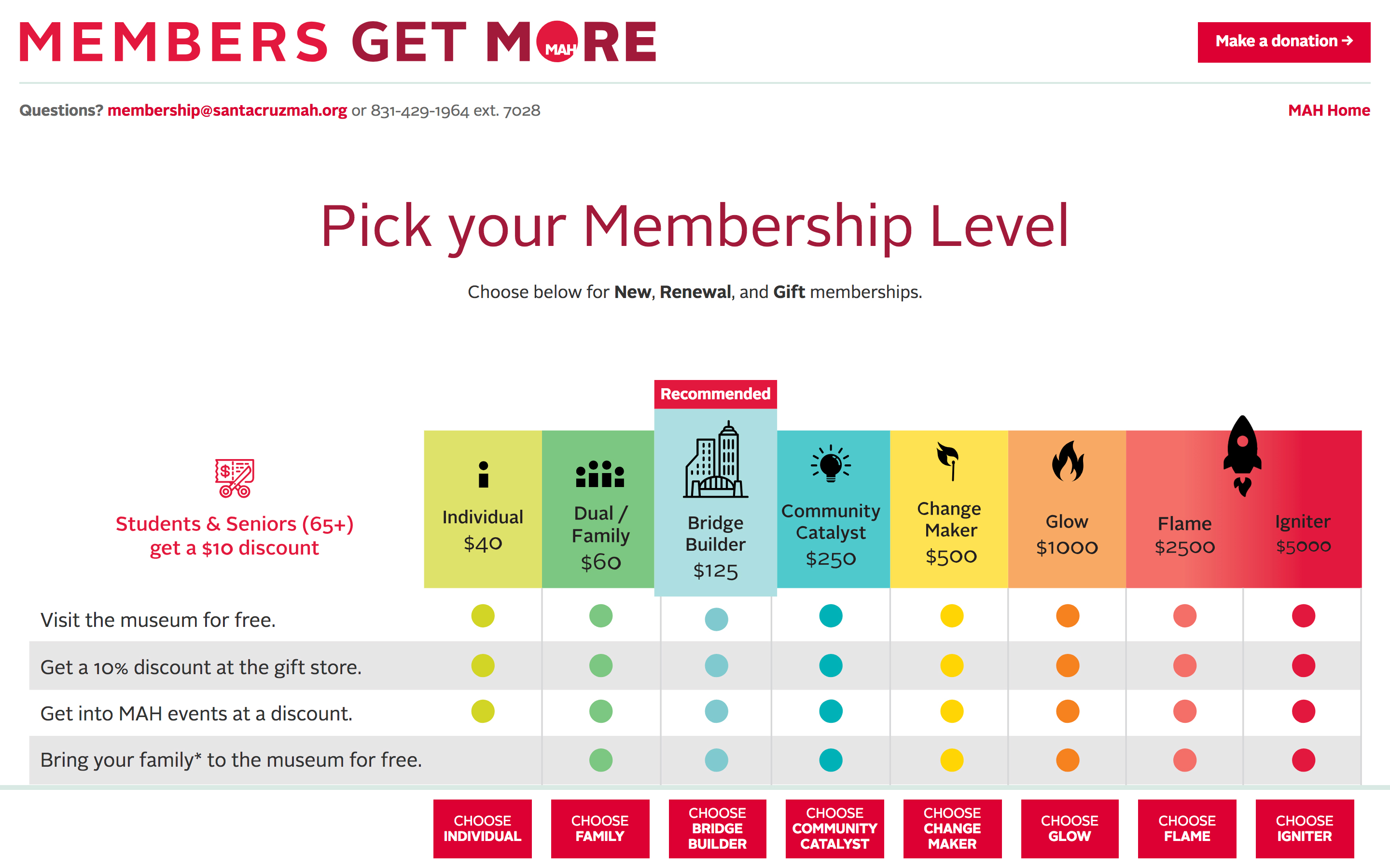
As part of our ongoing work with The Santa Cruz MAH, we recently refreshed the microsite used for membership renewals. The site is build on WordPress and Gravity Forms, with various plugins providing functionality including those from For Gravity, gravity+ and Gravity Wiz.
Bringing Warhol to Life Online: Strategy, Design, and Accessibility for warhol.org
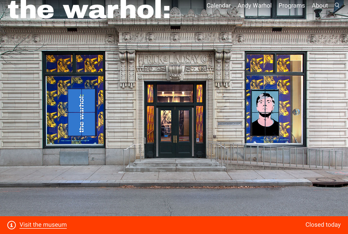
We worked The Andy Warhol Museum, conducting a comprehensive overhaul of warhol.org. Launched in May 2017, The redesign included migrating the backend to WordPress, redesigning the frontend, establishing a content strategy, implementing a new information architecture, and auditing and rewriting all text and images.
The new warhol.org is conceived primarily as a communications tool for audiences planning to visit the museum or attend a program, with a secondary goal of providing much sought-after content on Warhol to digital visitors across the globe.The mobile-first design relies on bright colors, expressive typography, and images of visitors engaged in art making and art viewing. The homepage has been reimagined to highlight the unique, active experience of being at The Warhol: as a visitor, you can make art in our Factory studio, play with floating pillow-shaped balloons in the Silver Clouds installation, or star in your very own screen test. The new site is also highlights the rich work and life of Andy Warhol. Our Life page, for example, tells Warhol’s story as illustrated through collection objects.
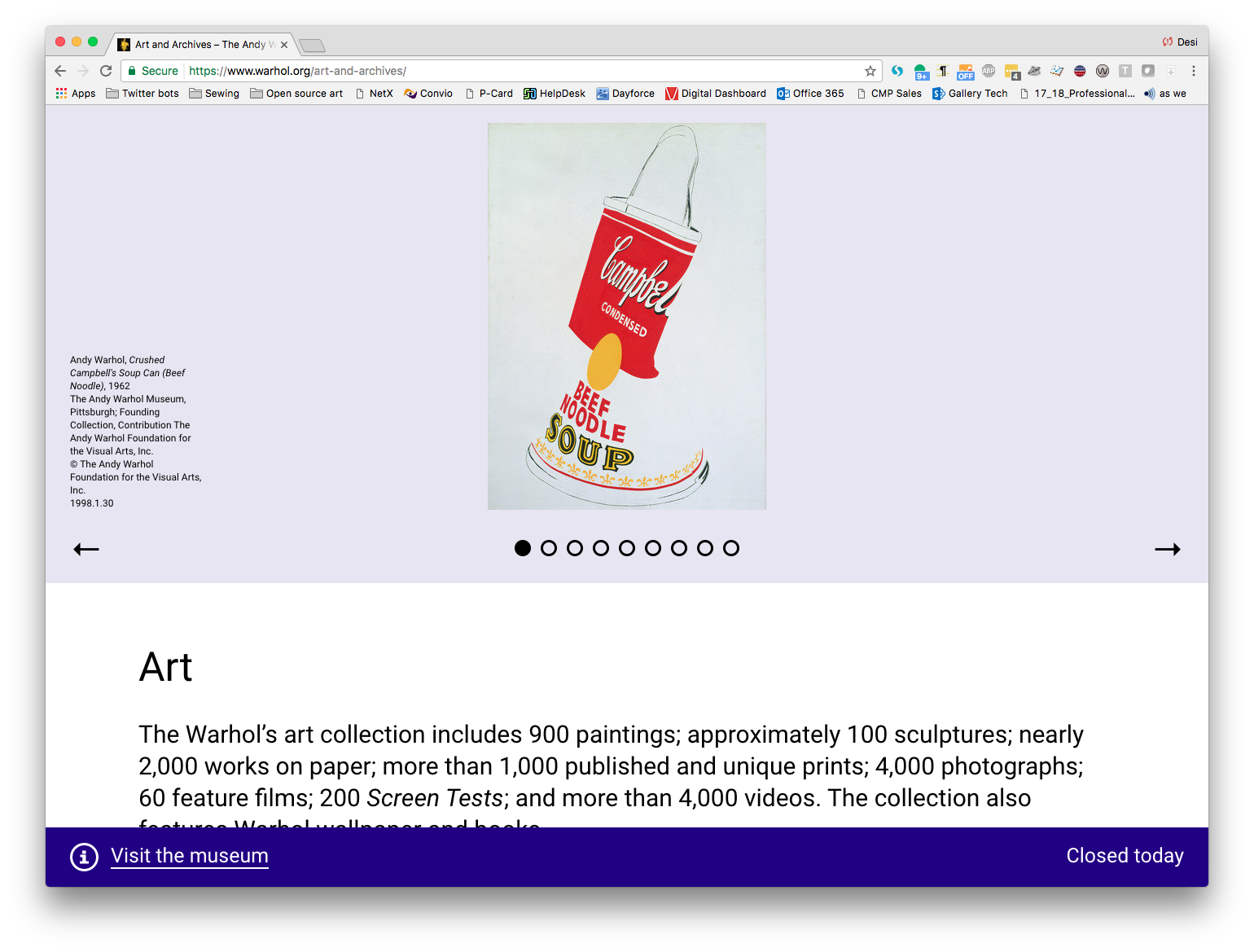
The content strategy for the The Warhol’s website redesign was informed by the Visitor Motivation Survey that the museum participated in a year prior. Through this research, the staff at the Warhol Museum decided to prioritize local and tourist audiences planning a visit, focussing on the website as a communications tool first and foremost.
Working with staff at the museum, we developed detailed user personas, completed card sort activities, and created journey maps to facilitate a new approach to the information architecture for the site. The result is a website that speaks clearly and directly to audiences looking to engage with the museum through a visit or a program.
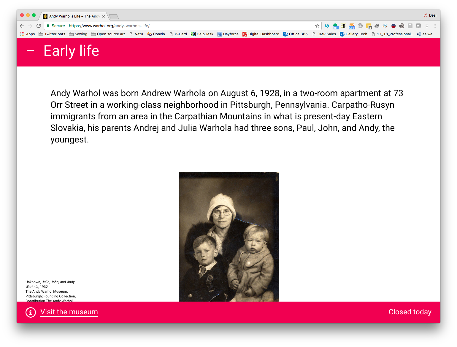
We worked with Prime Access Consulting, led by Sina Bahram, president, to make warhol.org accessible to users with a wide range of abilities and preferences. The site achieves WCAG (Web Content Accessibility Guidelines) 2.0 AA compliance and improves the web experience for visitors across a spectrum of abilities, including those who are deaf or hard of hearing; interact with the site via only keyboard or mouse due to limited mobility/motor control; people who are blind or have low vision and use a screen reader or employ zoom tools to enlarge the page; and users with cognitive disabilities.
Desi González, who was then The Warhol’s Manager of Digital Engagement, served as project manager and user experience lead, leading a core team that included Danielle Linzer and Jessica Warchall; and working with staff across the museum to redesign the site. We brought on Everything Type Company as our design partner. Zack Rothauser, Andrea Skeries and Daniel Abernathy contributed development. Sarah Wambold contributed to the content strategy.
From Physical to Digital: Creating ‘At Home’ Experiences and Virtual Programming
The pandemic of 2020 presented an unprecedented challenge for cultural institutions. We’ve been with with our clients every step of the way, creating projects that run the gamut of adaptations undertaken by the industry. We built “At Home” sections, designed and developed virtual events, and made a bring-your-own-device web app. Additionally, we led a cross-institutional survey to gain a unique insight into museum websites’ changing roles.
Cross-institutional Survey of the Effects of Shelter-in-place on Museum Website Visitation
As soon as authorities in the United States began announcing shelter-in-place orders, we recognized the importance of documenting museums’ responses to the pandemic. Drawing on our experience running the National Museum Website Visitor Motivation Survey, we acted quickly to spin-up a COVID-19 study.

Institutions participating in the COVID-19 survey
Our widely-cast call-for-participants led twenty institutions to sign-on. We collected quantitative data from Google Analytics and conducted qualitative interviews. By analyzing this data, we have gained insight into how visitor behavior has changed and how museums have responded.
We are now sharing our findings with participants and at industry conferences. Read about our presentation at MCN 2020.
“At Home” Sections
Museums strove to maintain bonds with their communities, even as they closed their doors. To provide educational resources and entertainment to those stuck at home, many museums created “at-home” sections that acted as hubs for digital content. We were hands-on in developing these features for the Andy Warhol Museum and Akron Art Museum.

Left: The Andy Warhol Museum. Right: The Akron Art Museum.
We created the Warhol’s solution by leveraging patterns and templates we had previously established through our recent redesign. Working with Museum staff, we reinvigorated what had formerly been the blog. We created assets that can live-on post-COVID, should the Museum’s strategy call for continued focus on digital publishing.
For the Akron Art Museum, we created a new, versatile set of templates. These assets allowed the Museum to move their digital content off Medium and onto their domain. We also upgraded the platform — migrating website hosting to WP Engine and code to Github — while giving museum staff greater ownership of their property.
Virtual Events
Another way cultural institutions adapted was to take their events virtual. We worked with the Chinese American Museum and Pleasure Dome, an experimental film exhibition collective, to reimagine signature programming for an online format.
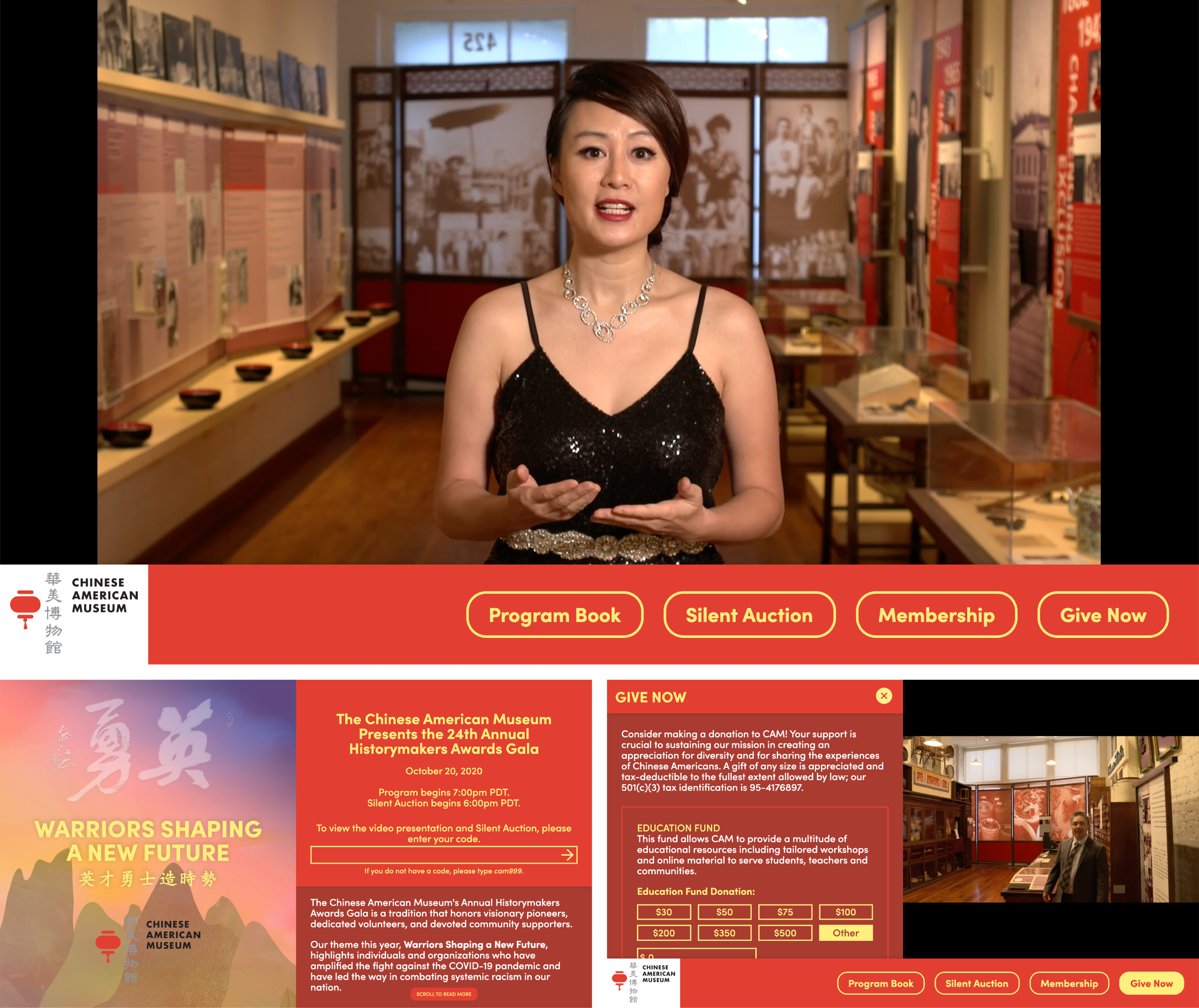
The Chinese American Museum’s Historymakers 2020 virtual gala
The Historymakers Gala is an important annual event for CAM, both in terms of the Museum’s financial health and community cohesion. Though the traditional black-tie dinner off the table, the organizing committee was adamant that the virtual event must convey the same sense of occasion and sophistication. Our solution allowed guests to make donations and participate in a silent auction while enjoying a live-streamed awards presentation. The presentation was a hit with guests. The Museum was happy to announce that the event achieved its financial stretch targets.

Pleasure Dome’s Digital Magazine
Pleasure Dome has presented the best new experimental film and video for over thirty years, and they weren’t about to stop because of a pandemic. Our solution was to reimagine their programming season as a “digital magazine.” Each issue substitutes for a screening, anchored by a feature presentation (often a collection of shorts), followed by a live Q&A (on Zoom) and accompanied by curatorial text. Out of respect for licensing and artist fees, each issue’s feature is available for a bracketed amount of time, within which guests can “rent” access.
Besides adding the digital magazine functionality, we refreshed the website’s design, migrated the hosting to WP Engine, and upgraded their online membership and publication order forms.
Bring-Your-Own-Device
Following a period of closure, some institutions reopened with safety precautions in place. One component of this was the reconsideration of in-gallery interactive touch-screen presentations.

Hammer Museum’s Mohn Award
Each year, as part of its Made In LA exhibition, the Hammer Museum administers the Mohn Award. A popular vote determines the winner. In the past, visitors to the show could log their choices via in-gallery iPad kiosks. This year the exhibition is staged at both the Hammer and the Huntington Library. We needed to make the experience as safe as possible. Our solution was to redesign and rebuild the web app for a “bring-your-own-device” model. Guests who use their phones to log in to the Museum’s wi-fi can access a dedicated microsite and make their voices heard.
In addition…
- We redesigned and redeveloped the website and graphic identity of the Institute for Learning Innovation.
- We set up Google Tag Manager for the Terra Foundation for American Art.
- We brought WordPress up-to-date for the Houston Center for Contemporary Craft and migrated their hosting to WP Engine.
- We added features to the architecture journal Common Edge in collaboration with Once Future.
- And we continued our longstanding collaboration with Everything Type Company. This season’s work included development with the Google Drive API and the Hubspot CMS.
Heartfelt thanks to team-members Zack Rothauser and Grace Poole for their outstanding contributions this year.
Want to work together? Please reach out via email — [email protected]