Websites
Page 4 of 5
Website for Photographer Lana Šlezić
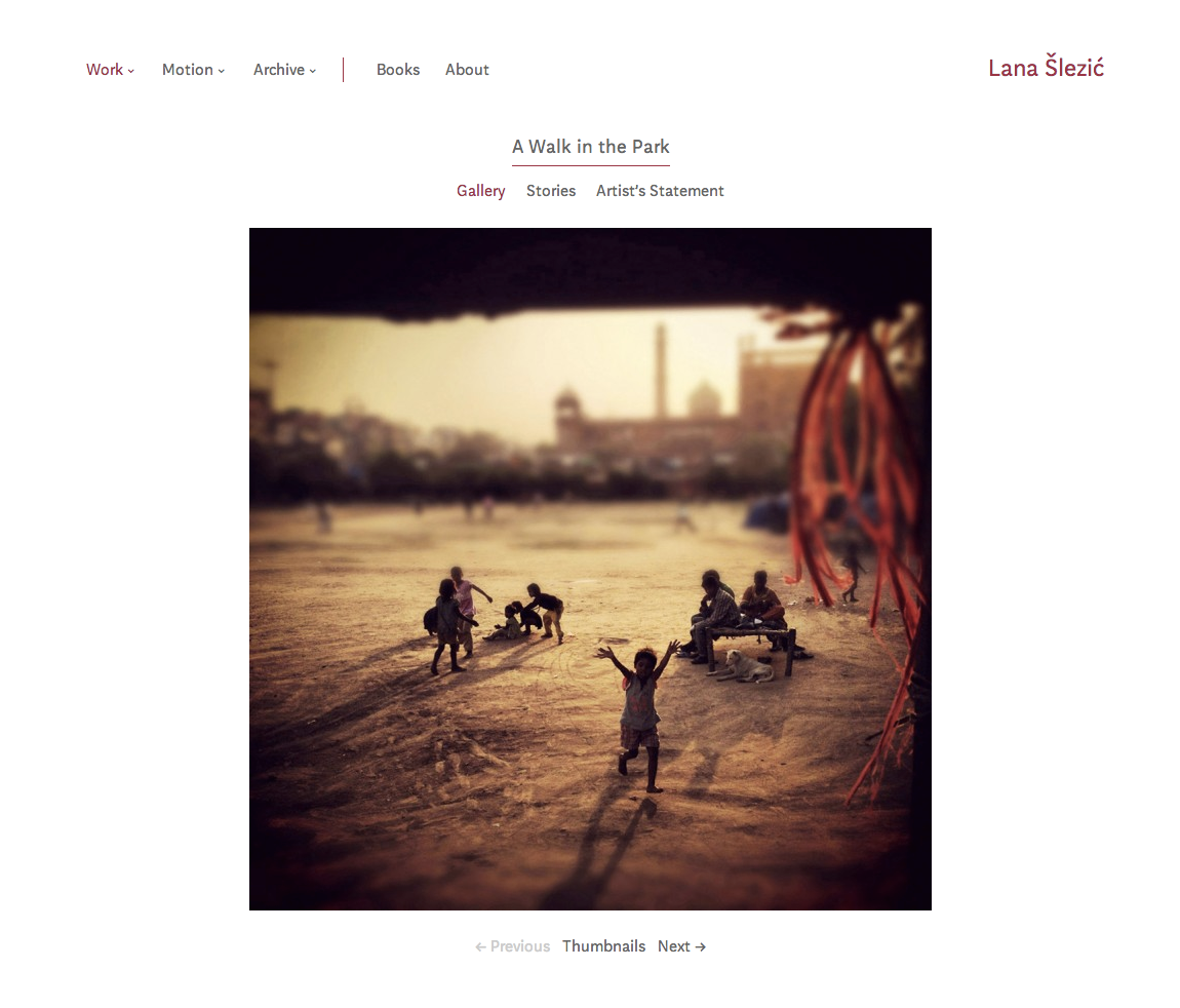
Lana Šlezić’s work has documented the plight of women and children. Her book Forsaken studied the conditions faced by women in Afghanistan. Her next project, A Walk in the Park portrays street kids in India. She is currently based in Canada.
Working closely with the artist, we created a website to represent her practice and aesthetic. The site is built using WordPress, extending the codebase we’ve developed for the deployment photography sites. The font is Aften, by Monokrom.
Lana Šlezić’s website is hosted by MediaTemple.
Goshka Macuga microsites for the Museum of Contemporary Art Chicago
This post is a collaboration between Sarah Wambold and Marty Spellerberg. Sarah Wambold is a Denver-based project manager and documentary producer. Marty Spellerberg is an Austin-based interactive media designer/developer.
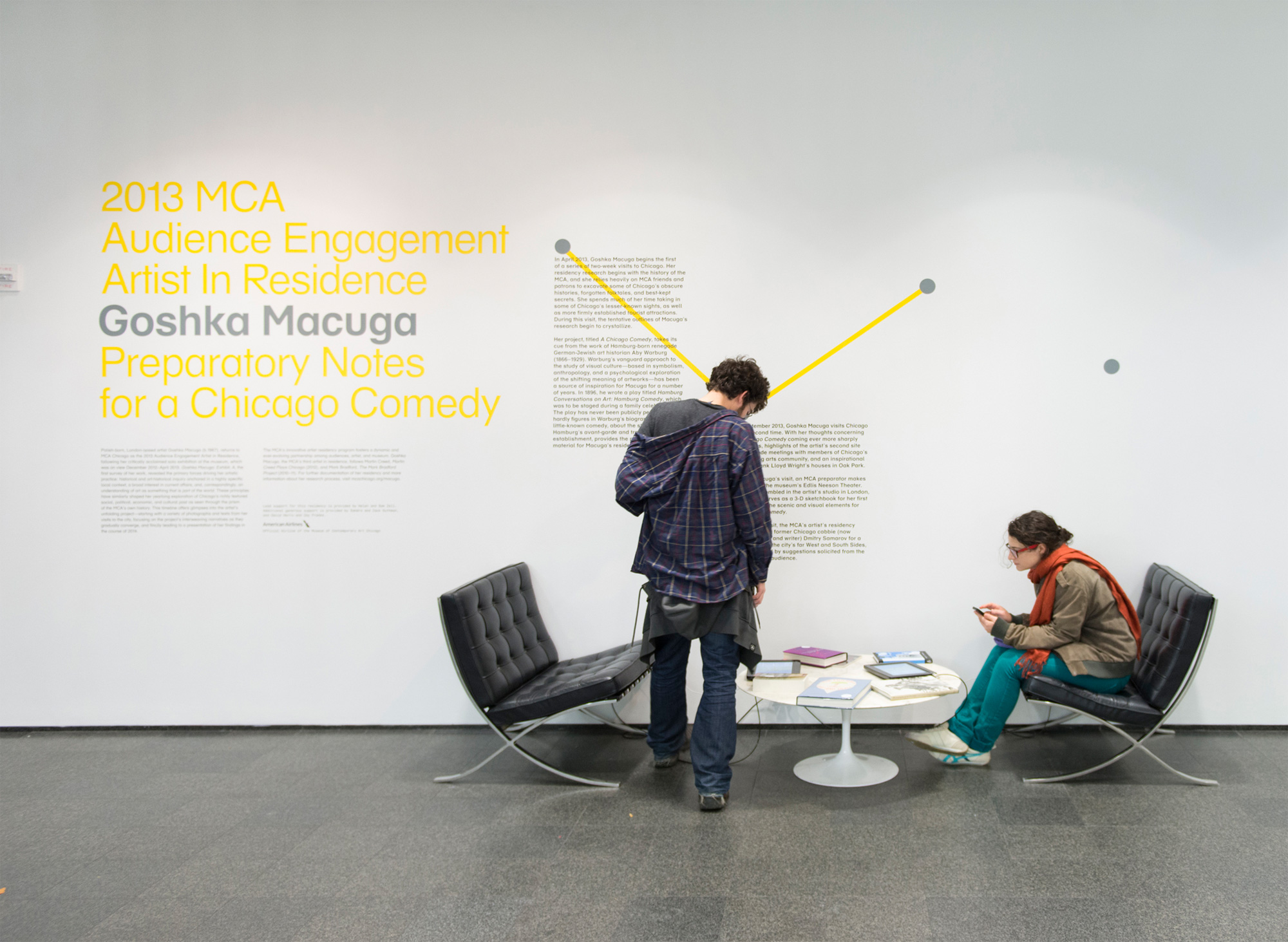
Goshka Macuga is the MCA Chicago’s 2013 Artist In Residence.
“Macuga’s work interweaves two strands that have helped define contemporary art in the last decade: artists’ increasing tendency toward historical and archival research and their growing interest in strategies of display and the dialogue between artistic and curatorial practice.”
— Dieter Roelstraete
Inspired by Hamburg Conversations on Art: Hamburg Comedy, a 1896 work German Jewish art historian Aby Warburg, Macuga’s residency project is to create a Chicago Comedy. But because the resulting work, likely to be a play, will not exist until the end of the term, the artist’s process is being documented and presented to the public as Preparatory Notes for a Chicago Comedy. Our team became involved as interactive media designers/developers.
With no artist on site—she’s in London—and no objects being produced in the early phases, how would museum visitors know there was, in fact, a residency taking place? We needed a physical manifestation or marker that would let the public know what was happening as it was happening.
In-Gallery iPad Kiosk
The artist was opposed to creating a object or an installation “as a placeholder,” so digital, with its ability to present a depth of information in a physically economical and engaging way, emerged as the best candidate. iPads as part of a title wall installation became the solution for a physical, onsite manifestation of the residency.
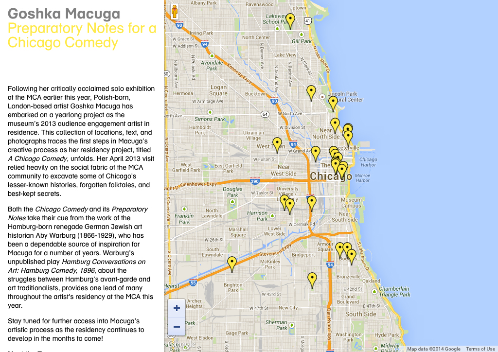
Early in the year, Macuga was joined by MCA Curator Dieter Roelstraete for a romp around the city, seeking to “excavate Chicago’s lesser-known histories, forgotten folktales, and best-kept secrets.” The material they generated became the basis for our presentation.
Since the artist’s notes were organized around places she visited around the city, we chose an interactive map interface. This provided an instantly relevant format: Onsite visitors are, by definition, present in Chicago and likely to relate to a map of the city. This also served to emphasize the project’s connection and relevance to the local community, a goal of the Museum’s residency program generally.
The technical solution was based on the technique demonstrated in Marty’s Integrating WordPress and Google Maps tutorial, which he previously used to create an in-gallery kiosk for the Chinese American Museum, Los Angeles.
Museum Website
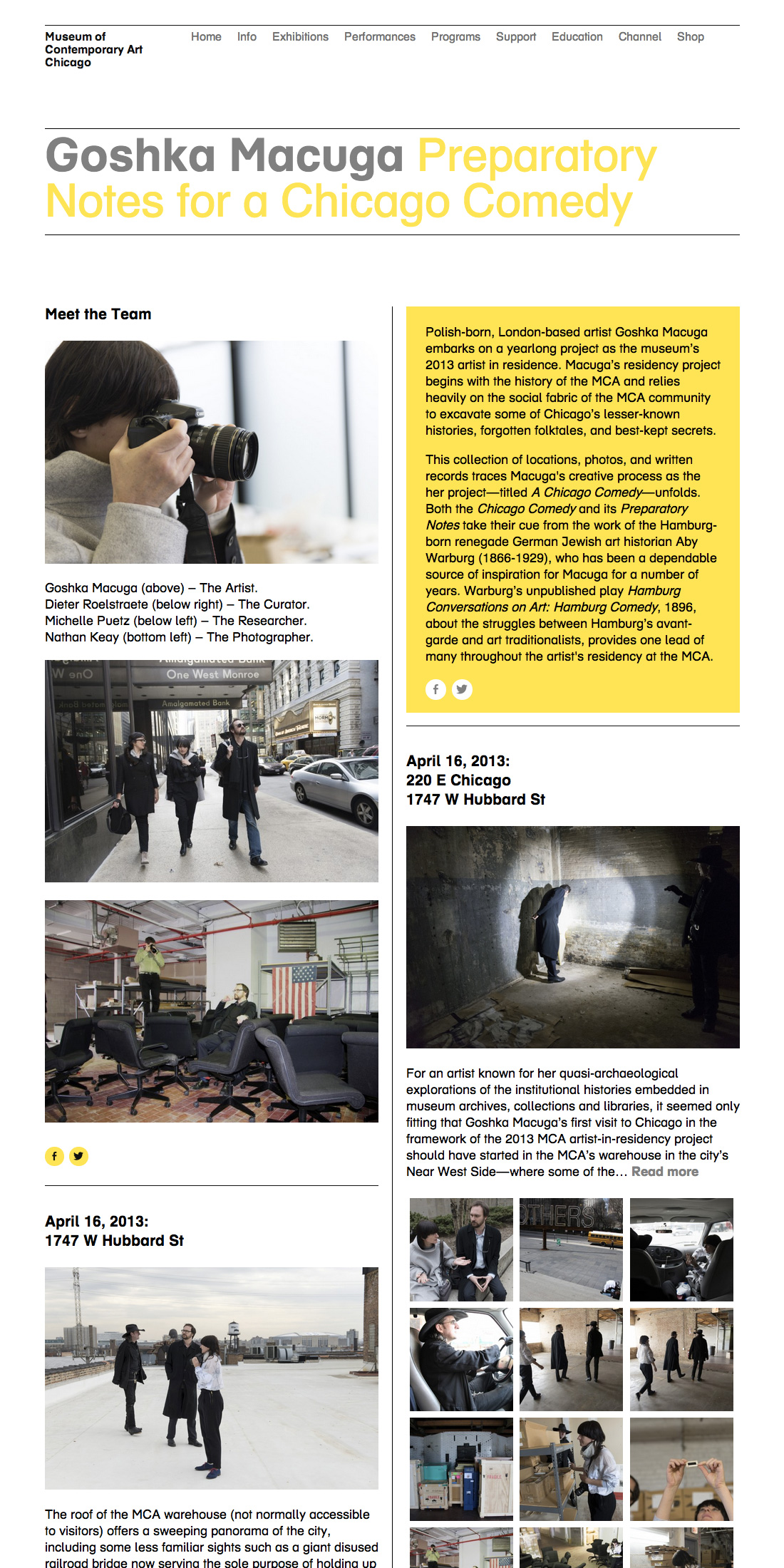
We also wanted to put something online that could live-on once the residency itself is completed. We realized, over several discussions with the curator, that Macuga’s work would find its form in phases: Lateral research of canvassing Chicago; vertical research of deep dives at the Warburg Institute; production, likely to happen abroad; and a to-be-determined final presentation. The digital strategy would need to respond to each of these.
We recognized that the map interface would be inadequate for telling the rest of the story of the residency; as Macuga moved from research-based activities, some happening abroad, and into production, using a map to navigate the content would no longer make sense.
The Museum had a history of stand-alone project blogs, and we made the choice to continue that format in this case. The first thing we did was to consolidate the most recent blogs under a unified banner and feed, which improved the prospects for long-term maintenance, as well as providing added context for future researchers. But we also wanted to provide a unique feel specific to the here-and-now, so we designed a two-column landing page using the Packery layout library.
The project was driven by a core creative concept that came into view over a period of time, as the artist’s process revealed the characteristics of the artwork she is creating. By adopting an agile design and development methodology, our team was able to respond to the changing needs for the project mid-course. The result was a compelling, revealing and engaging presentation for Museum visitors both onsite and online.
Project Collaborators
Digital Team
Producer and Project Manager: Sarah Wambold
Designer and Developer: Marty Spellerberg
Content Coordinator: Marian Oman
Residency Team
Project Manager: Erika Hanner
Curator: Dieter Roelstraete
Content Creators: Michelle Puetz, Dieter Roelstraete, and Goshka Macuga
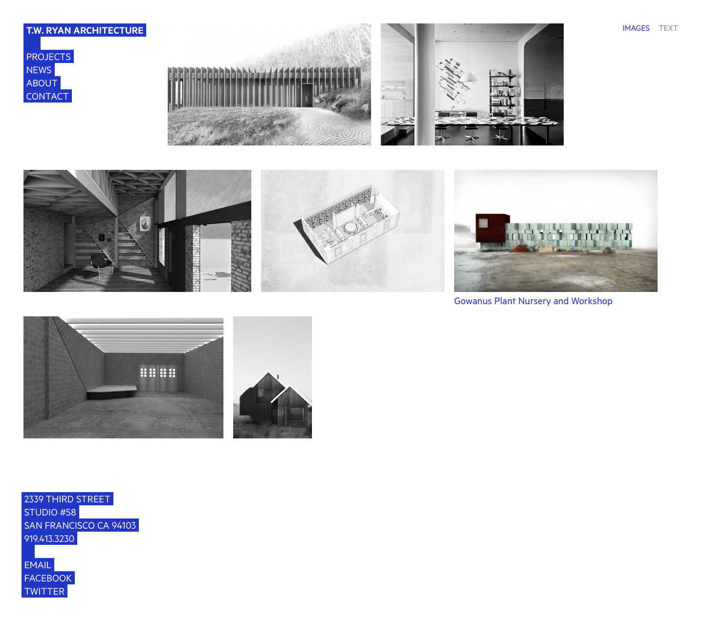
Website development for T.W. Ryan Architecture
Prior to founding TW Ryan Architecture in 2013, Thomas W. Ryan was a designer at Richard Meier & Partners and an associate at Christoff : Finio Architecture in New York. Visit website.


Project Team
Designed by Everything Type Company.
Developed by Marty Spellerberg / Spellerberg Associates.
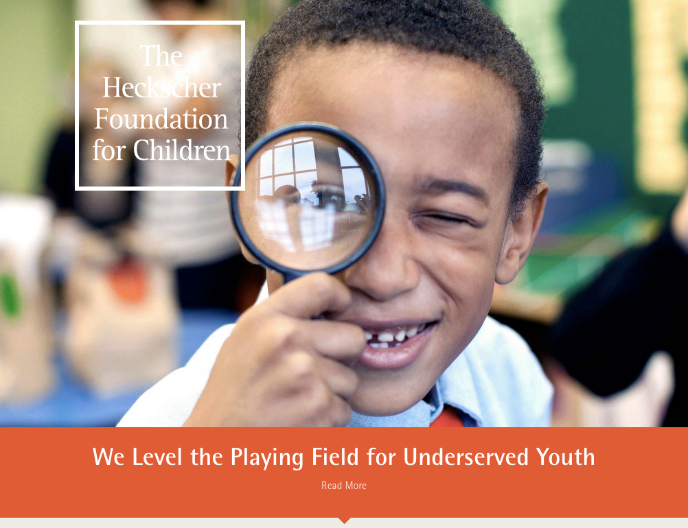
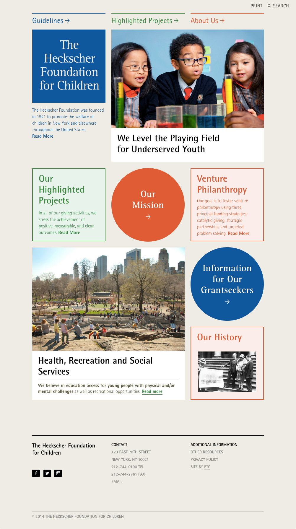
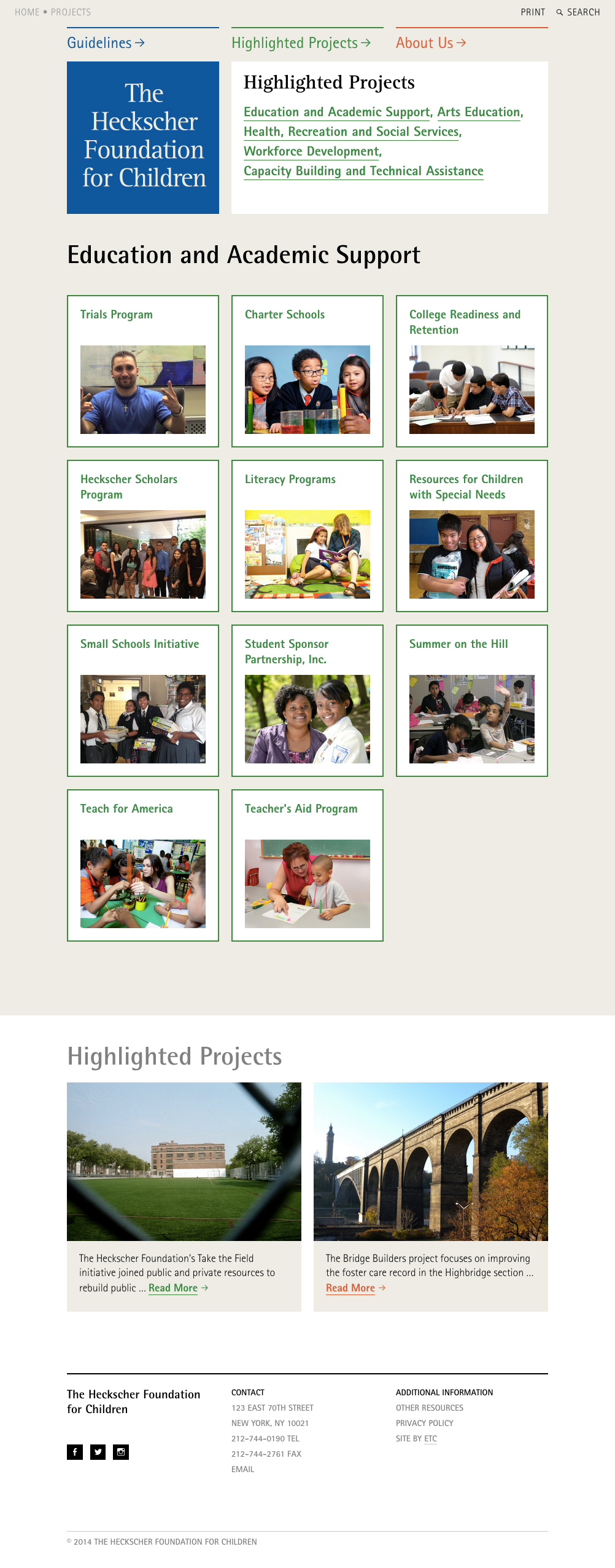
Website development for the Heckscher Foundation for Children
In 2014, The Heckscher Foundation for Children celebrated over ninety-three years of support to hundreds of organizations and programs, serving needy children and youth. Visit website.
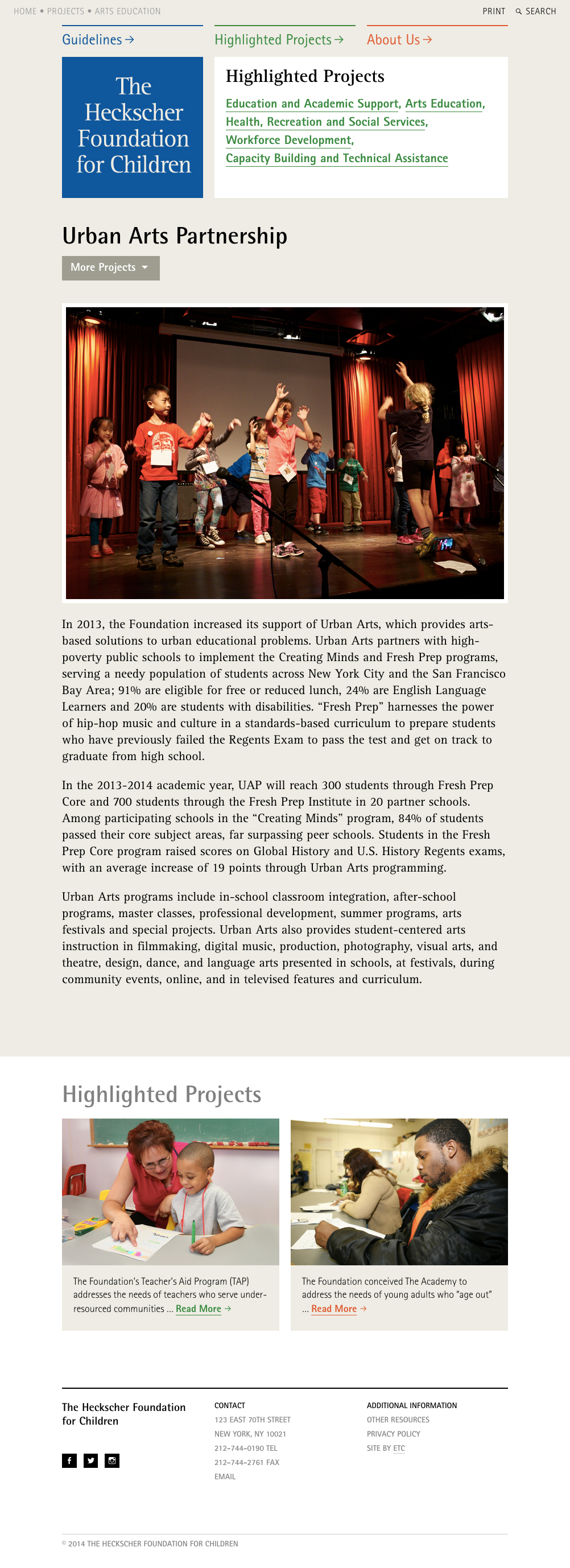
Project Team
Designed by Everything Type Company.
Developed by Marty Spellerberg / Spellerberg Associates.
Website for the Santa Cruz MAH’s Pop Up Museum
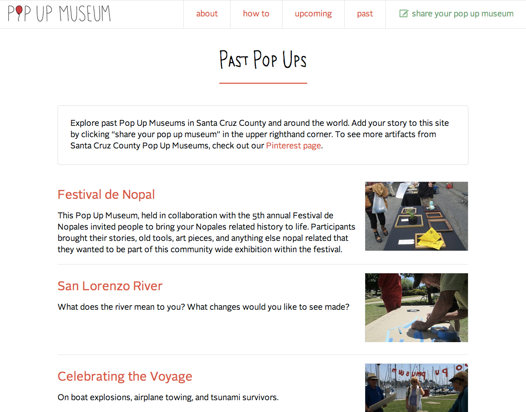
A Pop Up Museum is a of temporary exhibit created by the people who show up to participate. It works by choosing a theme and venue and then inviting people to bring an object on-topic to share. The Santa Cruz Museum of Art & History hosts Pop Up Museums throughout Santa Cruz County in partnership with community organizations, businesses, and schools.
Website designed and developed by Marty Spellerberg. Lettering, logo and illustrations by Iris Gottlieb.
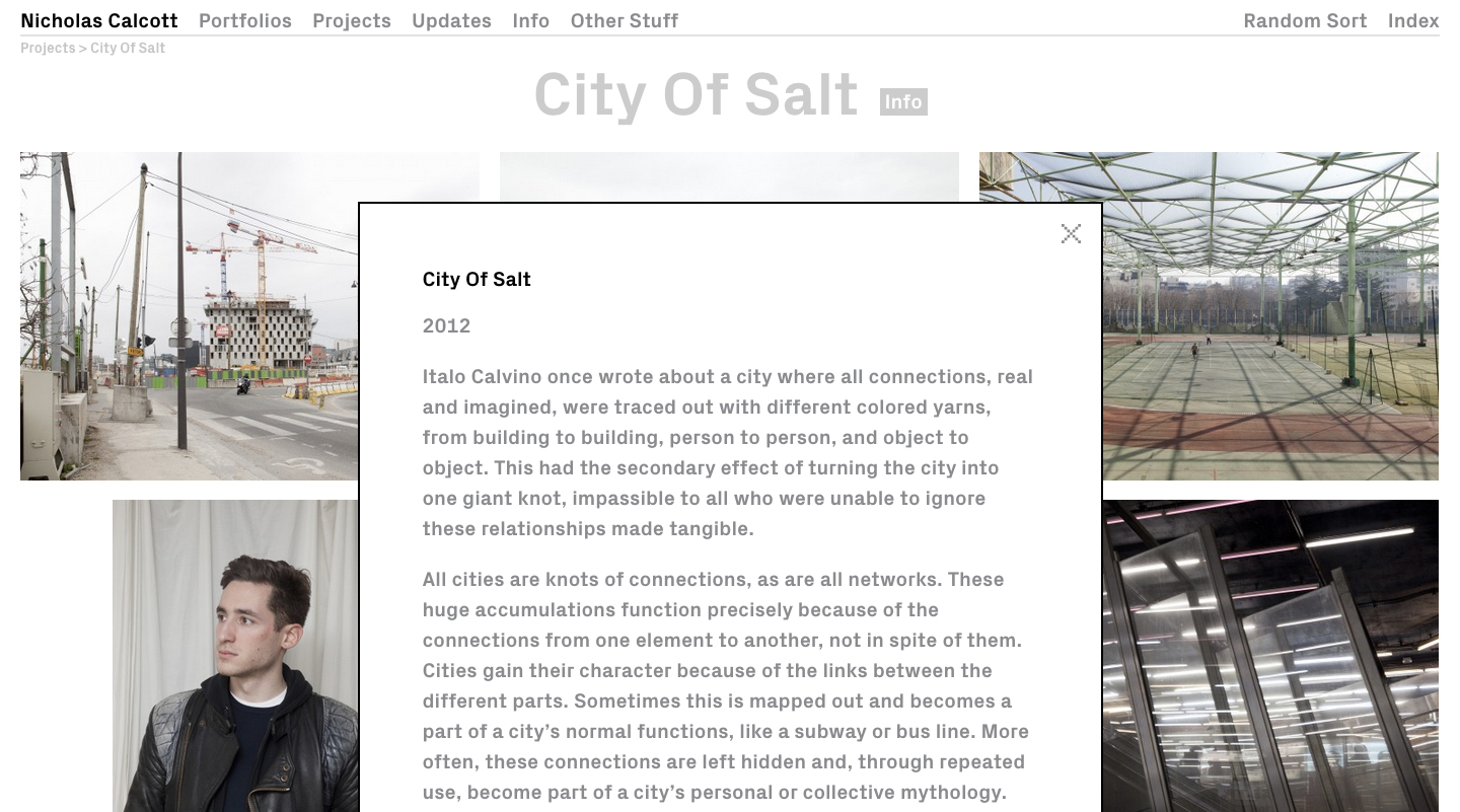
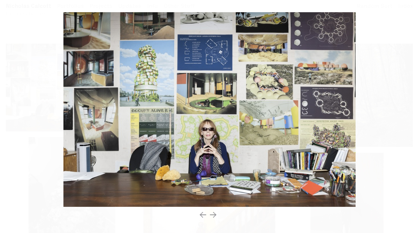
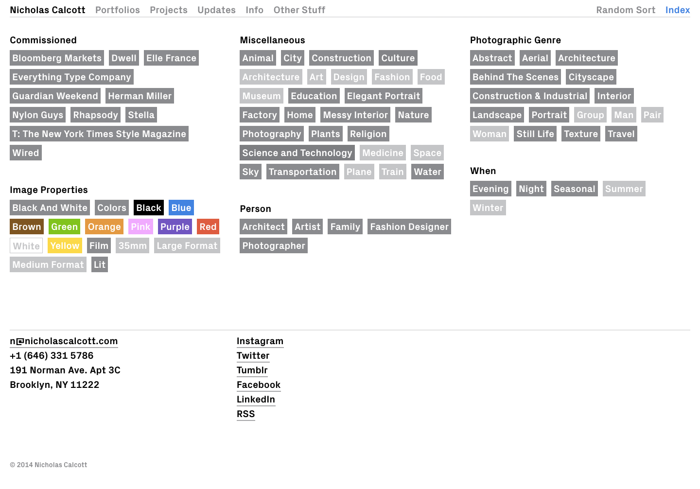
Website development for Photographer Nicholas Calcott
Nicholas Calcott was born in 1983 in Midland, MI. He currently lives and works in New York, NY. Visit website.
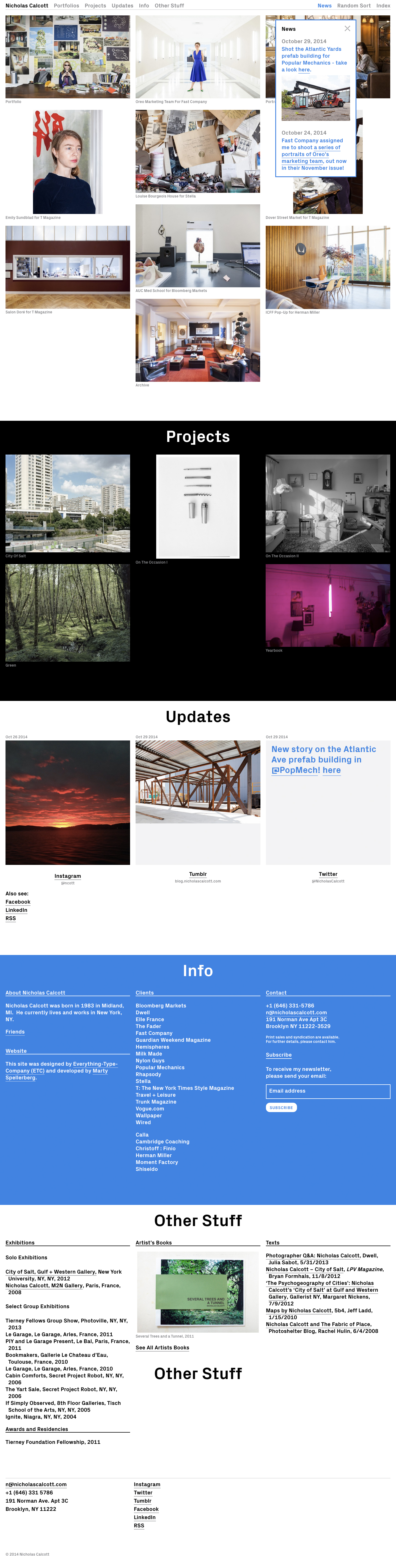
Project team
Designed by Everything Type Company.
Developed by Marty Spellerberg / Spellerberg Associates.
Migrating the Museum of Contemporary Art Chicago Exhibitions Website to WordPress

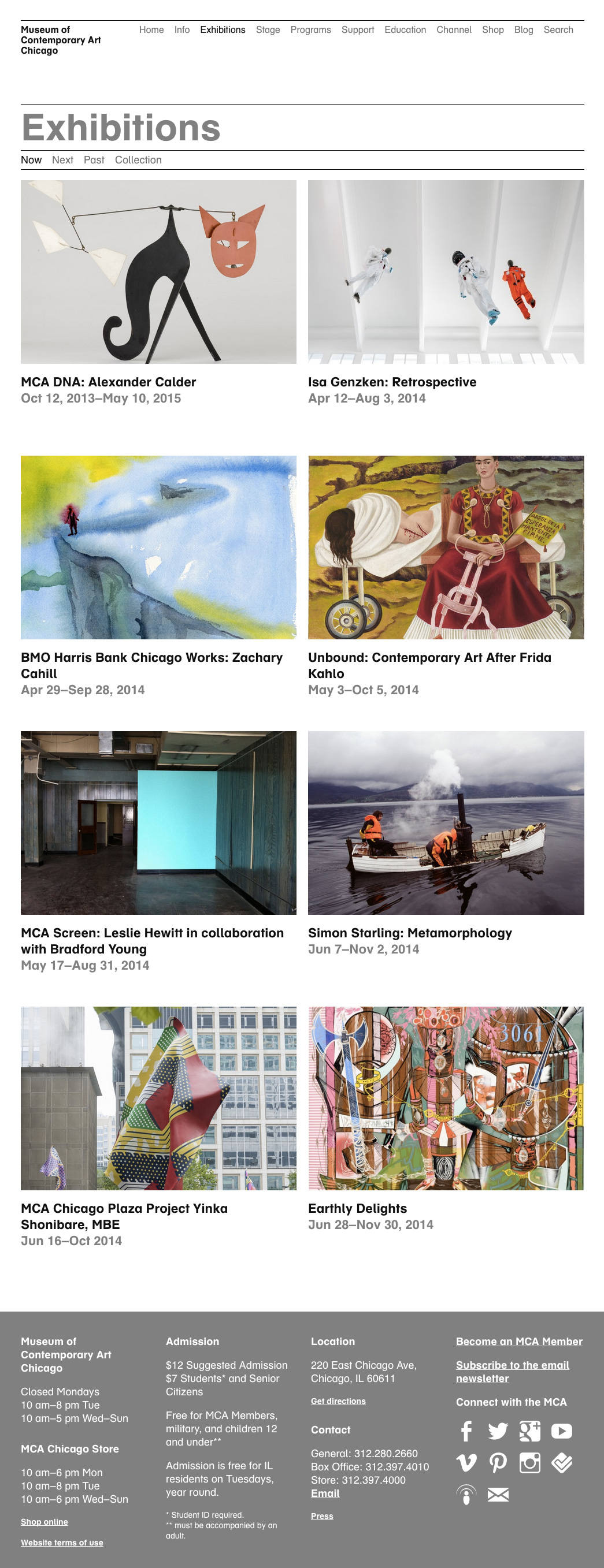
Working with the Museum of Contemporary Art Chicago, we recently completed a redesign of the Exhibitions area of the Museum’s website. The project was a collaboration between Spellerberg Associates and staff at the MCA.
On the front-end, we implemented a mobile-responsive design reflecting a contemporary interpretation of the Museum’s established visual identity. We also addressed elements of the navigation convention that had proved inconsistent and unclear to users. On the back-end, we moved from legacy CodeIgniter-powered infrastructure to WordPress.
Working with a live website and content set, it was important that the project be completed with continuity of service and minimal disruption to content editors. With this in mind, we adopted an iterative approach, with the migration taking place in two stages. First we moved the individual exhibition pages, one by one; second we moved the category archive pages.
Migrating the Exhibition Records
Exhibitions were created in WP as a custom post type. Knowing we had hundreds of records, we configured this type to be non-hierarchical, like Posts (hierarchical types, like Pages, run into performance problems with large sets). To match our data, three custom-field metaboxes were added the Edit screen: Start Date, End Date and Read Dates; other data was input into WP’s standard fields. Records were migrated manually, providing the opportunity to clean the content (remove dead links, etc) and update the accompanying images.
A “redirect” field was added to the legacy CodeIgniter CMS and was populated with the URL of the corresponding WordPress permalink. Using this data, the CodeIgniter templates redirected visitors from the legacy pages to the new, WordPress versions. In this way the migration was rolled-out incrementally, as records were completed.
Migrating the Exhibition Category Pages
Exhibition records were organized into a custom taxonomy called “Exhibition Categories,” which was used to generate the Past Exhibitions pages. During the first stage of the work, these taxonomy archives were redirected to the URLs of their CodeIgniter counterparts. Once the migration of the individual records was complete, the Exhibition Category templates were fully implemented and the redirect removed.
All exhibition records were filed in the appropriate “Past Exhibitions” category, even if the show had not yet completed. The taxonomy archive templates then used the Exhibition’s “End Date” custom field to filter out current and upcoming shows, displaying only those that had closed.
The last element was the Current and Upcoming Exhibitions pages. These were created as WordPress Pages containing custom loops which look up and display exhibitions with the appropriate Start and End Date custom fields. Here’s an example of the WordPress code:
The CodeIgniter versions of these pages were then redirected to their WP counterparts, completing the migration.
Project Team
Marty Spellerberg, Principal, Spellerberg Associates
Sarah Wambold, Former Director of Digital Media, Museum of Contemporary Art Chicago
Marian Oman, Content Coordinator, Spellerberg Associates
Shauna Skalitzky, Assistant Editor, Museum of Contemporary Art Chicago
Conference microsite and archive for the Santa Cruz MAH’s Museum Camp
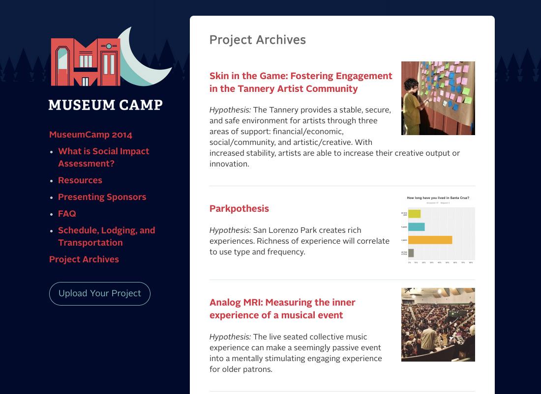
Museum Camp is an annual conference produced by the Santa Cruz Museum of Art & History. The format is similar to a hack-a-thon: Participants have 72 hours to work on a project consistent with a theme. This year’s theme was “Social Impact Assessment” and involved conducting research projects based on different locations around Santa Cruz.
Since Museum Camp is something that will recur each year, we decided to build a home for the camp separate from the main Museum website. As well as moving over the camp literature, we developed a portion of the site which allows participants to post documentation their projects to share with their peers and future researchers.
The Museum Camp logo was designed by Andrew McBride.
Website usability testing for the Clyfford Still Museum
This post is based on a report produced for Spellerberg Associates by Amanda Moon and Marian Oman. Their research was conducted at the School of Information at the University of Texas at Austin as part of a usability course taught by Randolph Bias.
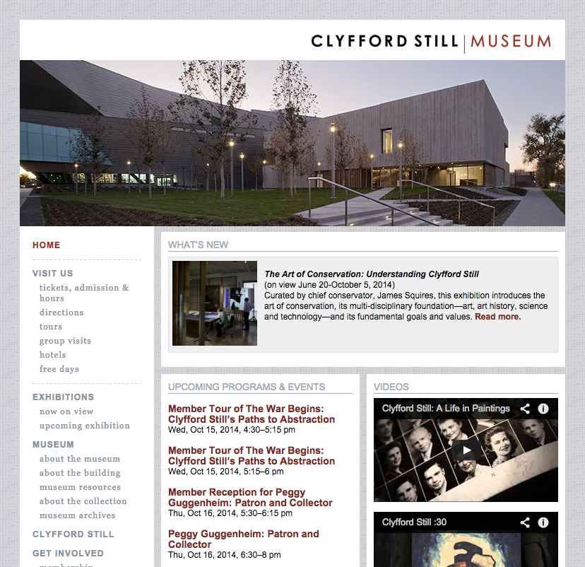
The Clyfford Still Museum in Denver, Colorado is a single-artist museum dedicated to the American master abstract expressionist painter. The Museum’s collection contains nearly 95 percent of the artist’s total output—more than 3,200 artworks—and houses the complete Still archives of sketchbooks, journals, and notebooks.
At the beginning of a website redesign project, we undertook a usability evaluation of the Museum’s website. Designing this evaluation to assist in identifying key areas of focus, our primary objectives were to:
- Better understand the mental models and expectations of website’s users;
- Identify the most salient usability shortcomings of the current site design;
- Offer recommendations for improving the overall user experience;
- Create a benchmark for any future usability testing.
We identified key use cases and goals by consulting with Museum stakeholders and conducting a heuristic site audit.
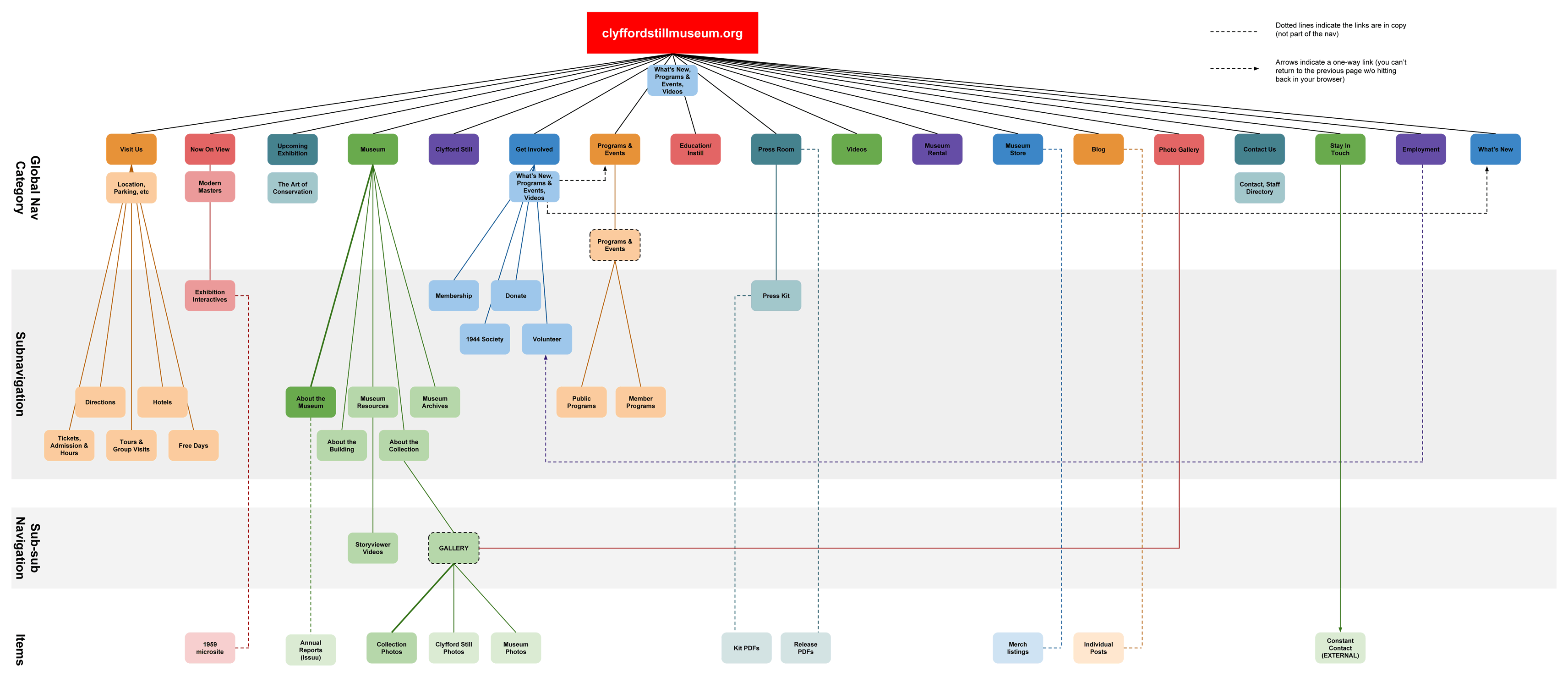
We then designed and conducted two evaluation activities:
- A card sort protocol generated insight into visitors’ mental models of site content and identified ways to improve the website’s information architecture and navigation;
- Three persona-based test scripts identified the most salient usability challenges presented to website visitors.
Twelve individuals participated in the evaluation, which was conducted at the University of Texas at Austin.
Card Sort
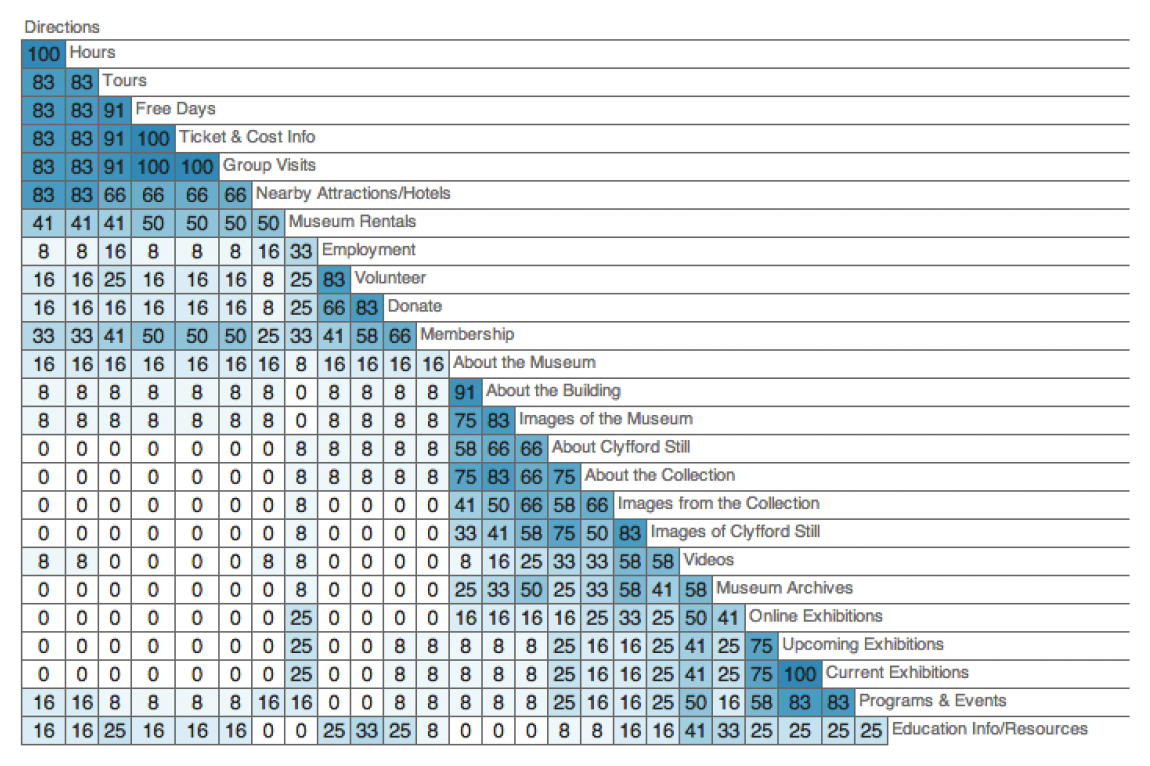
We narrowed 40 words from the existing website navigation down to 26 words that best represented the content. Each user then sorted these words into named categories using language of his or her own devising. They were encouraged to define no fewer than three and no more than five categories.
This activity was conducted using the the browser-based software program Optimal Sort, the results from which were used to generate a similarity matrix showing the percentage of participants who agree with each card pairing.
Task-based Test Session
User personas function as lenses through which to evaluate the site; each persona represents a distinct segment of the target audience and provides a framework for understanding that user segment’s typical goals and tasks.
We tested a broad swath of the site by testing three different user persona “paths,” which allowed us to test more tasks across all session types than would be reasonable to include in a single user’s test session. The three user personas we developed for this evaluation were:
The Art Enthusiast
You’re an art enthusiast living in Denver. Even though the Clyfford Still Museum has been open for a few years, you’ve never visited. You decide you’d like to check it out this Saturday. You will take your 7-year-old daughter and you will buy tickets online.
The Researcher
You’re a graduate student in Art History. You’re writing your thesis on some of Clyfford Still’s contemporaries, and you think some of their letters to Still may be housed in the Clyfford Still Museum’s archive.
The Educator
You’re a 5th grade teacher in Denver. You want to bring your class to visit the Clyfford Still Museum. Ideally, you’d like to schedule the field trip for a Tuesday morning next month.
Participants were assigned for their relative similarity to the user personas. For instance, the participants who completed “the educator” tasks were actually teachers.
We read each participant the persona-based scenario to which they had been assigned, then directed them to the website. They were asked to complete the tasks while “thinking aloud,” which provided insight into their thought processes as they moved through the website.
After the tasks were completed, the moderator asked several open-ended questions to identify any additional user needs or expectations that were not met by the website.
From Research to Redesign
This research revealed that improving the site’s navigation structure and consistency, creating more connections between pages, and increasing the image-to-text ratio throughout the site would be essential in the creation of a more user-friendly experience for Museum visitors.
This study provided was followed by additional phases of evaluation, including with Museum stakeholders, which tested the assumptions we’d made and the conclusions we’d arrived at. The entire process informed a website redesign, which launched in October 2014.
Website redesign for the Clyfford Still Museum

Featuring a bold, responsive design, the new website for the Clyfford Still Museum launched in October, 2014. This new site helps the museum position itself as a destination, a site of pilgrimage for art lovers interested in the life and work of master abstract expressionist painter Clyfford Still.
The project goals were to simplify the navigation and information architecture; build a new, more flexible and user-friendly content management system; and provide a updated, responsive design that featured more generous visuals and highlighted the museum’s building—an architectural gem.
We employed an Agile approach and worked with museum stakeholders to identify institutional priorities for the redevelopment project. We conducted several assessments of the previous site, including a site audit and a usability study, as well as several assessments of the information architecture throughout the process, to test our assumptions and inform our final decisions.
Project Collaborators
Content Strategist and Project Manager: Sarah Wambold
Designer: Scott Reinhard
Developer: Marty Spellerberg / Spellerberg Associates
for the Clyfford Still Museum: Dean Sobel and John Eding
Redesigned website navigation for the Santa Cruz MAH
I recently redesigned the top-navigation of the Santa Cruz Museum of Art and History’s website. Working closely with Museum staff, I simplified the nav and introduced a modern, mobile-responsive interface pattern.
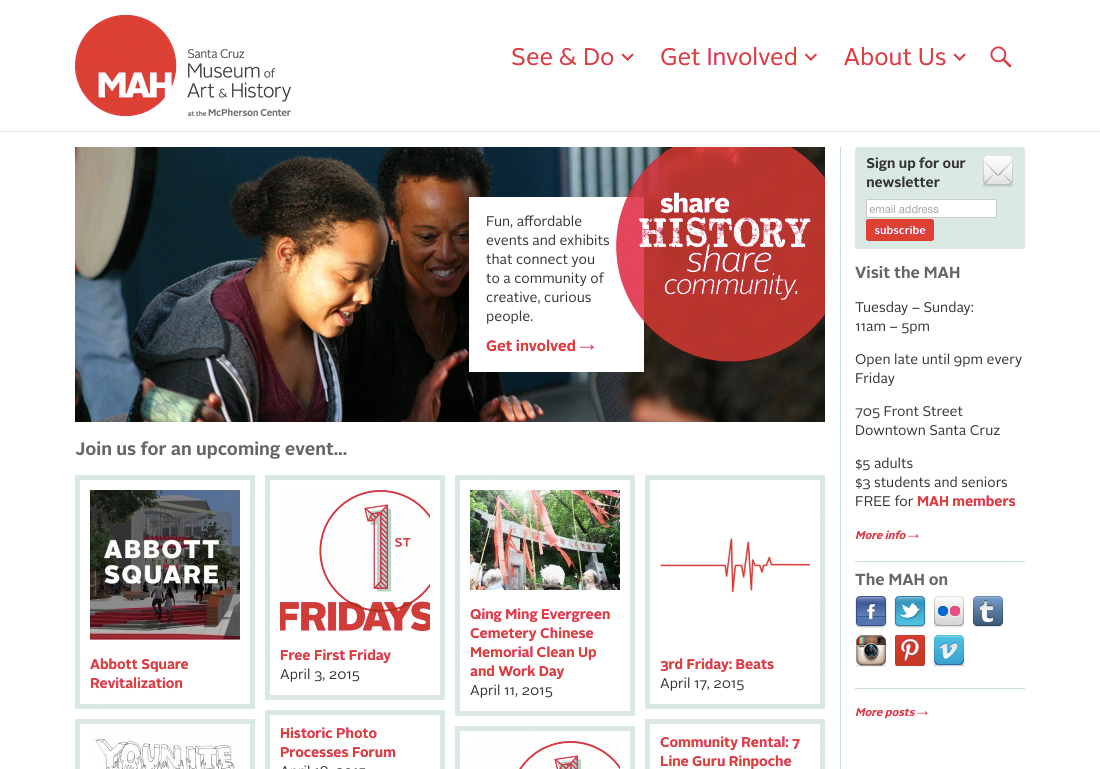
The MAH is about engagement. The Museum is fulfilling its mission when it’s “bringing people together around art and history.” The seed of this navigation change began with a conversation about opportunities to better accomplish that mission using the website.
The design at that time included seven top-level links — Calendar, Exhibitions, Learn, Get Involved, Rent the MAH, Blog and About. We realized that this fairly typical collection of links didn’t signal to visitors how central getting involved was to the MAH experience.
Now, by reducing that down to three — See & Do, Get Involved and About — we’re more clearly communicating to visitors the Museum’s character and priorities.
Also, the web has changed since the site’s last redesign. Mobile apps and responsive web design have introduced a slew of new interaction patterns. While the site has not yet been converted to responsive (a project that’s currently in-progress), we used a mobile-inspired interaction pattern for the second-level links.
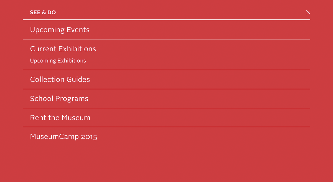
Whereas the old design used a drop-down style commonly cribbed from desktop menus, for this design clicking/tapping each of the top-level items triggers a full-screen shade.
And rather than listing the second-level links horizontally, we’ve stacked them vertically. This reduces line-length-imposed character limitations, allowing the Museum the flexibility to include as many items as they need in each shade, each with as many words as is needed for effective communication.
Project team
- Marty Spellerberg, Designer/Developer for Spellerberg Associates
- Elise Granata, Marketing & Engagement Coordinator for the Santa Cruz MAH
Development of Covered with Fur, an online literary magazine by A Strange Object press
In 2014 I was fortunate to work with A Strange Object, a small press in Austin Texas, on Covered with Fur, their vision for an online literary magazine. I became involved during the later stages of the process, to help them with their final push, and was curious to know how the project had developed from inception. So I asked my collaborator Joe Costello, a usability specialist with a background in small press publishing, to flesh out the story.
In this guest post, Joe Costello speaks with Covered with Fur’s nonfiction editor Jenn Shapland and fiction co-editor Marian Oman.

Joe Costello:
This project had several stages of development; what were they?
Marian Oman:
Jill Meyers, Callie Collins, Jenn Shapland, and I all worked together on the literary magazine American Short Fiction (ASF). ASF went “on hiatus” in 2012, at which point Callie and Jill started talking about founding their own small press. That’s how A Strange Object was born.
They knew they wanted to publish print books, but they wanted to have a digital presence as well. I had been the web editor at ASF, so they asked me if I wanted to be involved in putting together an online fiction magazine for A Strange Object. Jenn had been involved at ASF too, so she came on board to edit nonfiction.
I had a lofty vision for the fiction side of things originally… I wanted to use the digital platform to showcase the behind-the-scenes process of fiction writing, and to publish not just final stories, but also relics of the creative process. My whole thing was just that writing and publishing both are so much more than a final product, but in fact leave all kinds of physical traces—notes, drafts, scribblings…ink, old printing presses, wood pulp—in the process. Even “digital publishing” exists in the material world, even though everyone likes to talk about it as though it’s ephemeral. Nope — there are keyboards, servers, cables. I saw a digital magazine as a vehicle for poking at that boundary between process and product, for whatever that’s worth. We’ve incorporated that idea into the site by publishing a sub-series called “The Material” where we feature supplemental materials related to the writing process that went into the stories we’ve published.
Anyway, that was the idea. And it stayed an idea for a long time, as we had no technical expertise to implement them. Eventually Jenn started learning something about web development and different website/content platforms, so she started building the site herself. By that time, I was in grad school and had started working for Marty Spellerberg part-time on the side. So, it was a natural thing to ask Marty if he could help get the site to a fully implemented/realized form.
Joe:
At the Covered with Fur about page, I’m curious about the statement “We believe in subtraction, in lingering, in making space.” What were the early conversations about the vision of A Strange Object’s weekly digital magazine?
Jenn Shapland:
I knew I wanted something spare. I was tired of looking for worthwhile things to read on the web and finding instead an endless chain of links and listicles that seemed more interested in keeping my attention moving, unfocused—perhaps more easily advertised to?—than in holding my attention. I wanted to make something quiet enough to hear what its contributors were saying—to create a monologic space for each piece. I knew I wanted it to be an online magazine that suggested an alternative to the existing format of blogs and digital publications that constantly update. I knew that this wasn’t going to be about “hits” or “likes” or “comments.”
We also knew that for our own sakes, and to be consistent with the non-overwhelming plan for the mag, we didn’t want to put out six new pieces a week, or a new piece every day (though originally we’d thought of it that way). It was kind of a revelation when Jill suggested at one of our meetings “What if we just had FICTION and NOT?” And I love it, because it emphasizes and calls attention to the simplicity, the ease of the magazine. We’re not going to publish more than you can read and digest—perhaps even revisit—in a week, which eases up on the pressure of constant influx of new material, new articles, what I see as the more more more quality of the web.
Marian:
I feel like this stems from our collective sense that all the things that make reading and writing powerful—i.e., beauty, wonder, curiosity—these are all things one has to make space for. We live in a too-much world—too much information, too much to do. As publishers/editors, I think we all feel like it’s part of our job to create the space—by publishing work that surprises or delights; by presenting it in a (hopefully) aesthetically arresting way—that empowers people to have those little moments of magic.
Joe:
The design evolved a lot during the process. Will you please elaborate a bit on the original designs?
Jenn:
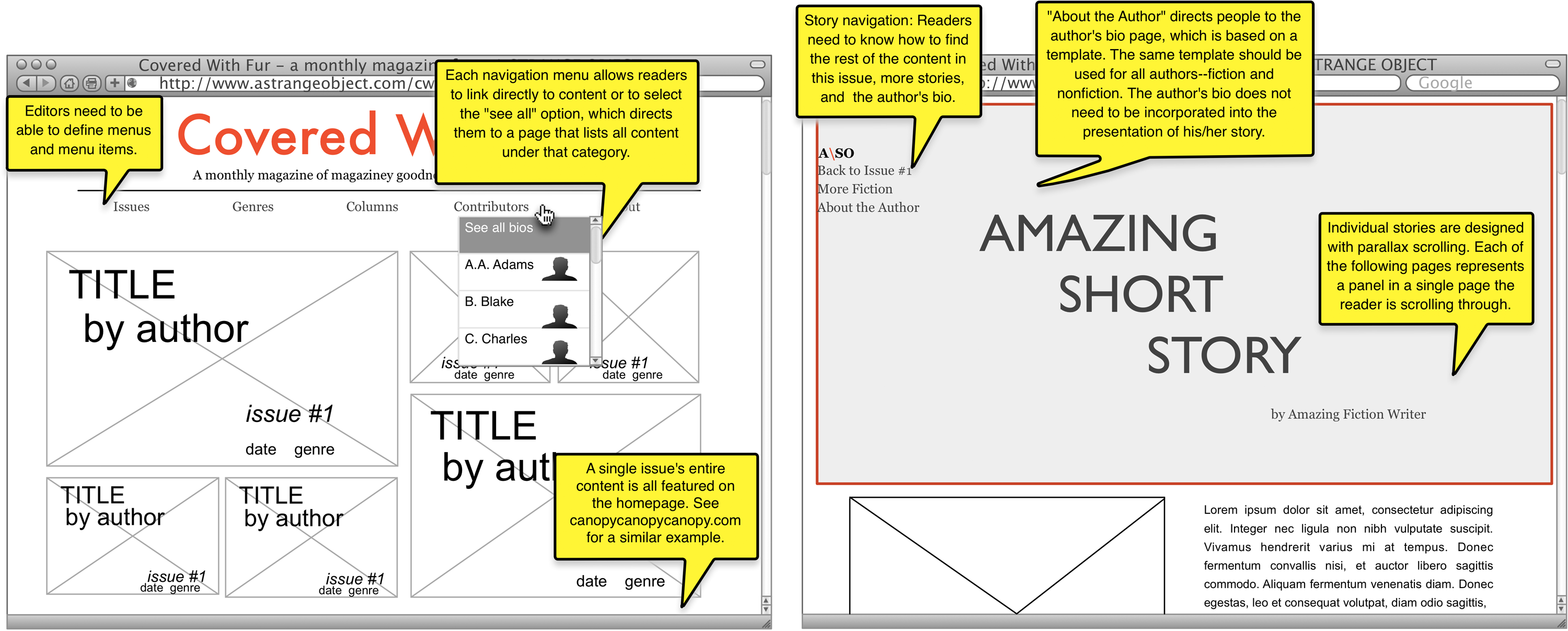
As I recall, we drew inspiration for the homepage in the original wireframes from a previous version of Triple Canopy’s website. We also used Pitchfork’s cover stories for ideas about layout for individual stories. We worked with Justin Cox at Public School to build them.
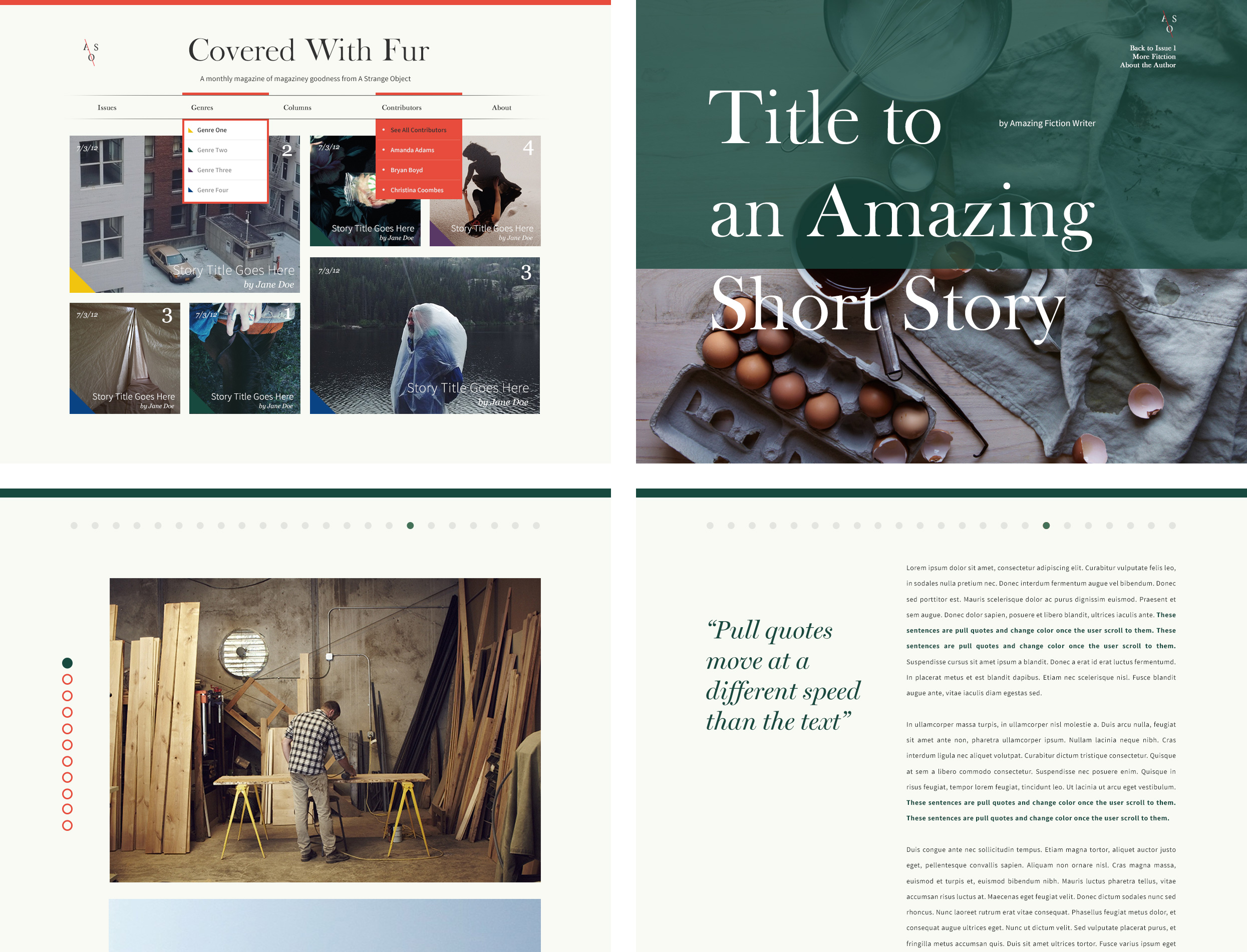
We spent a long time choosing a readable webfont, getting the line spacing exactly right, giving the pages actual margins. White space is invaluable. And we also keep readers in mind by drawing their attention to the individual lines of a piece with print-derived elements, like pull quotes and drop-caps.
Joe:
How did you negotiate balancing features/design goals and technology/cost limitations?
Jenn:
We had this conversation over and over throughout the process. Ultimately, it came down to questions about how we can accomplish what we want (i.e. consistently put out work in an immersive, well-designed form) within reason. And since a big priority for the magazine is paying our contributors, we made some sacrifices along the way. But I actually think it ended up better than what we originally imagined. Pared down, distilled. Marty was helpful in steering us toward what features we could afford and what we could approximate without breaking the bank.
Joe:
As the site is up and running now, have there been any surprises?
Jenn:
Well, there was one time I accidentally brought the whole site down. Thank heavens for Marty’s timely intervention! That was seriously alarming.
Otherwise, running the site has been remarkably smooth. My favorite surprises come from watching submissions come in, and finding and soliciting new work, which connects me to a whole new network of practicing writers and artists. And then we’ve been also able to find unexpected ways to use some of the features Marty built in. For example, the gallery function is giving us a great platform for the genre we’re calling “Slash”—work that doesn’t fit comfortably in a category. “The Material” is a series of slash pieces that combine images and text to excavate a fiction writer’s process of creation—notes, drafts, inspirations. I’ve also used the gallery to create a hybrid art/photo essay with Lynne Maphies’ “I Can’t See the Arctic from Here.” It started as an essay, but the focus was so visual and so steeped in artworks and landscapes that Jill suggested laying it out as a photo essay of sorts. I love the result.
Marian:
CWF was a long time coming. We originally conceived of the site in August 2012, which means I originally read some of these pieces what feels like a lifetime ago. So, it’s been lovely to be resurprised by them, to see them reincarnated online, and to read them with fresh eyes after all this time.
Joe:
Returning to the statement about “making space,” do you feel that technology offers writers new bounds?
Jenn:
Definitely. But I think that’s true of any technology, any publishing platform, even any writing utensil. I love that CWF is bringing process to publication, documenting a writer’s progress from the early stages of insight to the crafting and revising of a piece. Others, Genius for example, are also exploring this on the web, albeit in a more interactive way. We’re going for immersion over interaction.
And I think there’s a sense of being able to take certain risks, certain chances with web publishing that you might not see in print. But I do want to resist the binary between web and print, and to suggest that the two media are both constantly in flux and being redefined.
Marian:
To be honest, I’m a bit boggled by this debate about “the future of publishing,” as though change is somehow at odds with or new to making art. I feel like good writing is good writing—whether it’s on a papyrus or a screen.
Joe:
Do you see physical and virtual publication as increasingly codependent?
Jenn:
Codependent doesn’t feel like the right word, but coevolving might. Is that a word? A Strange Object publishes print books and an online magazine. More and more of literary culture takes place online—on review websites, on social media like Twitter and Goodreads—even if the readers or reviewers never touch an e-book. And for CWF’s part, we’ve found print publications to be inspiring for our design, while looking for ways to take advantage of some of the distinct features and qualities of digital publication.
Marian:
I guess it’s about having more choices. I don’t think you have to publish digitally today—though it certainly would be weird if, say, The New York Times didn’t have a digital component. But there are plenty of print-only or web-only publishers, and plenty who do both. And that’s great!