Websites
Page 2 of 5
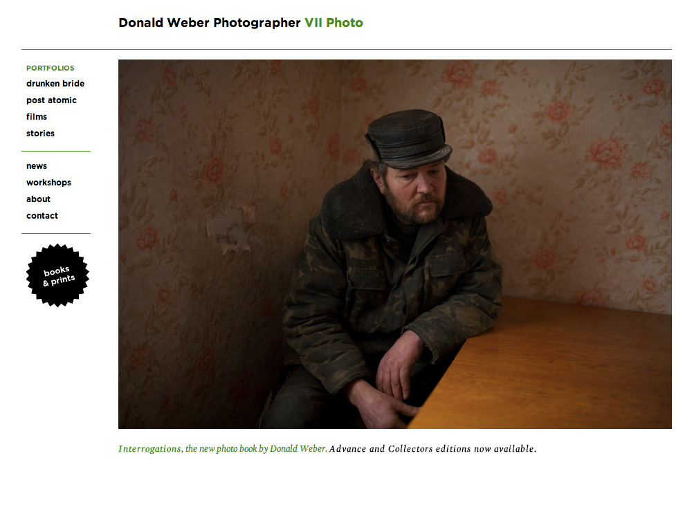
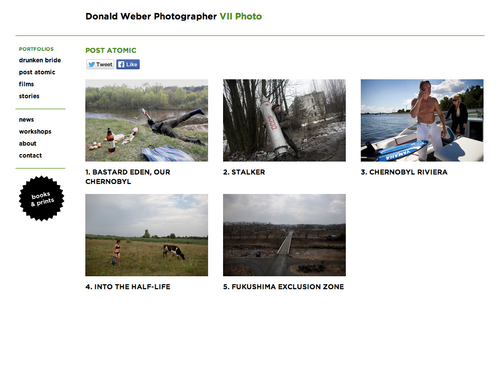
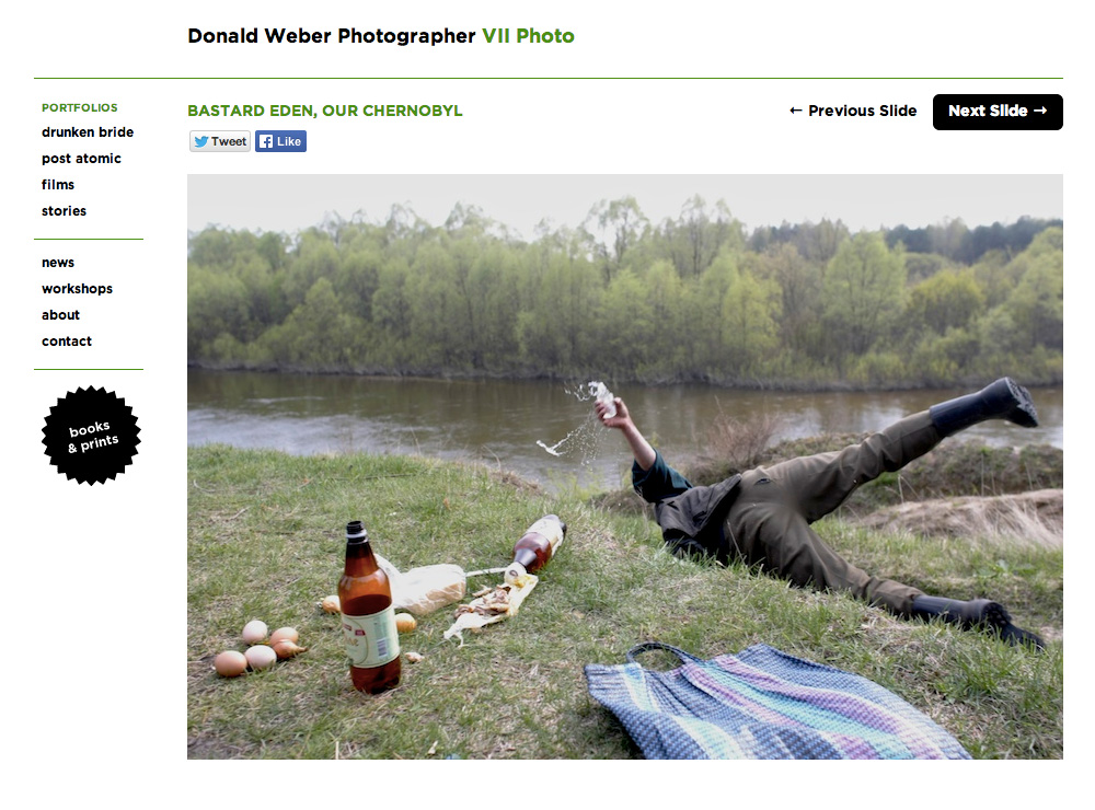
Website Redesign (2010) for Photographer Donald Weber
The 2010 redesign for Donald Weber’s WordPress-based website features a side-scrolling slideshow for the narrative presentation of images as well as pages for the promotion of the photographer’s books and grant-writing workshops.
Donald Weber’s website is hosted by MediaTemple.
In-Gallery Kiosk for Artist Midi Onodera
The Archive and Everyday Life Conference, held May 6–8, 2010 at McMaster University, examined how fields of archive intersect with everyday life. The conference program includes panel discussions, screenings, and visual art.
Midi Onodera’s year-long 2009 video project A Movie A Week was on view in the accompanying group exhibition held at Hamilton Artists Inc. from May 1–15. Her collection of 52 mini-movies “focus the lens on daily, un-monumental occurrences fit for the small screen.”
A long-time collaborator of Midi’s, I developed her site and online-presentation of A Movie A Week. For this exhibition, Ruby Pajares and I created a stand-alone version of the project (image above) that could be run off a lap-top.

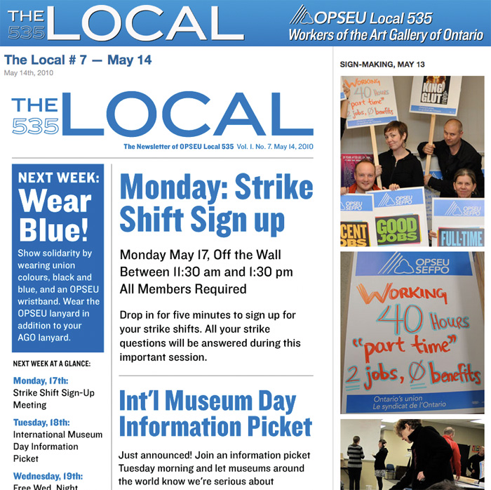
New website for OPSEU Local 535
As an employee of the Art Gallery of Ontario, I am a member of OPSEU Local 535. I got involved this year as part of the communication committee, designing the Local’s newsletter and, recently, website. Check it out!
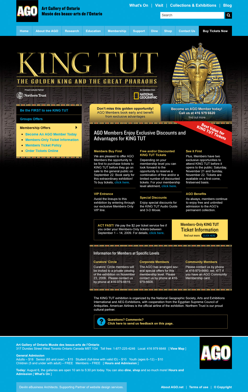
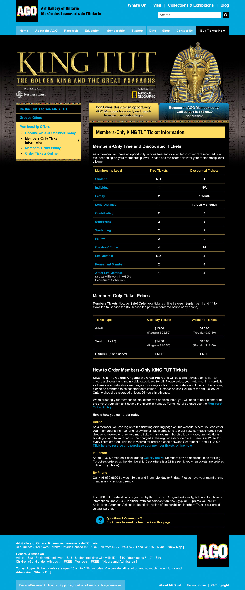
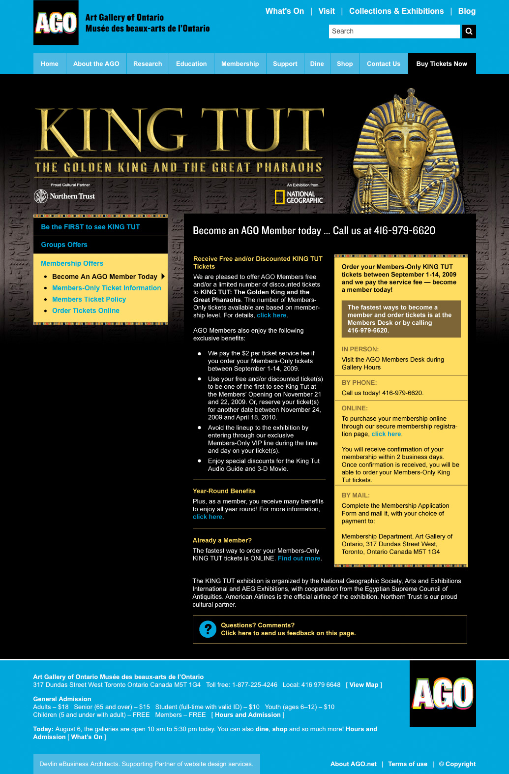
King Tut Membership microsite for the
Art Gallery of Ontario
The AGO had a lot riding on King Tut in 2010. The museum reopened to great fanfare the year before, but the recession hit hard and revenue targets were proving hard to hit. A 1979 Tut exhibition had sparked “Tutmania” throughout Canada and brought more than 750,000 visitors to the AGO; the museum hoped the sequel would prove a comparable blockbuster.
We knew Tut would bring the Gallery to the attention of a huge number of people that were not normally museum-goers. The Development department was determined to seize this unique opportunity to convert them to museum members. Expectations were also high among existing customers, who expected to reap the benefits of their membership. Our team created this collection of pages to communicate with both audiences.
Working in-house at the AGO, I received a packet of info that was, in a way, a brain-dump. Written by my colleagues in Development, it was packed with information they knew we needed to convey. It contained a pitch to prospective customers, as well as information specific to members at various levels, and a run-down of a time-ticking procedure that was unusual for the Gallery. The first thing I did was comb through the text, grouping like-with-like and eliminating redundancies. I followed this with a design that applied the AGO’s King Tut identity in a layout that maximized the visual interest of otherwise dense information. Once the scheme was accepted and approved, I put it together using HTML/CSS and our ModX-based CMS.
It was an enjoyable project, executed smoothly, and I was glad to contribute towards an objective that meant so much to the museum.
Website for Artist Flavio Trevisan
I’m happy to announce a new website for Toronto-based artist Flavio Trevisan. Flavio makes sculptures, mostly, based on maps. The site is a pretty straight-forward WordPress implementation. Check it out!

Website for Artist Midi Onodera
Midi Onodera is an award-winning Canadian filmmaker who has been directing, producing and writing films for over twenty years.
Website for Convenience Gallery
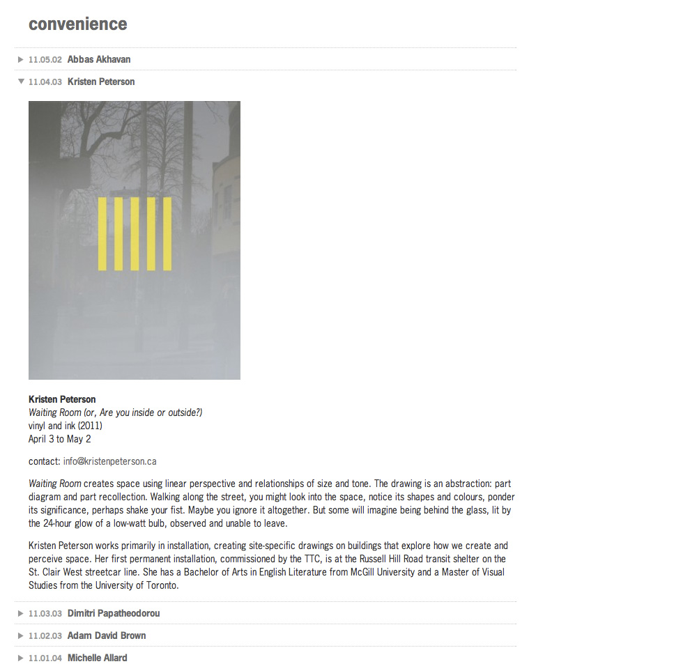
Convenience shows work “that engages, experiments, and takes risks with the architectural, urban, and civic realm.” The site architecture is straightforward: present the exhibitions in reverse chronological order. So for this redesign we applied simple accordion navigation to open-up past entries. The font is News Gothic.
Website for Filmmaker Chris Kennedy
Chris Kennedy is a filmmaker, film programmer and writer whose work “operates in dialogue with the history of film as art.” This is Chris’ first site and serves as a calling-card for his pedagogical work. I wanted the stills from his films to be the primary visual statement, with the rest of the design as quiet as possible. The font is FacitWeb.

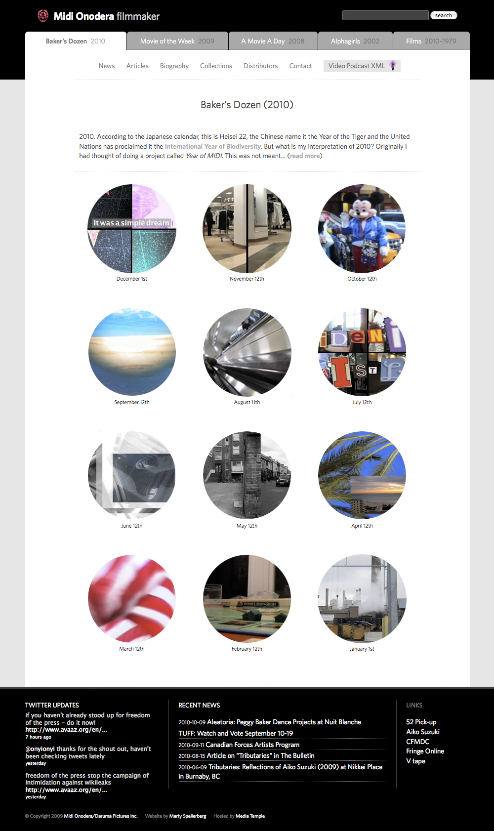
Website Redesign for Artist Midi Onodera
Midi Onodera is an award-winning Canadian filmmaker/moving image artist who creates shorts intended for “small screen” podcasting. This redesign includes a visual overhaul based on a look mocked-up by designer Ruby Pajares, and a full refactoring of the theme’s codebase. The fonts are Chaparral Pro and Museo Sans.

Campaign Microsite for Photographer Donald Weber’s Book “Interrogations”
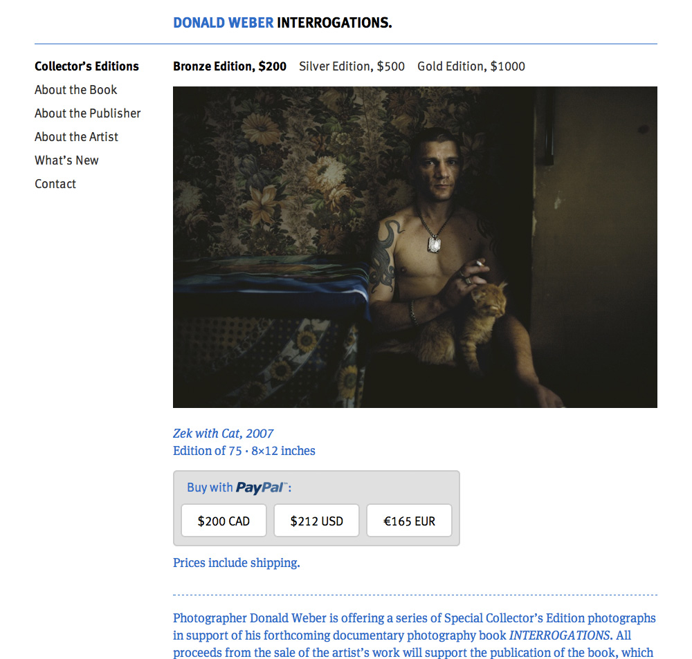
Donald Weber is a photographer with the VII Network, mainly studying post-Soviet authority in Ukraine and Russia. With this site Don is offering a series of photographs in Kickstarter-like support of his forthcoming documentary photography book. I see it as an experiment in the disruption of the traditional ways and means of Art capitol using internet technologies. The font is FF Meta.
Website for Photographer Seth Anderson

Photographer Seth Anderson is based in Chicago, a city that is often his subject. Prolific on Flickr, his images are frequently licensed for reproduction in blogs, books, documentaries and other media. We created a site that makes it easy to order physical prints.
Anderson’s photos are perhaps best approached through categories, making image discovery the site’s central mecanism. The approaches we employed became the basis for my techincal tutorial posts on creating a WordPress Tag Search using jQuery and a Categories Page using Nested Loops.
Introducing “Multiple,” a new online artwork / web comic

What’s your favorite super power? Flight? Strength? Invisibility? For as far back as I can remember, mine has had to do with time: I wish I could do two things at once.
The closest example in mainstream comics is Marvel’s Multiple Man. He creates duplicates of himself that behave independently, merging memories after-the-fact. I’ve long thought, however, that it would be more interesting to explore a character who could, using the memory and concentration of a single individual, do two things at the same time. That’s what I explore in this comic.
The drawings were produced in the winter of 2009/10. I spent an hour each night, four nights each week, drawing with pen. Whenever I was unsatisfied with a sketch, I’d squeeze in a weekend session. I used photo references, choosing then-White House Chief of Staff Rahm Emanuel as my main model; I liked the dark circles under his eyes — they fit a character whose every moment is a feat of concentration. Plus he was in the news a lot, making it easy to find images of varied expressions and angles. A young Ted Kennedy and news anchor Daljit Dhaliwal were used for supporting characters. I collected the drawings in little photocopy zines and, when the long dark winter was done, set the project aside.
I took Multiple back up in the summer of 2011, transferring the drawings to my iPad for shading. When it came to pairing them with text, I knew I didn’t want expository dialogue. I looked to analytical texts — Memory led to Time, and I landed on Heidegger’s short lecture The Concept of Time. I contacted the translations’ publisher, inquiring regarding the fee to license an excerpt of the text in an online artwork. They responded with a flat, “no web use” policy (which is scandalous, in my opinion). So I’ve used ideas from the text as a starting point, restating them in my own words and interspersing them with statements of my concept.
I’ve began posting one panel each weekday. There are 48 panels total, which should take it through January 2012. You can catch-up on the panels posted thus-far via the website, and I hope you follow along via Twitter or RSS.
Thank you.