Museums
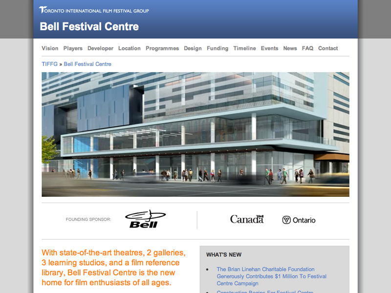
Bell Festival Centre Website Redesigned
Proudly announcing the redesign of Bell Festival Centre! Coinciding with the groundbreaking at King and John Streets in Toronto, the website was created in-house at the Toronto International Film Festival Group by developer Marty Spellerberg and programmer Gabriel Perez.
Check out Bell Festival Centre!
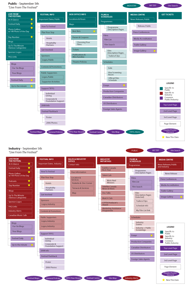
Toronto International Film Festival ’07 Information Architecture
This is a page from the Information Architecture for the 2007 Toronto International Film Festival. It reflects a significant restructuring from previous years, cutting the number of main nav items in half. This page shows one of seven key dates leading up the the festival, with both “Public” and “Industry” views of the site.
The architecture was drawn-up by developer Marty Spellerberg with contributions from the entire online team and feedback from stakeholders across the organization.
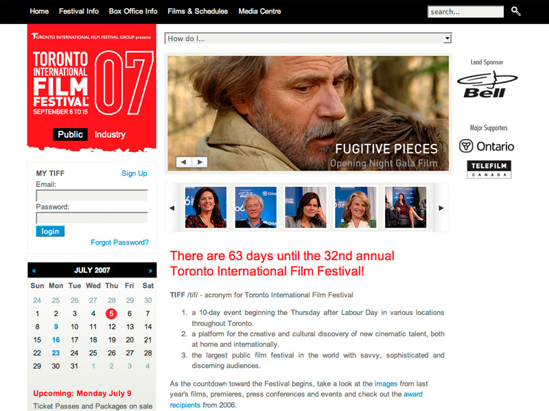
Toronto International Film Festival ’07 Website
The 2007 Toronto International Film Festival is now live! The website was created in-house at the Toronto International Film Festival Group by Developers Richard Norman and Marty Spellerberg; Programmers Gabriel Perez and Ric Pettit; Coordinator Neil Haapamaki and Project Manager Alice Ko. Our favorite features are the Flickr-powered galleries and the Google-powered maps.
Check out the Toronto International Film Festival ’07!
Toronto International Film Festival Group Website Redesigned
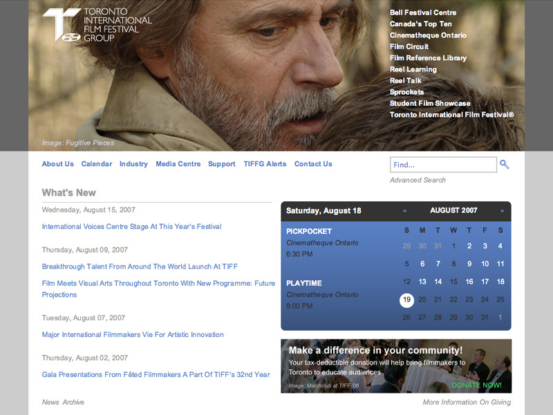
Announcing the redesign of the Toronto International Film Festival Group ! It was designed and built in-house by developer Marty Spellerberg.
Check out the Toronto International Film Festival Group!
Bell Lightbox Website
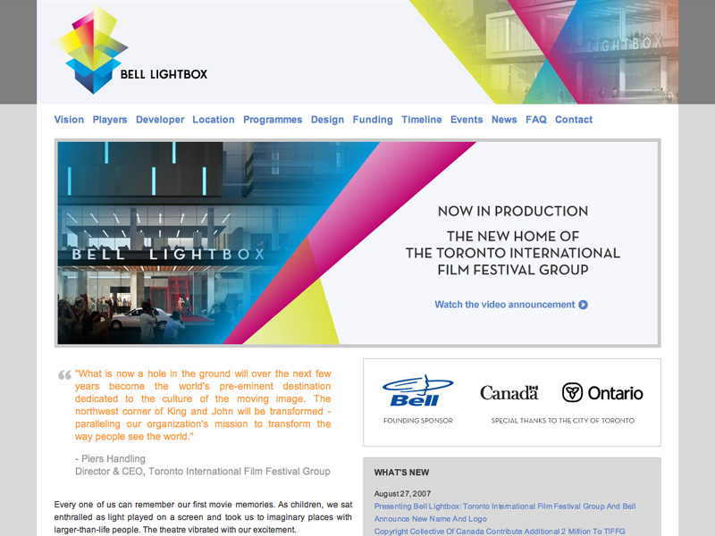
Announcing the launch of Bell Lightbox! The website is a refresh of the former Bell Festival Centre site, incorporating the Envisioning + Storytelling creative, new renderings by KPMB and the TIFFG framing. The website was created in-house at the Toronto International Film Festival Group by developers Marty Spellerberg and Richard Norman, and programmer Gabriel Perez.
Check out Bell Lightbox!
Art Gallery of Ontario Website Redesign
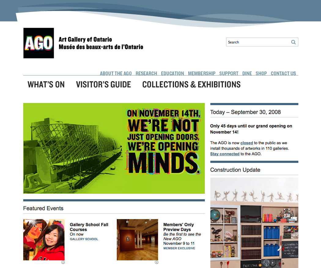
Well, here it is. In the first of four planned releases we’ve introduced a look and feel constructed around the AGO’s new graphic identity. It’s the result of a team effort, and seasons of research.
From a development perspective it’s simply a re-skinning of the legacy ColdFusion site; the CMS we’ve been implementing with Devlin will debut in the coming months.
The new building opens November 14.
AGO / OSC / ROM Web Summit
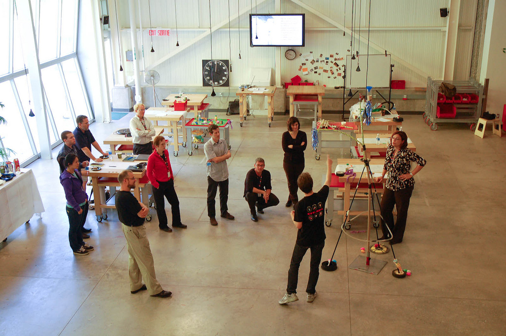
Every few months the web teams of the Royal Ontario Museum, the Ontario Science Centre and the Art Gallery of Ontario get together for a nerd-fest. The events are a welcome diversion from the daily grind of production, and a vital expression of community and common purpose.
Creating the Grange Prize Online Vote
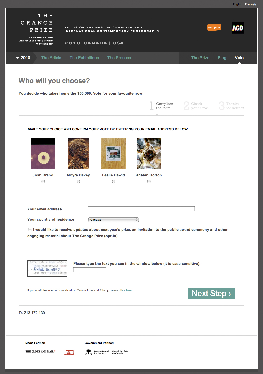
The Grange Prize is an annual contemporary photography prize. The winner is chosen through a people’s-choice vote conducted in-gallery and online. When the AGO took over the site this year, our goal was to create an easy to use and reasonably secure voting mechanism. The rules of the vote were simple — one vote per email address. This meant the main thing we needed to do was verify email addresses. We realized we already had the capability to do this, in the form of the double-opt-in mechanism of our list manager.
What is Double-opt-in? A user submits an address using an online form – that’s the first opt-in. Addresses are stored in the system and marked “unconfirmed.” Then the user confirms the action by clicking a link in an email – that’s the second opt-in. It is not until the verification link is clicked that it is marked as “active” or “confirmed.”
The choice being voted on – in our case Artists – were “segments” of the list. Segments are simply a second column of data, typically holding some sort of preference or demographic data.
So mainly we used the system as designed, simply changing the language presented to the user so that “subscribe” became “vote.” Easy!
Details, Details
There are many, many list management options out there. The ideas outlined above probably apply to any system. We happen to use a system called Cakemail, which has its own peculiarities.
In Cakemail, if a previously confirmed address is re-submitted it is marked as unconfirmed until the verification link is clicked. To ensure votes were not invalidated in this way we needed to check that an address had not already been confirmed.
Luckily, Cakemail provides a way to do this. If you pass an email address to a certian URL, it will return either a “1” or a “0” in response. So when the user submits their address we used this PHP class to get the response from that URL and from there it’s a simple ‘if/else” to either submit the address to the system or redirect to a ‘Sorry, you’ve already voted’ message.
One last thing to mention is the CAPTCHA, which is used to verify that the from is being submitted by a human being rather than an automated bot. For this we used eForm, which is part of the ModX content management system upon which the site was built.
King Tut Membership microsite for the
Art Gallery of Ontario
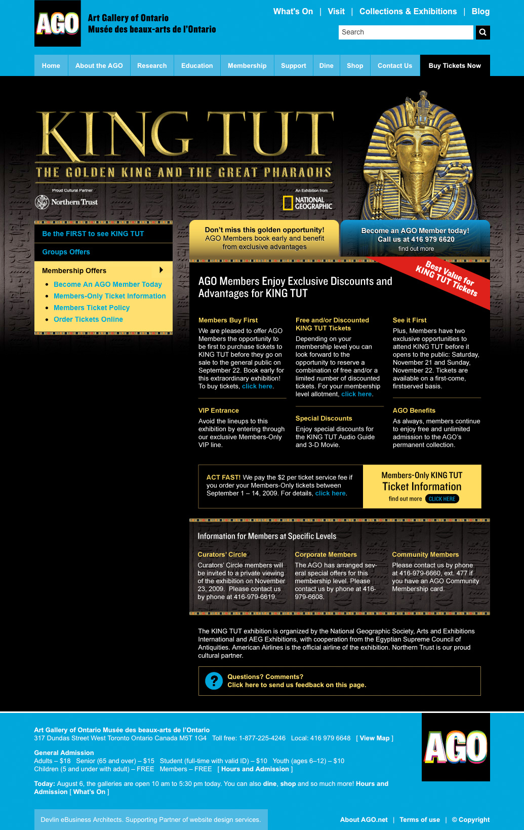
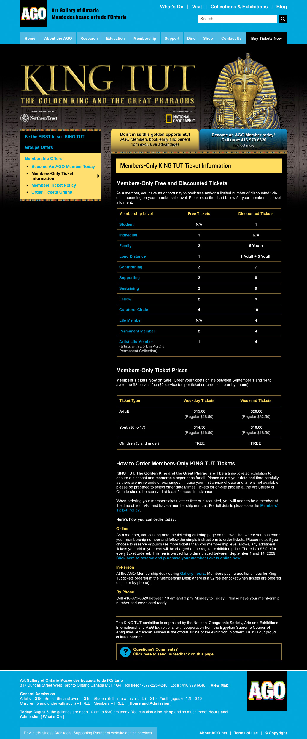
The AGO had a lot riding on King Tut in 2010. The museum reopened to great fanfare the year before, but the recession hit hard and revenue targets were proving hard to hit. A 1979 Tut exhibition had sparked “Tutmania” throughout Canada and brought more than 750,000 visitors to the AGO; the museum hoped the sequel would prove a comparable blockbuster.
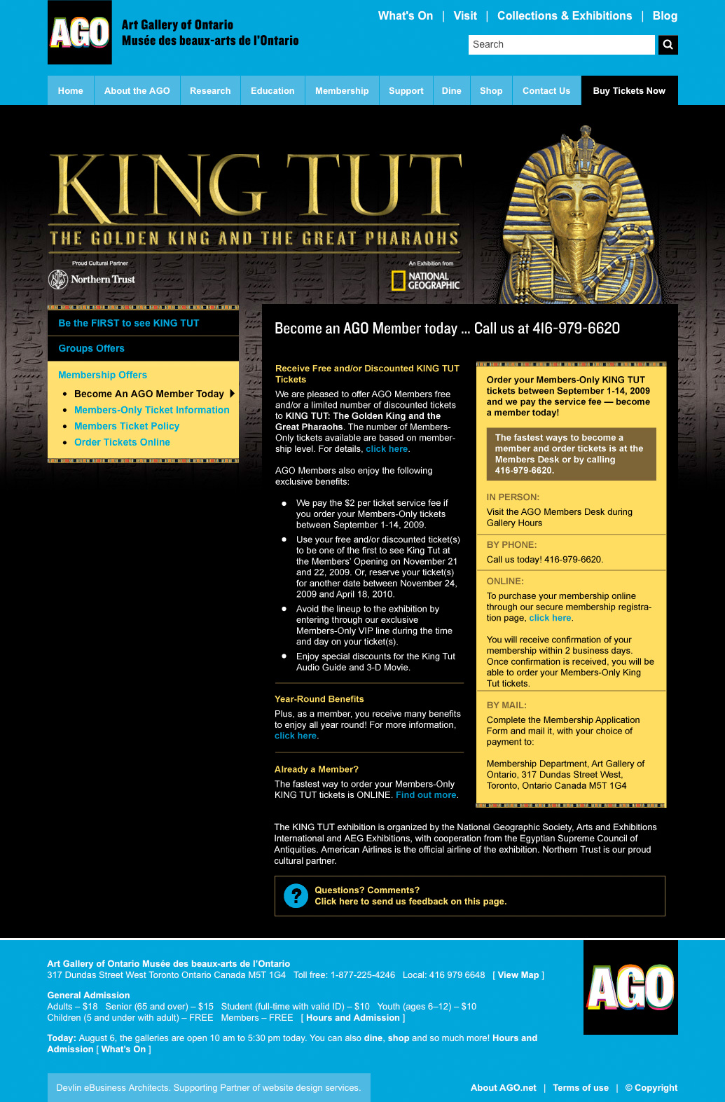
We knew Tut would bring the Gallery to the attention of a huge number of people that were not normally museum-goers. The Development department was determined to seize this unique opportunity to convert them to museum members. Expectations were also high among existing customers, who expected to reap the benefits of their membership. Our team created this collection of pages to communicate with both audiences.
Working in-house at the AGO, I received a packet of info that was, in a way, a brain-dump. Written by my colleagues in Development, it was packed with information they knew we needed to convey. It contained a pitch to prospective customers, as well as information specific to members at various levels, and a run-down of a time-ticking procedure that was unusual for the Gallery. The first thing I did was comb through the text, grouping like-with-like and eliminating redundancies. I followed this with a design that applied the AGO’s King Tut identity in a layout that maximized the visual interest of otherwise dense information. Once the scheme was accepted and approved, I put it together using HTML/CSS and our ModX-based CMS.
It was an enjoyable project, executed smoothly, and I was glad to contribute towards an objective that meant so much to the museum.
Rolling out Social Media at the Art Gallery of Ontario
I was involved with Social Media at the Art Gallery of Ontario through my position as New Media Developer. Our team’s actions resulted in the creation of a new full-time position to coordinate content for web and social media channels.

Identify Connections
I looked around our organization and saw that there were a number of people doing parts of “social media” but they were in different departments and in some cases had never met each other. I recognized this as an opportunity to increase the efficiency and effectiveness of our efforts.
I initiated monthly meetings where content creators brought forward their material and brainstormed with web publishers ways to present them online. A to-do was noted for each item and this list became the agenda for the next meeting. Representatives attended from the New Media, Education, Communications, and A/V teams. In addition, web-specific meetings were held for all major projects.
Institute Processes
Our team brainstormed ways to add social media to existing forms and administrative procedures. This was especially important with regard to copyright clearance and the production of audio/video material. We focused our attention on material which could be repurposed for our various channels, which were crossed-linked. We initiated and implemented changes to our website and email templates that highlighted our social media channels. We added Social Media questions to our existing survey of program participants, which gave our information architecture a demographic baseline (see graphic, above).
Recognizing that most material posted by the Gallery crossed my desk on its way online, I started the AGO’s Twitter feed and posted links to material as it went live. In addition, I shared the account information with the rest of the team, who used it according to their perspective — publicists in service of building buzz, educators in service of engagement. Other tools in our kit included Youtube, Facebook, Flickr and the AGO’s own blog. A member of our team brought forward Tumblr, which we adopted for our “Art of the Day” feature. This was a feature we had implemented on our own site, but by moving it to Tumblr we gained that platform’s passionate audience as well as automatic integration with Twitter. As our efforts progressed we became concerned with new material created especially for these channels and crafted to their specific strengths.
Present to leadership
After a period of work using these processes, our efforts were noticed outside and within the organization. Members of our team were invited to present at conferences and were quoted in the media. I was invited to present this work to the Gallery’s leadership team and corporate advisory board, which included the director of Facebook Canada. Discussion at these presentations revolved around appropriate metrics, with emphasis both on what could be expressed through existing language and what new measures could be defined. It was identified that our efforts needed to be incorporated into a broader institutional strategy.
This resulted in the creation of a new full-time position to coordinate content for web and social media channels. I provided documentation of my Social Media processes and procedures, which were integrated into the portfolio of the new position.
I am pleased that our grass-roots efforts benefited the organization and led to positive change. I am currently testing the applicability of these techniques to other projects in the visual arts.
Website redesign for the Santa Cruz Museum of Art & History
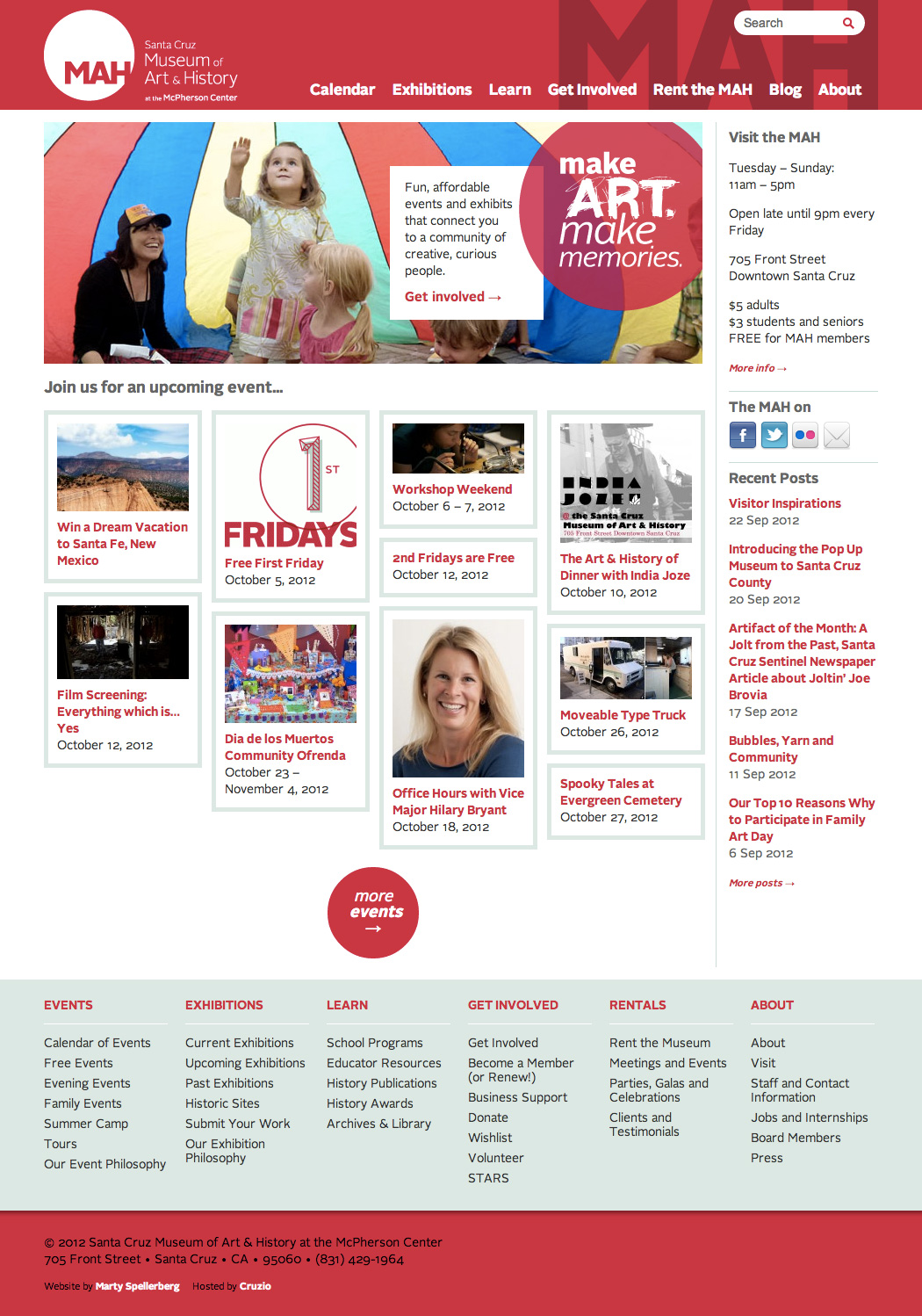
Like many of my museum colleagues, I’m a big fan of Nina Simon’s blog, Museum 2.0. When the Santa Cruz Museum of Art & History, of which she is the director, needed a new website, I jumped at the opportunity. Simon praised my work, saying,
“Marty is everything I could have wanted from a designer — he overdelivered on my vague directives and pushed me to think more rigorously about what we were trying to do.”
The project was a full website redesign and redevelopment. We migrated from a legacy CMS to WordPress, added new content and functionality, and redesigned to match the MAH’s new visual identity.
Origins: A User-Generated Museum Exhibit created using iPads, Google Maps and WordPress

Origins: The Birth and Rise of Chinese American Communities in Los Angeles is a permanent, cutting edge exhibition celebrating the growth and development, since the 1890s, of Chinese American enclaves from Downtown Los Angeles to the San Gabriel Valley.
Origins was designed for the Chinese American Museum, Los Angeles by THINK Jacobson & Roth. I was fortunate to be brought on as a member of the THINK team, providing start-to-finish design and development on the exhibit’s media component, Origins online. An interactive website available in the exhibit’s Monterey Park area, Origins online allows visitors to find and share great places, stories and resources of the San Gabriel Valley and other LA neighborhoods. The in-gallery presentation includes a table with two iPads for accessing the website, and a third for recording video of visitors’ own stories.
Agile Design Process, No Wireframes.

One of the earliest decisions we made on the project was to forego traditional wireframes.
The project team, consisting of CAM’s Steve Wong and Michael Truong, and THINK’s Lori Jacobson and Carla Roth, had a strong broad-strokes image of what they wanted. At our first meeting they described a map of the San Gabriel Valley, with markers indicating points of interest submitted by the public. And so, to our second meeting, I brought a working prototype demonstrating that functionality.
We continued in that vein for much of the project. At each meeting we reviewed the current state of the application and came to a consensus on development priorities for the next week. Feeling our way forward, we’d field lots of ideas and implement those with the highest priority. This process reminds me of the saying, “crossing the river by stepping on stones.”
Rather than discussing abstractions and hypotheticals, this approach allowed us to base our decisions on real experiences with a working interface. And rather than spending our limited time producing paper documents such as wireframes and mockups, all our effort went toward expressing ideas in code that could be poked, prodded, tested and, ultimately, launched.
“When Marty proposed working without wireframes, I immediately responded positively to this idea. With a tight budget and a hands-on client, working with iterative prototypes was the way to go. Rather than lingering in pre-production, this allowed us to quickly make team decisions and try things out in a very real way.”
— Carla Roth
At about the two-thirds mark we took a step back and presented our work, and the decisions it embodied, to Executive Director Michael Duchemin, who gave it his blessing. As the physical exhibition took shape we took a break, and by the time we reconvened the launch date had begun to loom large. So we locked development on new functionality and turned our focus to fit and finish.
I proposed that, since the site would be presented in-gallery using iPads, we adopt the iOS design vernacular. Applying gradients, highlights, textures and pop-overs would involve adding substantial complexity to the code, however, and increase the cost-of-change. For this reason we decided it was finally appropriate to create a mock-up and secure a more traditional client sign-off. From there we turned to browser testing and bug barbecue, then finished with the physical installation and documentation.

Google Maps + WordPress + iPads
Curator Steve Wong described his own extensive use of Google Maps in charting the region’s activity and history, and imagined enabling something similar for the community. I had previous experience with the Google Maps Javascript API so was able to hit the ground running. We chose WordPress for the CMS because of its ease-of-use for both development and content management. Additionally, I knew that the Gravity Forms plugin would allow us to fulfill the user-submission aspect of the project. And we chose Media Temple to host based on the suitability of their offering and my own familiarity with their setup. (Their location in Los Angeles was a bonus!)
The implementation’s core technical concept is described in my WordPress + Google Maps tutorial. Also, this project was the original motivator for the Address Geocoder WordPress plugin, which is now available from the WordPress plugin directory. The other aspect of the technical challenge was creating a JavaScript-heavy site that would look its best on 3rd generation iPads running the Kiosk Pro browser, while also performing on the desktop.
I’m happy to answer questions regarding the technical aspects of this project, including the Google Maps API, WordPress or, more generally, our agile approach and deploying web-based museum exhibits using iPads. Questions about the overall exhibit should be directed to THINK Jacobson & Roth.
The Chinese American Museum is a great space with a ton of history and a staff truly committed to serving their community and preserving its heritage. If you’re in LA, go see the exhibit!