Museums
Page 3 of 4
Web development for artist Mel Chin’s The Tie That Binds

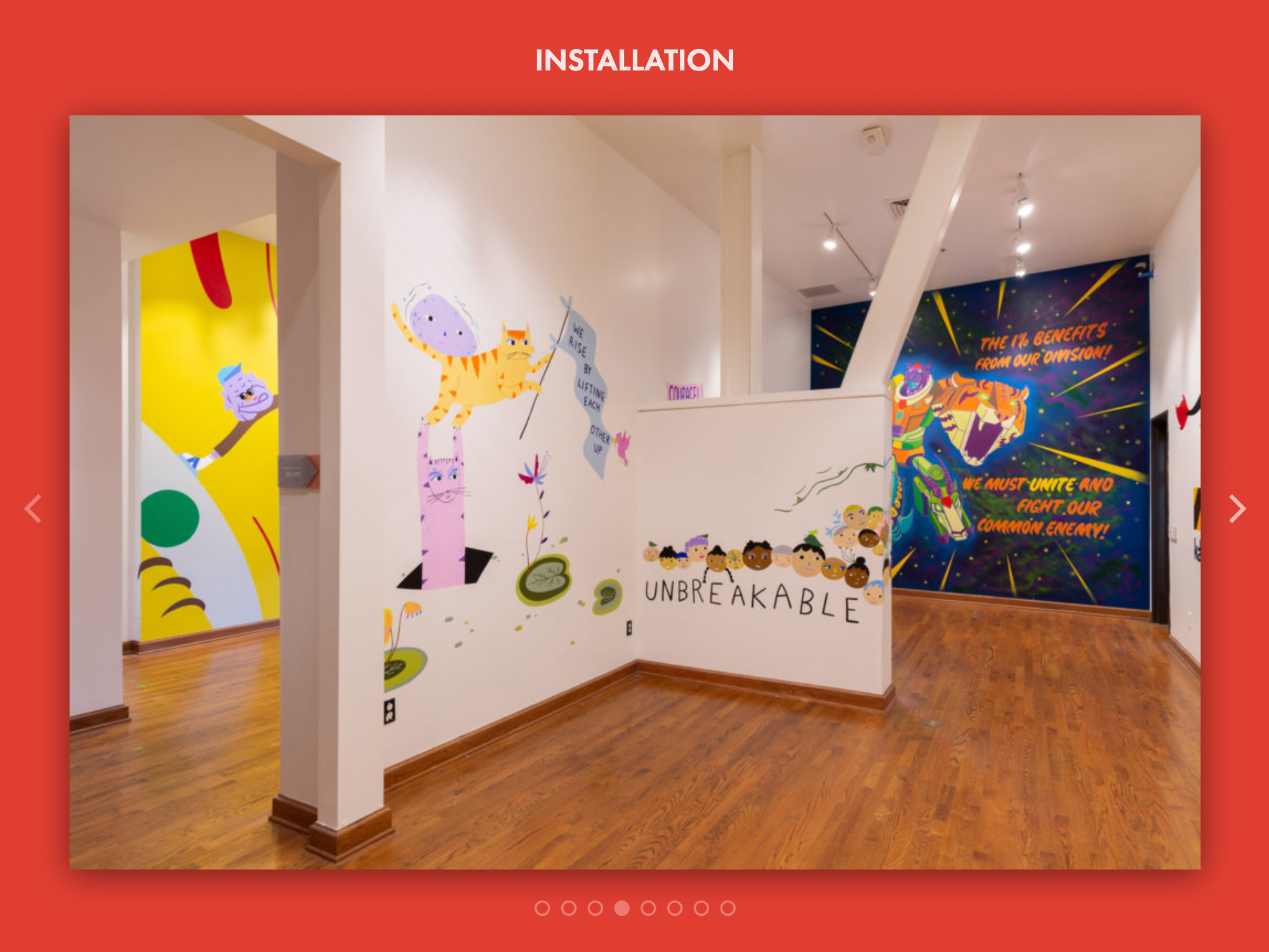
I’m happy to have launched the website for artist Mel Chin’s land art project, The Tie That Binds, part of CURRENT:LA Water, Los Angeles’s inaugural public art biennial.
Originally from Houston Texas, Mel Chin is known for works that require multi-disciplinary, collaborative teamwork that conjoin cross-cultural aesthetics with complex ideas.
The Tie That Binds begins at an 18-acre post-industrial lot along the LA River known as the Bowtie . Visitors, who are guided through eight unique, drought-resistant sample gardens, can then commit to creating a mirror garden in their own yard. Participants receive a blueprint for one of the 512 different designs and instructions on how to plant, establish, and maintain their mirror garden. The newly planted gardens in yards all over the city are meant to reflect a future drought-resistant, collective landscape for LA.
Our team worked closely with Mr. Chin to determine the website’s direction, establishing that its primary purpose would be to drive public visitation to the Bowtie (rather than, say, serve as a “catalogue” or archive). The website, along with the project’s identity and graphic materials, was designed by LA-based designer Tom Kracauer; I provided WordPress and mobile-responsive front-end development; and Amanda Wiles, of Mel Chin Studio, handles maintenance of content.
Thank you to the project team for a great experience; and thanks also to LA arts organization Clockshop for putting us all together!
Check out The Tie That Binds.
Membership microsite refresh for the Santa Cruz Museum of Art and History
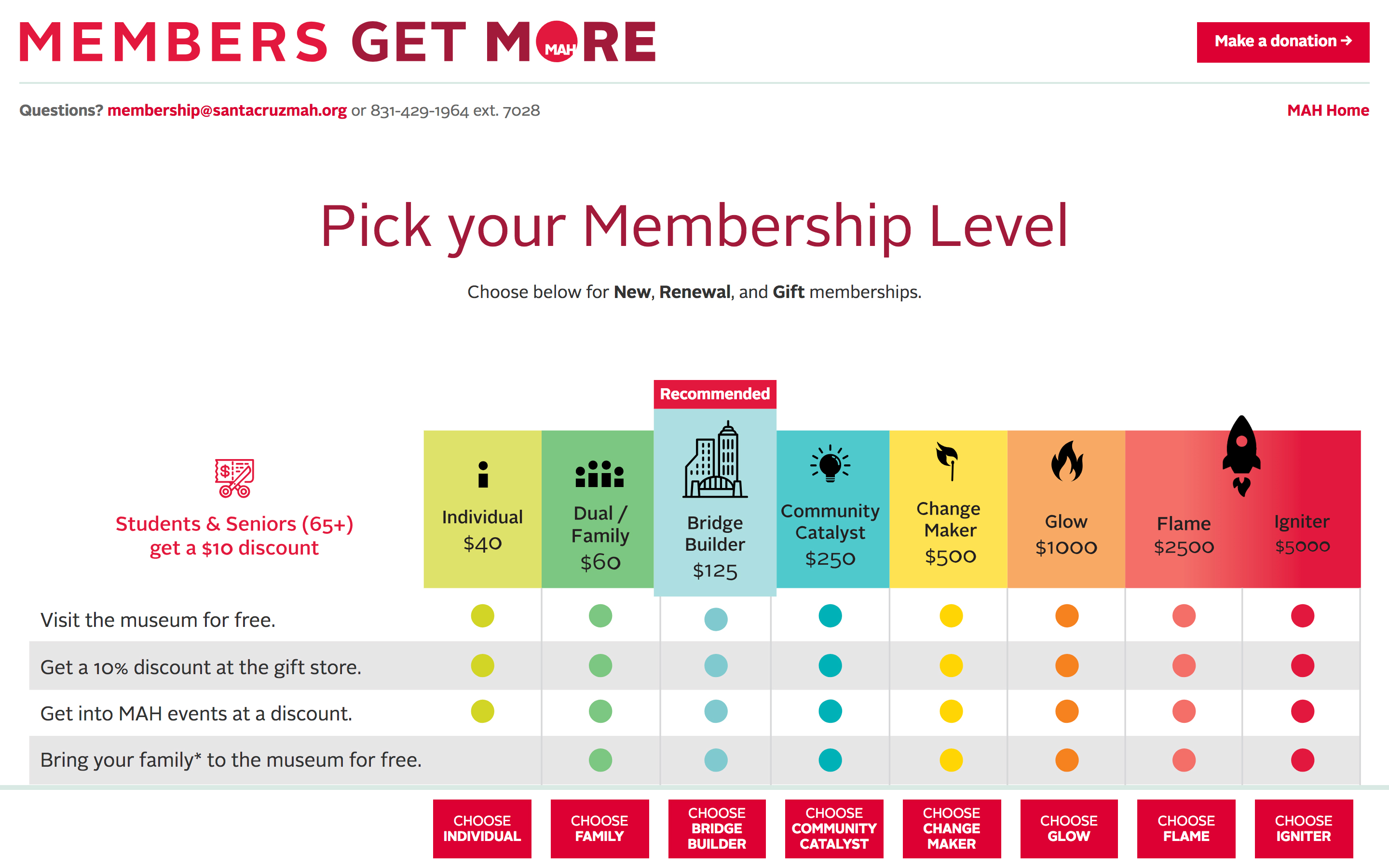
As part of our ongoing work with The Santa Cruz MAH, we recently refreshed the microsite used for membership renewals. The site is build on WordPress and Gravity Forms, with various plugins providing functionality including those from For Gravity, gravity+ and Gravity Wiz.
Digital Catalogue for the Clyfford Still Museum’s Works on Paper

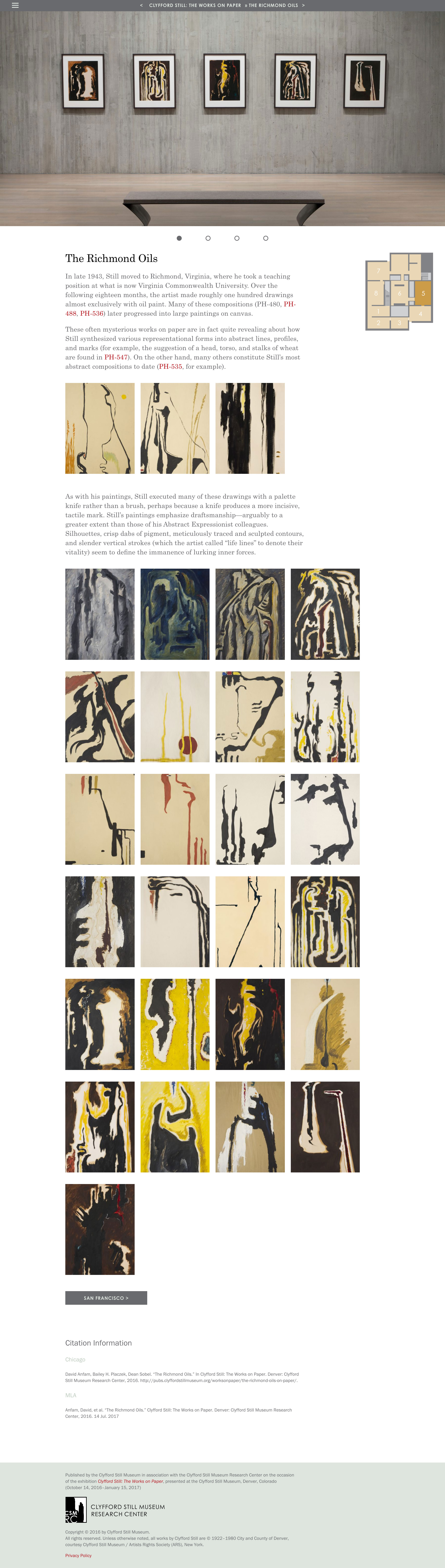
Clyfford Still: The Works on Paper is the first exhibition devoted exclusively to Still’s graphic art. The accompanying exhibition catalogue, the Clyfford Still Museum’s first in a digital format, provides a visually rich experience of never-before-seen works.
Distribution online has ensured a much larger audience for this work, a major priority for the museum, whose collection rarely travels outside Denver. Online user sessions for the publication have far exceeded our expectations in numbers and geographic reach, and quickly surpassed estimates for sold copies of a print run.
The online publication features installation photographs from every gallery wall in the exhibition, as well as high-resolution images of all 256 objects included in the exhibition. The deep-zoom interface allows for an intimate examination of these drawings, revealing evidence of Still’s hand and his mastery of drawing media.
The publication was created using a static-site-generator plugin (Simply Static) on a custom-built theme in WordPress. Inspired by recent work in digital publishing by the Getty Museum, the static-site approach helps ensure stability and longevity for the publication and its scholarly content. E-pub and PDF formats are also available via the online publication at no charge. A 152-page print-on-demand softcover catalogue is available through CSM’s online store.
This project was a collaboration with Sarah Wambold.
pubs.clyffordstillmuseum.org/worksonpaper
Web-based Touchscreen Video Kiosk Platform for the Clyfford Still Museum

Clyfford Still Museum’s new video kiosk platform was built to scale with the museum’s growing video library. The priorities for the system were to make the videos accessible to people with hearing impairments; to design a system that could be content managed from afar; and to create an architecture that could scale with the content—one that could easily accommodate as many videos as desirable, and allow for flexibility in the organization and presentation of those videos on a station-by-station, screen-by-screen basis.
It features touchscreen navigation; closed captioned videos; and the ability to create, publish, and maintain multiple custom interfaces simultaneously. Although the application was built for onsite audiences, the new system leverages web standards for accessibility and sustainability.
The technical configuration is a lightweight, easy-to-update system that fits well into CSM’s technology stack and can accommodate an infinite number of videos and combinations thereof. The interface’s content management is handled through WordPress. The application itself is written in React JS, and communicates with WordPress via a JSON feed. The videos and captions are hosted on Vimeo and accessed by the kiosk application through Vimeo’s API. Each station runs on a Mac Mini that is configured for touch inputs (which is not native in Mac OS). The application runs in Chrome through the Kiosk app extension for a frameless, secured experience.
“Emotion, Intimacy and Space: Designing and Developing the Clyfford Still Museum’s In-Gallery Video Kiosk System,” to be presented at the MCN Conference in November 2018, will discuss how digital design can reflect the physical space in which it is installed, how graphic and movement choices affect visitors’ sense of intimacy, and how the interactive components of museum visitors’ experience can be made approachable through the collaborating disciplines of design and development.
This project was a collaboration between Normal, Spellerberg Associates, Will Meier, and Zack Rothauser. The internal team for this project included Sarah Wambold, Victoria Eastburn and Dean Sobel.
Bringing Warhol to Life Online: Strategy, Design, and Accessibility for warhol.org
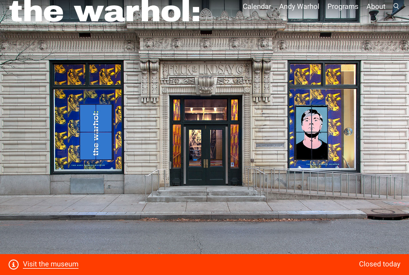
We worked The Andy Warhol Museum, conducting a comprehensive overhaul of warhol.org. Launched in May 2017, The redesign included migrating the backend to WordPress, redesigning the frontend, establishing a content strategy, implementing a new information architecture, and auditing and rewriting all text and images.
The new warhol.org is conceived primarily as a communications tool for audiences planning to visit the museum or attend a program, with a secondary goal of providing much sought-after content on Warhol to digital visitors across the globe.The mobile-first design relies on bright colors, expressive typography, and images of visitors engaged in art making and art viewing. The homepage has been reimagined to highlight the unique, active experience of being at The Warhol: as a visitor, you can make art in our Factory studio, play with floating pillow-shaped balloons in the Silver Clouds installation, or star in your very own screen test. The new site is also highlights the rich work and life of Andy Warhol. Our Life page, for example, tells Warhol’s story as illustrated through collection objects.
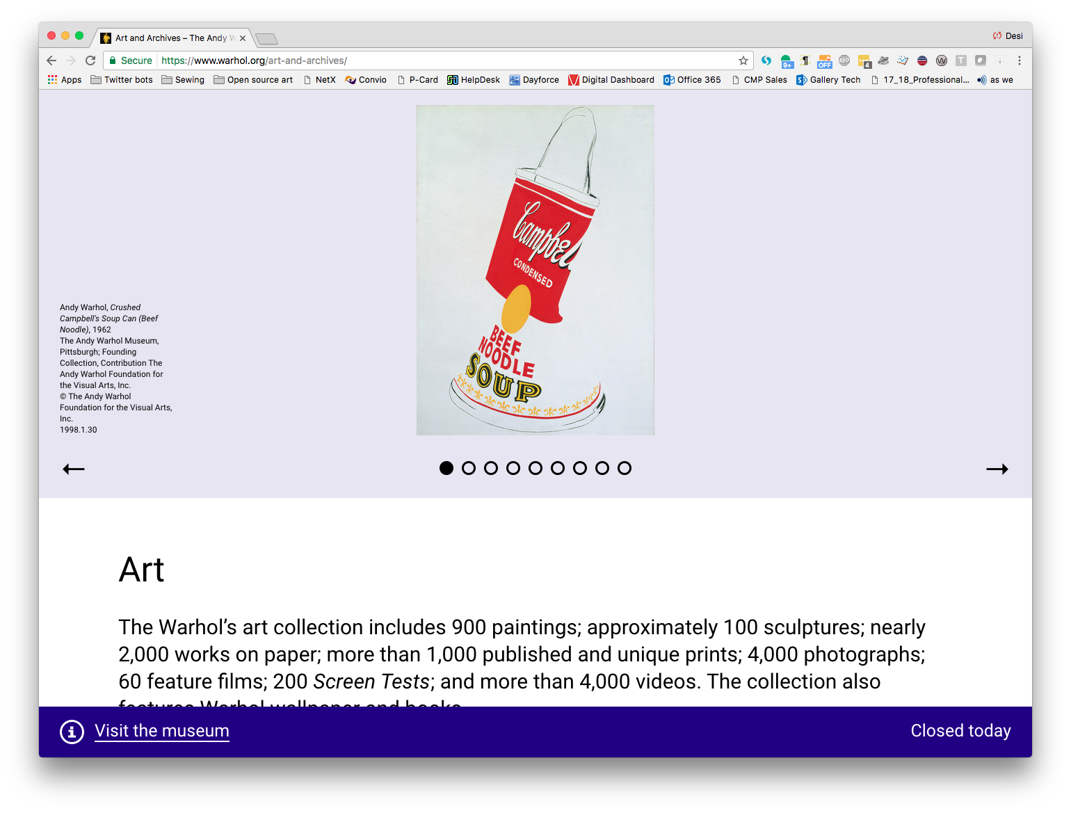
The content strategy for the The Warhol’s website redesign was informed by the Visitor Motivation Survey that the museum participated in a year prior. Through this research, the staff at the Warhol Museum decided to prioritize local and tourist audiences planning a visit, focussing on the website as a communications tool first and foremost.
Working with staff at the museum, we developed detailed user personas, completed card sort activities, and created journey maps to facilitate a new approach to the information architecture for the site. The result is a website that speaks clearly and directly to audiences looking to engage with the museum through a visit or a program.
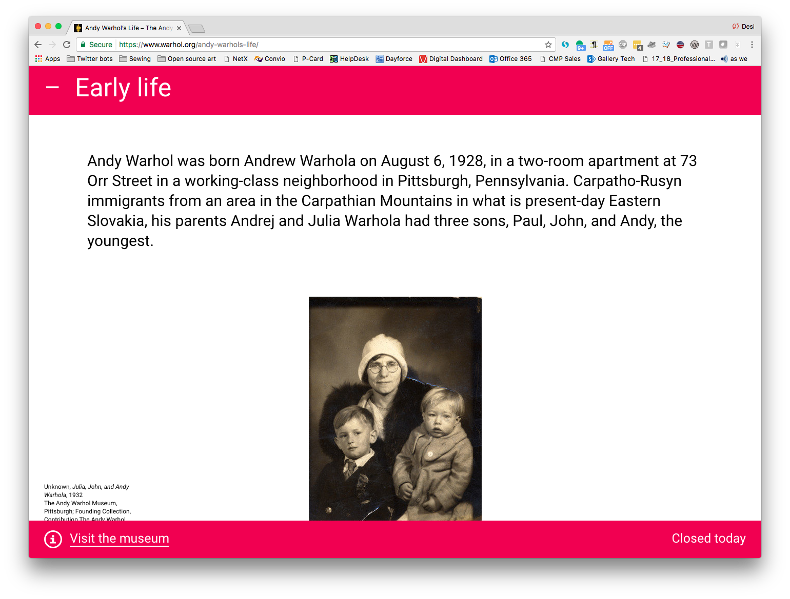
We worked with Prime Access Consulting, led by Sina Bahram, president, to make warhol.org accessible to users with a wide range of abilities and preferences. The site achieves WCAG (Web Content Accessibility Guidelines) 2.0 AA compliance and improves the web experience for visitors across a spectrum of abilities, including those who are deaf or hard of hearing; interact with the site via only keyboard or mouse due to limited mobility/motor control; people who are blind or have low vision and use a screen reader or employ zoom tools to enlarge the page; and users with cognitive disabilities.
Desi González, who was then The Warhol’s Manager of Digital Engagement, served as project manager and user experience lead, leading a core team that included Danielle Linzer and Jessica Warchall; and working with staff across the museum to redesign the site. We brought on Everything Type Company as our design partner. Zack Rothauser, Andrea Skeries and Daniel Abernathy contributed development. Sarah Wambold contributed to the content strategy.
Building for Discovery: A Purpose-Built Gallery Space for Marianist History at St. Mary’s University
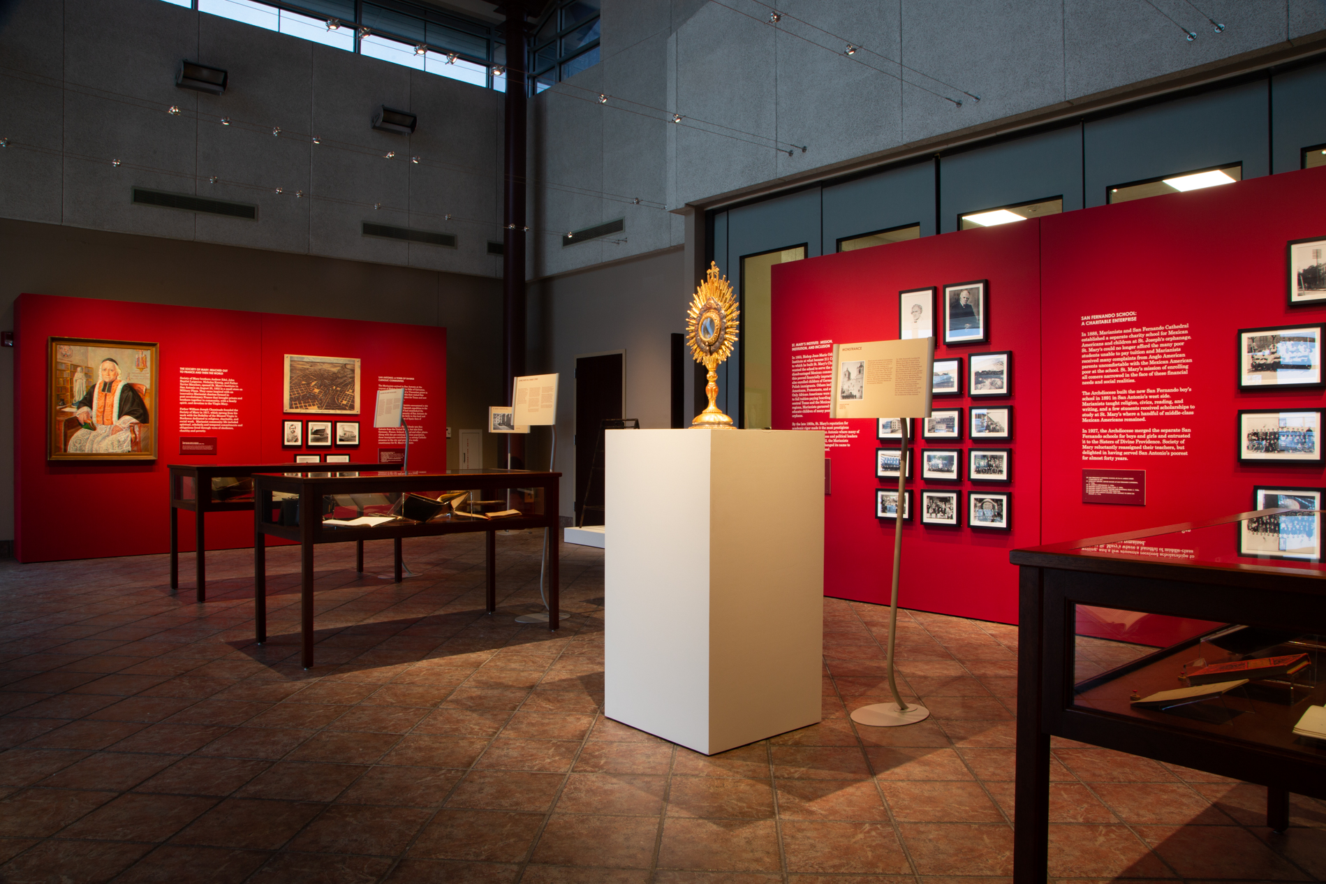
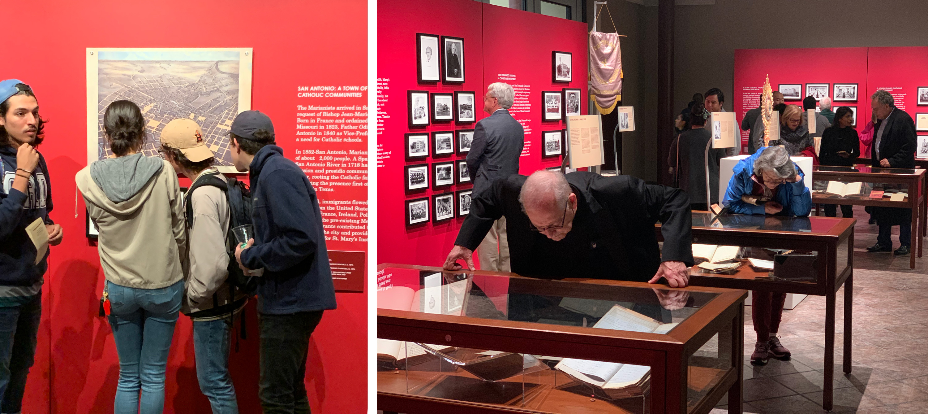
NAMPUS at St. Mary’s needed a facility to tell stories with their historic objects and photographs. We transformed an unused lobby into a flexible display space, complete with the inaugural exhibition. The result is one of the most beautiful and atmospheric spaces on campus.
Initiated September 2018, the project was organized into two phases. The first was through the Marianist Province of the United States, whose archive it is; they commissioned the exhibition furnishings (lighting, walls), which are to be permanent to the facility. The second was through the Public History Program of St. Mary’s University; they commissioned the design and installation of the inaugural exhibition. The opening reception was held in February 2020.
Research
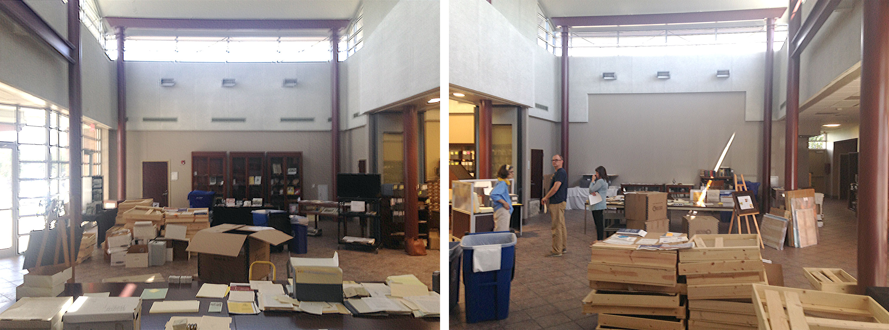
We interviewed the NAMPUS / St Mary’s team, learning about their mission and the project’s audience. The Society of Mary is an international Roman Catholic religious congregation and the archive in San Antonio is the repository of their American records (they also have a substantial presence in Ohio and Hawai’i). In addition to being a resource used by historians, the archive receives visits from brothers and priests. Additionally, the University is home to a public history program, so the exhibit space would serve as a lab for students. The objective was to create a facility with flexible exhibition furnishings that could be used to tell many different stories over the coming years.
We took a field trip to the Harry Ransom Center at the University of Texas at Austin, an inspiring example of the form. The Ransom’s Chief Preparator helpfully demonstrated their system of movable partition walls and discussed their lighting and vitrines. Knowing a portion of our audience would be elderly, we studied the Smithsonian’s accessibility guidelines and a book on planning environments for people with dementia.
Lighting
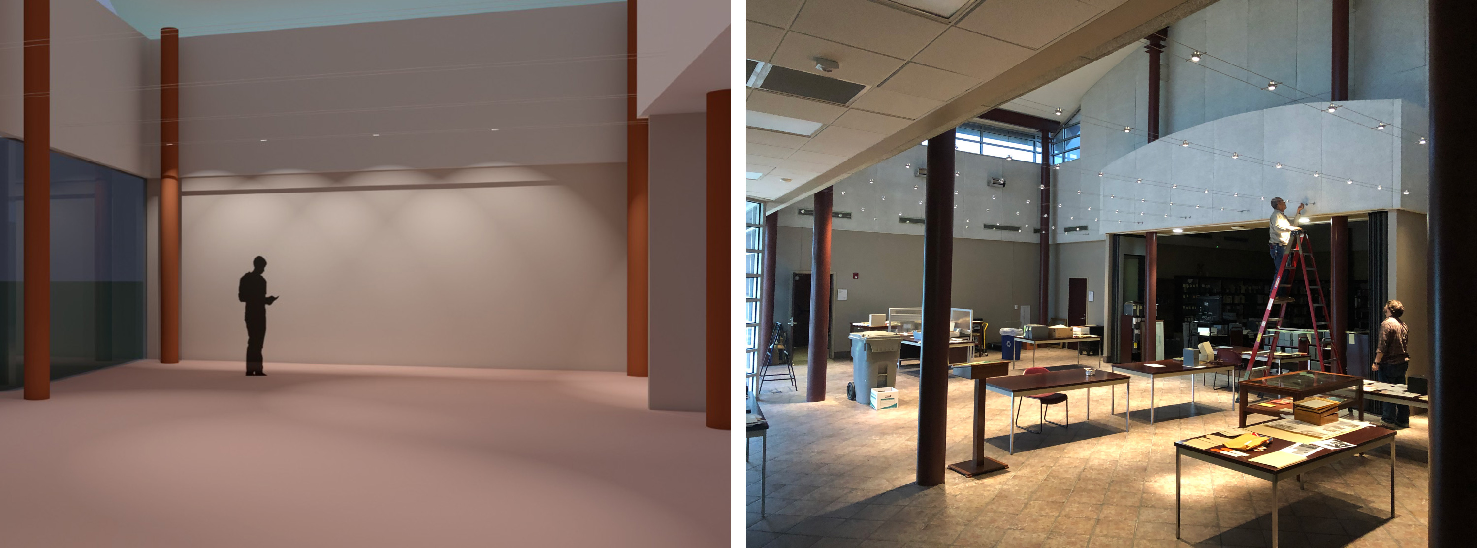
Our first concern was to appropriately light the space. The existing floods provided a harsh, industrial light; staff mostly left them off. The sun cast uneven beams through the atrium windows as it arched across the afternoon sky.
We easily controlled the natural light by installing solar shades. But the atrium presented a challenge: Should we drop the ceiling? Hang traditional tracks with long conduits? Neither appealed. Instead, we selected the “Kable Lite” system from Tech Lighting, which proved to be the ideal solution. Not only was it easy to install, but it also resulted in a minimum of visual distraction. The 32 jewel-like fixtures can be placed anywhere along the nine columns of unobtrusive cables, providing flexibility for any exhibit arrangement.
Walls
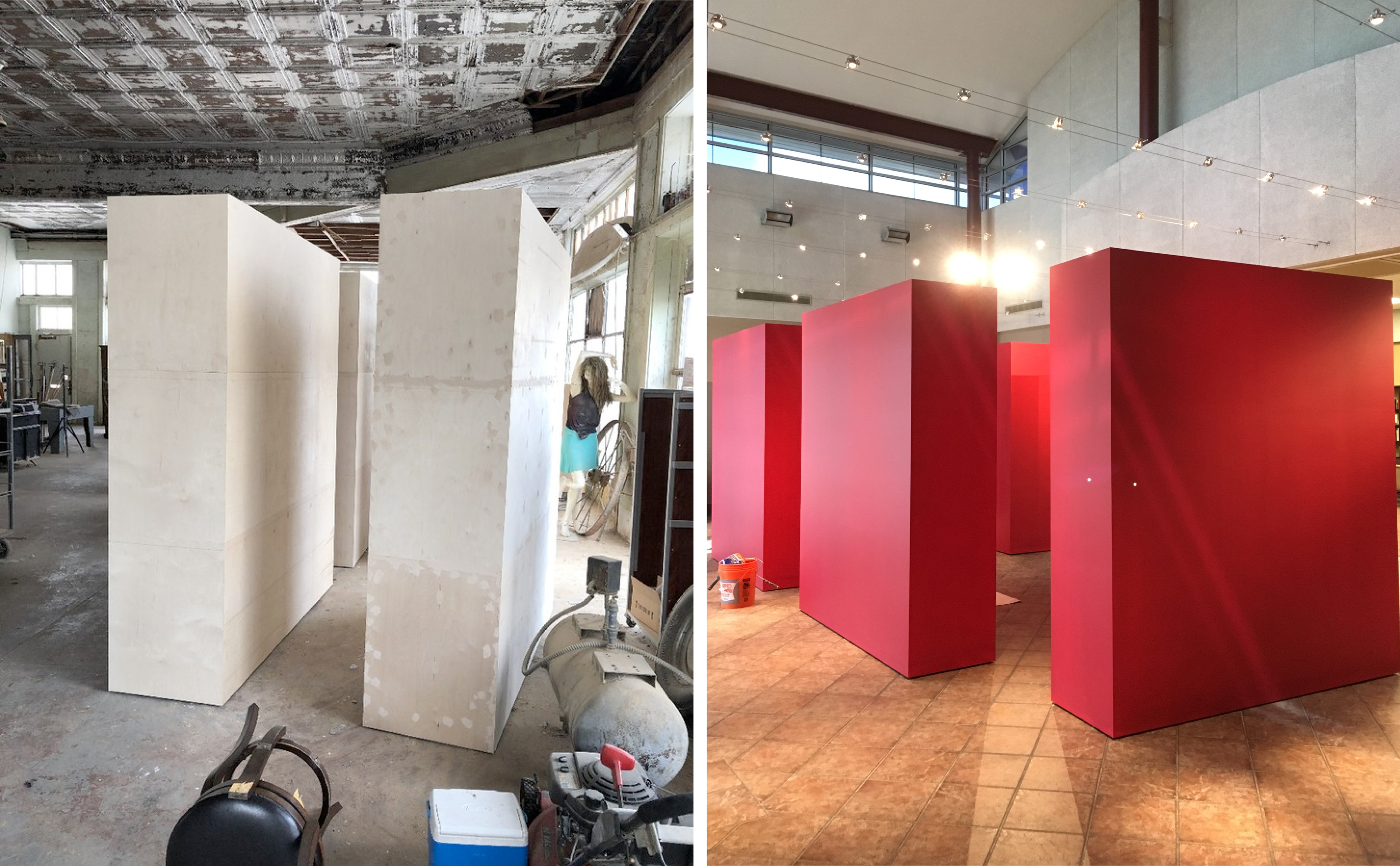
When it came to the walls, flexibility was of paramount importance. The brief called for a system that could easily adapt to a myriad of exhibition concepts. In response, we designed a box eight feet tall, seven feet wide and two feet deep, and built six of them. They are clad in birch, so nails can be driven anywhere, and they are on casters, so can be easily moved by one or two people. We realized before construction that the building did not have a service entrance and that the pieces would need to come in through the front door. For this reason, each box was delivered in two halves and finished in situ.
Additionally, we worked with the archive to identify key objects that were likely to remain on permanent display. For these pieces we purpose-built pedestals.
Layout
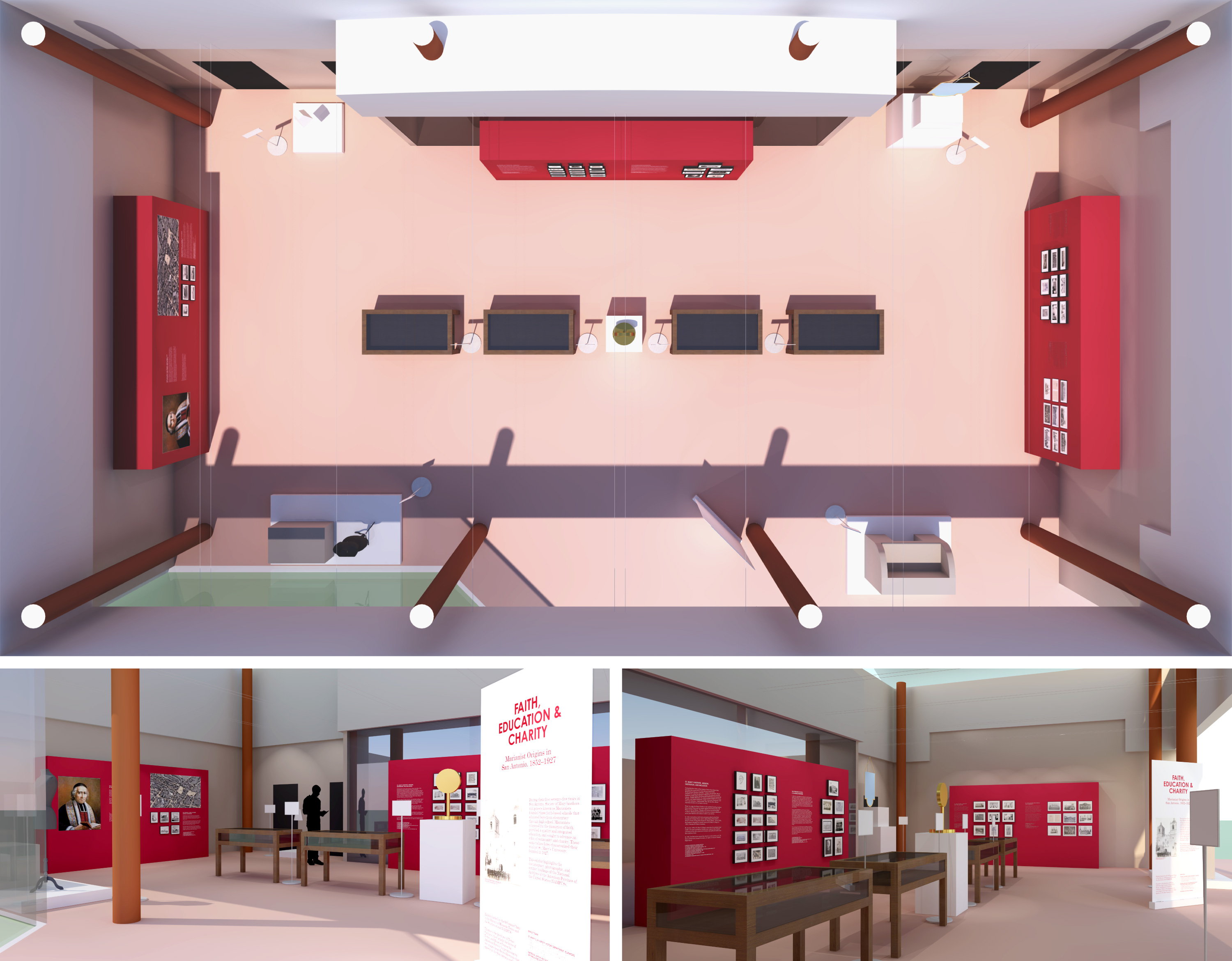
It was then that we began to consider the inaugural exhibition. The St. Mary’s team presented their concept that the exhibit would tell the story of the early years of Marianist schools in San Antonio, told through archival photographs and objects. It would be titled “Faith, Education & Charity: Marianist Origins in San Antonio, 1852–1927.”
Analyzing the material, we developed the exhibition design. We landed on a symmetrical layout that can be spatially understood at a glance. The partitions would be pressed up against the facility walls, in three pairs of two. Four cases, already owned by NAMPUS, would contain objects and be lined up in the center. Four key objects would be placed in the corners, with the fifth in the center. One aspect of the proposed story was not like the others; it was jettisoned.
The interpretive text would be attached to the walls with vinyl, and near the cases and pedestals via commercially available sign stands. A banner stand would be used to create a “title wall” near the entrance. We used 3D renderings to evaluate color choices and decided on a rich, “Catholic” red for the walls.
Installation
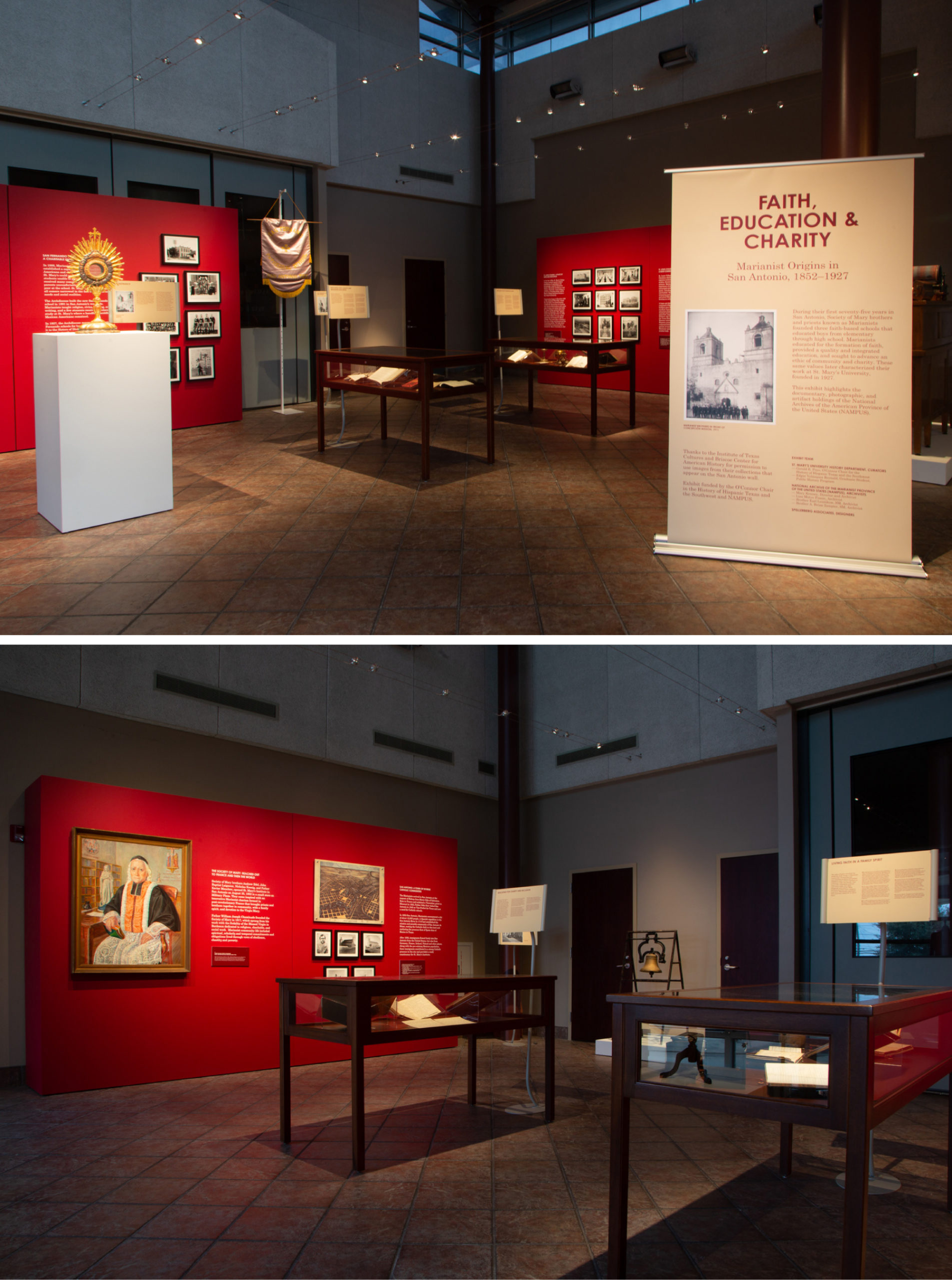
We coordinated the content with the St. Mary’s team. Text and photos were edited to fit space constraints, necessitating multiple rounds of revision. Fifty images were chosen for reproduction, in the end, most coming from nearly pristine large-format glass negatives. We scanned, retouched, printed and framed the work for display. Graphic panels were designed and fabricated; fixtures were acquired and assembled.
This process took place over several months, culminating in three days of on-site installation. The opening reception was held on February 10, 2020. The exhibit is open by appointment.
Credits
For Spellerberg Associates:
- Marty Spellerberg, creative director and project manager;
- Chris St Leger, architectural design and build lead;
- Elijah Barrett, photography lead;
- Michael Villarreal, preparator;
- Tyson Skross, 3D artist.
Service bureaus and contractors:
- Alterman Electric of San Antonio;
- Holland Photo Imaging of Austin;
- Lasr Signs of Lockhart;
- Lights Fantastic of Austin;
- Schneider Solar Screens of San Antonio;
- Talley Woodworking of Lockhart.
Thank you to the entire NAMPUS / St. Mary’s team, especially:
- Mary Kenney, NAMPUS Director and Archivist;
- Gerald E. Poyo, O’Connor Chair for the History of Hispanic Texas and the Southwest;
- Edgar Velázquez Reynald, Graduate Student, Public History Program.
And special thanks to Margaret Sternbergh, for her early advocacy of the project and interpretive planning.
From Physical to Digital: Creating ‘At Home’ Experiences and Virtual Programming
The pandemic of 2020 presented an unprecedented challenge for cultural institutions. We’ve been with with our clients every step of the way, creating projects that run the gamut of adaptations undertaken by the industry. We built “At Home” sections, designed and developed virtual events, and made a bring-your-own-device web app. Additionally, we led a cross-institutional survey to gain a unique insight into museum websites’ changing roles.
Cross-institutional Survey of the Effects of Shelter-in-place on Museum Website Visitation
As soon as authorities in the United States began announcing shelter-in-place orders, we recognized the importance of documenting museums’ responses to the pandemic. Drawing on our experience running the National Museum Website Visitor Motivation Survey, we acted quickly to spin-up a COVID-19 study.

Institutions participating in the COVID-19 survey
Our widely-cast call-for-participants led twenty institutions to sign-on. We collected quantitative data from Google Analytics and conducted qualitative interviews. By analyzing this data, we have gained insight into how visitor behavior has changed and how museums have responded.
We are now sharing our findings with participants and at industry conferences. Read about our presentation at MCN 2020.
“At Home” Sections
Museums strove to maintain bonds with their communities, even as they closed their doors. To provide educational resources and entertainment to those stuck at home, many museums created “at-home” sections that acted as hubs for digital content. We were hands-on in developing these features for the Andy Warhol Museum and Akron Art Museum.

Left: The Andy Warhol Museum. Right: The Akron Art Museum.
We created the Warhol’s solution by leveraging patterns and templates we had previously established through our recent redesign. Working with Museum staff, we reinvigorated what had formerly been the blog. We created assets that can live-on post-COVID, should the Museum’s strategy call for continued focus on digital publishing.
For the Akron Art Museum, we created a new, versatile set of templates. These assets allowed the Museum to move their digital content off Medium and onto their domain. We also upgraded the platform — migrating website hosting to WP Engine and code to Github — while giving museum staff greater ownership of their property.
Virtual Events
Another way cultural institutions adapted was to take their events virtual. We worked with the Chinese American Museum and Pleasure Dome, an experimental film exhibition collective, to reimagine signature programming for an online format.
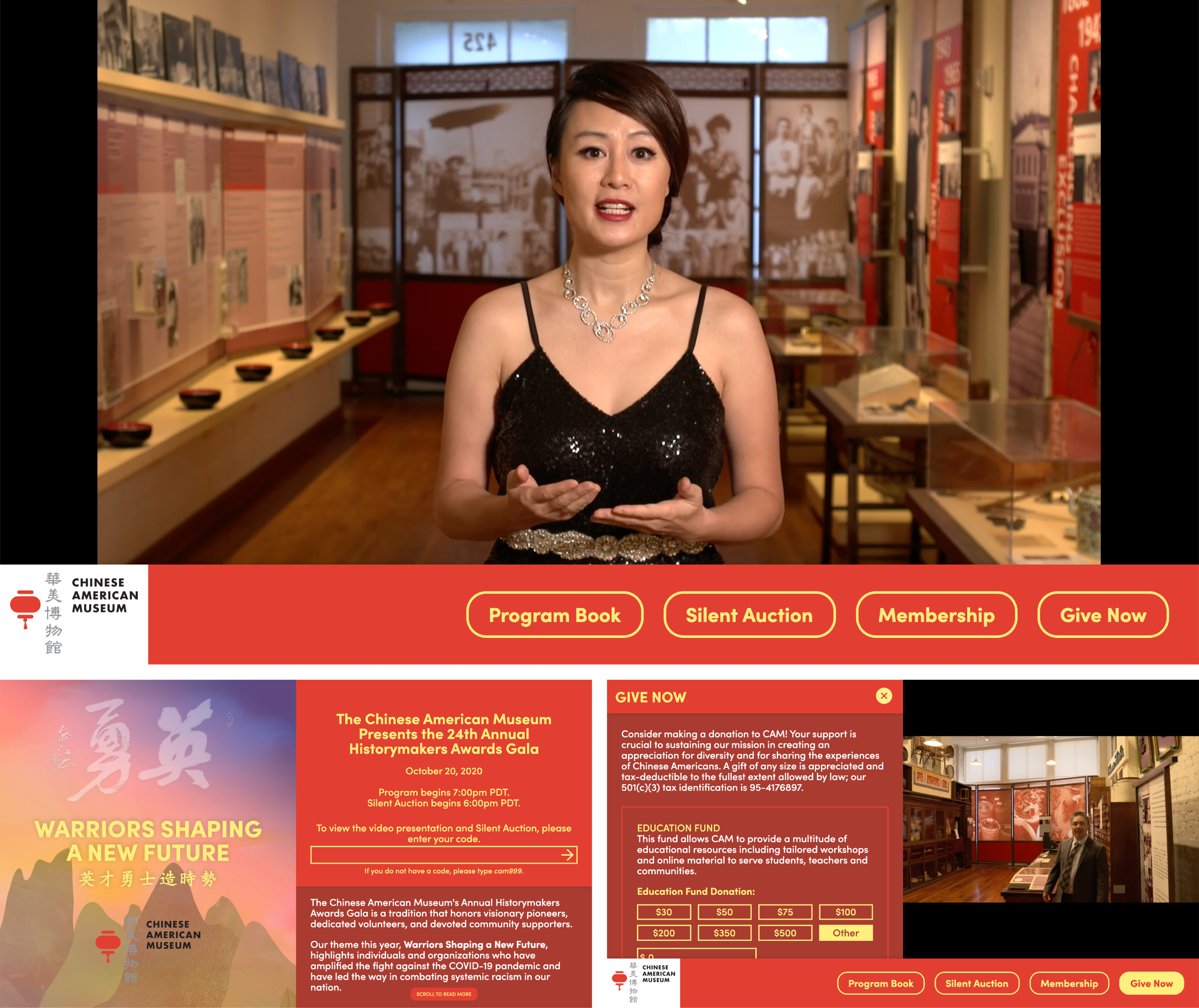
The Chinese American Museum’s Historymakers 2020 virtual gala
The Historymakers Gala is an important annual event for CAM, both in terms of the Museum’s financial health and community cohesion. Though the traditional black-tie dinner off the table, the organizing committee was adamant that the virtual event must convey the same sense of occasion and sophistication. Our solution allowed guests to make donations and participate in a silent auction while enjoying a live-streamed awards presentation. The presentation was a hit with guests. The Museum was happy to announce that the event achieved its financial stretch targets.

Pleasure Dome’s Digital Magazine
Pleasure Dome has presented the best new experimental film and video for over thirty years, and they weren’t about to stop because of a pandemic. Our solution was to reimagine their programming season as a “digital magazine.” Each issue substitutes for a screening, anchored by a feature presentation (often a collection of shorts), followed by a live Q&A (on Zoom) and accompanied by curatorial text. Out of respect for licensing and artist fees, each issue’s feature is available for a bracketed amount of time, within which guests can “rent” access.
Besides adding the digital magazine functionality, we refreshed the website’s design, migrated the hosting to WP Engine, and upgraded their online membership and publication order forms.
Bring-Your-Own-Device
Following a period of closure, some institutions reopened with safety precautions in place. One component of this was the reconsideration of in-gallery interactive touch-screen presentations.

Hammer Museum’s Mohn Award
Each year, as part of its Made In LA exhibition, the Hammer Museum administers the Mohn Award. A popular vote determines the winner. In the past, visitors to the show could log their choices via in-gallery iPad kiosks. This year the exhibition is staged at both the Hammer and the Huntington Library. We needed to make the experience as safe as possible. Our solution was to redesign and rebuild the web app for a “bring-your-own-device” model. Guests who use their phones to log in to the Museum’s wi-fi can access a dedicated microsite and make their voices heard.
In addition…
- We redesigned and redeveloped the website and graphic identity of the Institute for Learning Innovation.
- We set up Google Tag Manager for the Terra Foundation for American Art.
- We brought WordPress up-to-date for the Houston Center for Contemporary Craft and migrated their hosting to WP Engine.
- We added features to the architecture journal Common Edge in collaboration with Once Future.
- And we continued our longstanding collaboration with Everything Type Company. This season’s work included development with the Google Drive API and the Hubspot CMS.
Heartfelt thanks to team-members Zack Rothauser and Grace Poole for their outstanding contributions this year.
Want to work together? Please reach out via email — [email protected]
CMS Integration and Digital Publishing for Akron Art Museum
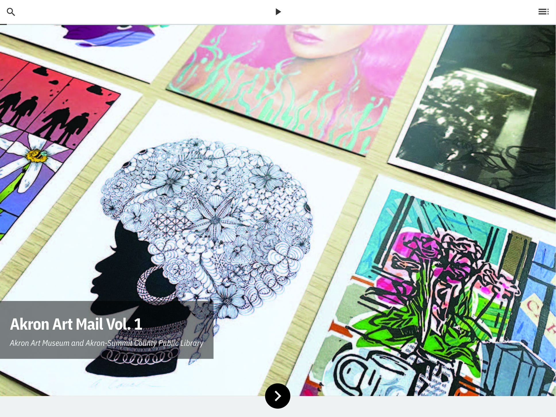
The Akron Art Museum is an art museum in Akron, Ohio. In 2021/22, we provided ongoing web development and support. We integrated the Qi collections management and Raiser’s Edge constituent relationship management systems into the Museum’s WordPress-based website. Additionally, we developed the Akron Art Mail multiformat publication using Quire.

Andy Warhol Museum (2021/22)
The Andy Warhol Museum is North America’s largest single-artist museum in Pittsburgh, Pennsylvania. Continuing our years-long relationship, in 2021/22, we provided ongoing web development and support. We updated the navigation and upgraded the search of the Museum’s WordPress-based website. Additionally, we collaborated with the Center for Digital Experiences at Pratt Institute on a website visitation analysis.


Terra Foundation for American Art (2021/22)
Based in Chicago, Illinois, the Terra Foundation for American Art supports American art exhibitions, projects, academic research, and publications worldwide. In 2022, we designed and developed the pages announcing the new mission/vision/values and the forthcoming Foundation Report. We provided support that increased the stability and security of the Foundation’s WordPress-based website. Additionally, we collaborated with the Center for Digital Experiences at Pratt Institute on a website usability report.


Website and Streaming Platform for Media City Film Festival
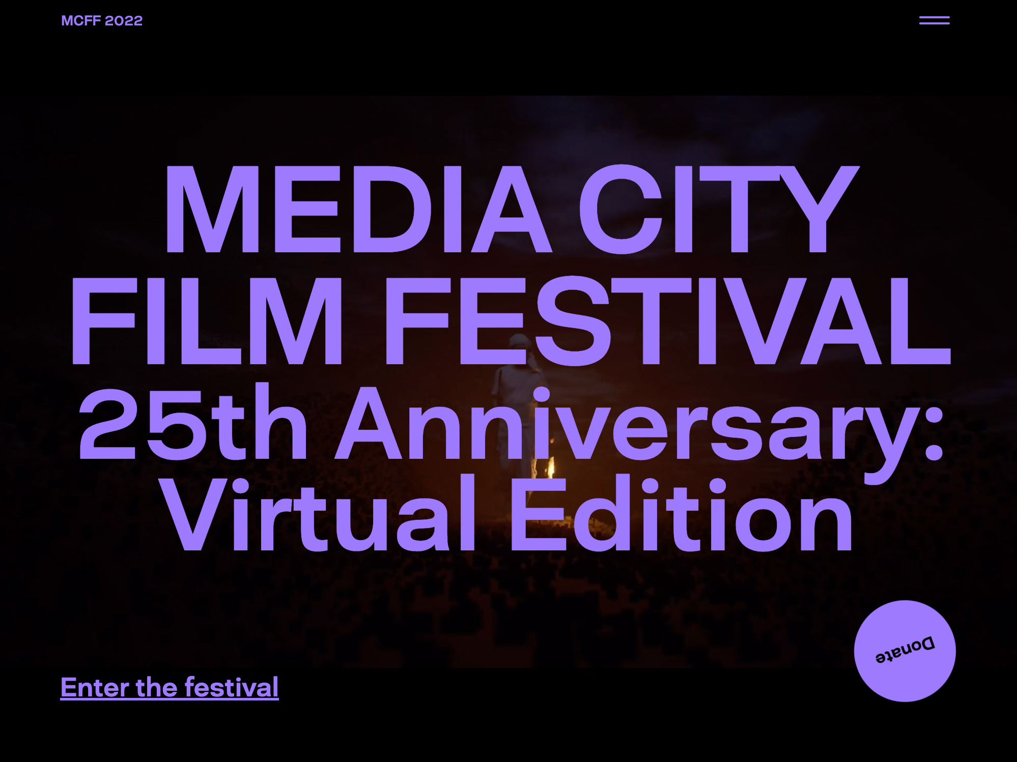
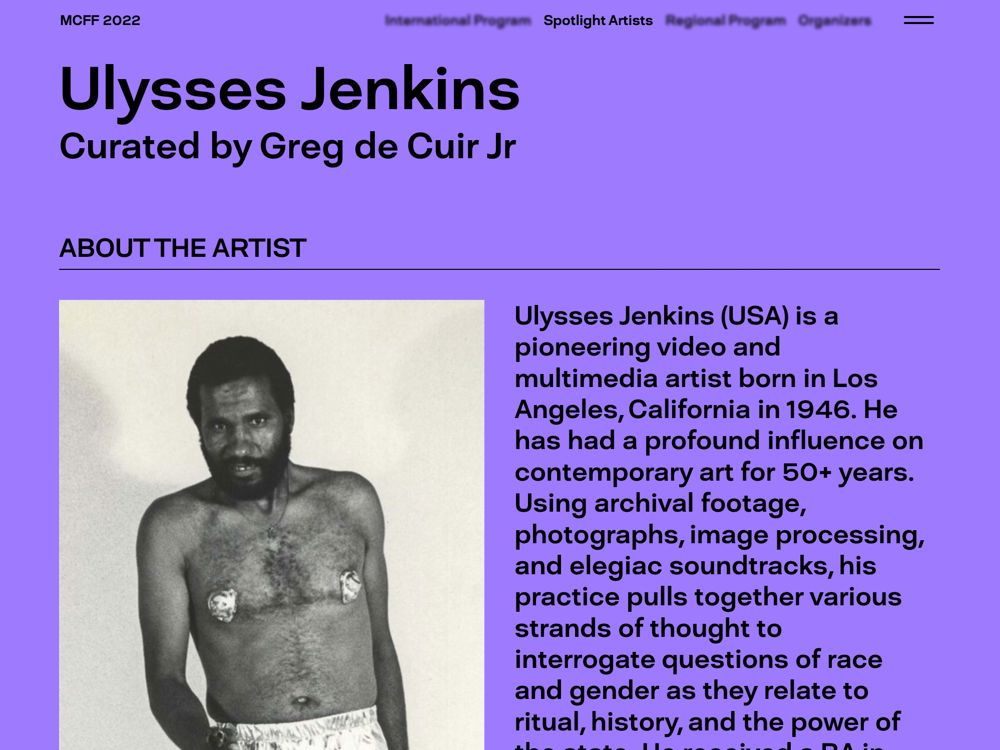
Straddling the border between Windsor, Ontario, and Detroit, Michigan, the Media City Film Festival presents international film and digital art. In 2022 we helped launch a global, virtual iteration of the festival by designing its website and developing a WordPress integration for the CineSend secure video streaming service. We partnered with Hour Studio for the design.
Exhibition Microsites for the Chinese American Museum Los Angeles
The Chinese American Museum Los Angeles is dedicated to the history and experience of Chinese Americans in California. Continuing our years-long relationship, in 2021/22, we provided ongoing web development and support. In particular, we designed and developed microsites for the Year of the Ox and Collective Resilience exhibitions.